Yahoo's New Logo — And Branding Changes
08 September 2013
Almost invariably, I hate branding changes. Sometimes, they’re needed because of changes of business, but most are just sheer WTFery and large wastes of money.
But first, I’d like to incorporate this geeking out about Yahoo’s new logo by reference. There’s one quibble I have, though: I wouldn’t use the word “fashion” to describe Optima. I’d say “formal.” There’s a seriousness to it, but it’s also neither a fish-or-fowl entry in the serif vs. sans dichotomy.
It’s one of my favorite typefaces, and that’s one of the reasons I use it for the body text on deirdre.net. I use a funky serif font (Opuscula Serif) for the headlines, so the body text needed to be something that wasn’t quite the usual Helvetica or Times, but also needed not to be particularly far out there.
The old Yahoo logo wasn’t dated. It was friendly. The new one is just off-putting. Ugh. I feel sad for some talented designers, like Marco, who have to face that every day.
Here’s a branding change I think makes sense, even though I don’t like the logo change:
United Airlines had a classic logo designed by Saul Bass in 1974. It’s invariably referred to as “the tulip” logo.
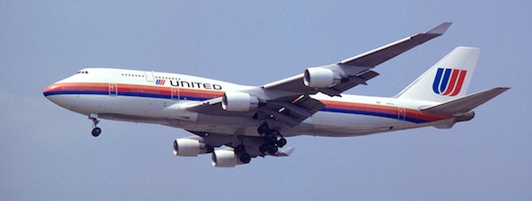
I’ll skip a branding change here and go to the last pre-merger change to the monochrome tulip logo, which is my personal favorite.

Then there was the merger with Continental, which had the “lottery cage” logo (a change from their earlier “meatball” logo, which you can see on their wiki page).
So the goal was to really bring home that this was a merger. So the type saying “United” looks more similar to the historic look for United, but the tail logo was from the Continental side of the house. And there was much whining, but I actually think it’s brilliant integration of the history of both companies. They were keeping the United name, but they kept the significant part of the Continental logo: the tail of the plane.
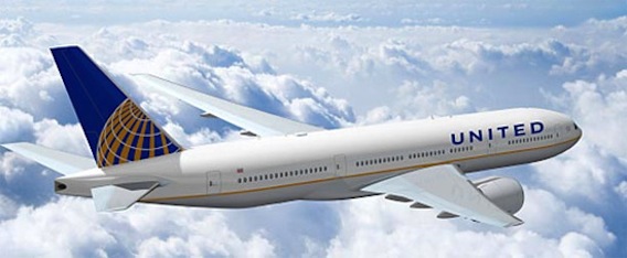
This is the rare case where a logo change made unambiguous sense (more so than the similar change American made to their long-standing logo).
But Yahoo’s? Makes no sense to me. Being different isn’t being better. There are far more ways to fail than there are to succeed.