Typecon, a Typography Conference
30 May 2014
One of the things about Doing New Things This Year is the fact that I get to, you know, do new things this year.
It’s interesting to review various fields to see when “indie” started becoming mainstream and more than a curiosity. For type, it hit earlier than others. I remember that even in 1994 there were indie type designers making money, though it really took e-commerce and font sites like myfonts.com before anyone could make a career at it.
A convention I didn’t know about until a few days ago is Typecon. In the long tradition of using horrible pun names for convention titles, this year’s conference is in Washington D.C. and is therefore called Capitolized.
Typography’s a layer between script systems and the reader, one that communicates a lot of meta information about the message.

(Fonts, in order: Downcome by Misprinted Type (free), Eveleth, by Yellow Design Studio, Holden, by AlterDeco typefoundry, and Showcase Script by Latinotype.
Most people wouldn’t think the last really wasn’t communicating danger in any meaningful sense.
Anyhow, back to the conference.
The keynote speaker is Tobias Frere-Jones, one of the designers of some of the most amazing modern type. And also the plaintiff in the largest career divorce in recent typography history. The company that used to bear his initials, HF&J, is now Hoefler & Co.
Then there’s the program, which includes awesome things like type foundry ephemera, the typography at Medium, Victorian-Era calling cards, designing for audiences with low literacy skills, typography in medically-critical contexts, typography of food packaging in America, the evolution of Korean typesetting, typography of the American record industry from 1898 to 1967, problems of Hebrew typography, including Karmeli script, the special issues of typography for software development, the problems of creating Arabic typeface variants of fonts like Zapfino. I love the description of this talk:
As the Arabic companion to Zapfino, the first question that Zapfino Arabic had to address was: does it slant forward or backward? The next question that quickly followed: which Arabic calligraphic style would be a suitable companion to the distinctive flair of Zapfino?
I can’t even begin to imagine the issues in bidi (bidirectional, meaning mixed left-to-right and right-to-left lines) of a typeface as calligraphic as Zapfino.
Are we done yet? We are not.
We haven’t covered the workshops yet.
There’s a full-day workshop on calligraphy and fonts; one on developing Devanagari typefaces; the workshop where you bring a glyph design, use a CNC router to make a wooden version of your design. A second workshop is about letterpress printing, where one can bring one’s wooden glyph created the day before. The Letterpress Poster Sprint & Print sounds really awesome, but I went for the other option: flourishing rules. There’s a full day workshop in Hebrew type design, as well as a half-day one in watercolors. (And there are more.)
The one I’m really waiting for is called Pen Dance. Here’s the description:
Make a pen using a soda can and explore the marks it makes! This workshop will get your hands dirty as you experience the visceral pleasures of pushing ink through a pen. We will make our own writing tools, then learn how they work, starting from the simplest marks and working up to letters and words. Freeform letter styles with a lot of expression are the result … your letters will be unique and extraordinary.
Sounds like fun.
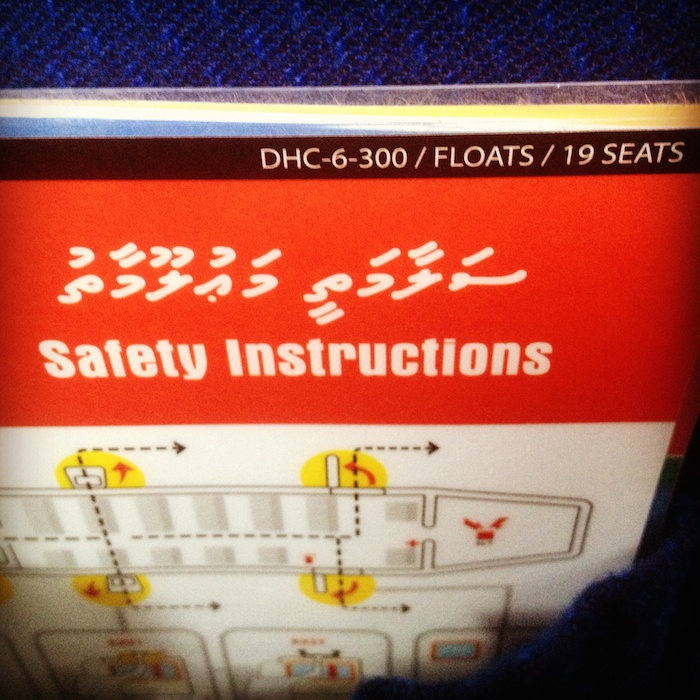
Random photo that I always think of when I think of typography: Maldivian Air Taxi’s safety card, complete with Dhivehi script.