I have to admit I’m not usually a huge fan of branding campaigns, but Typecon 2014’s branding, designed by Build really knocked it out of the park.
The conference theme was “Redacted,” and the name was “Capitolized,” both homages to the conference’s Washington D.C. location. The theme also included double-speak and information combined with (justifiable) paranoia.
Welcome to the City of Magnificent Intentions
[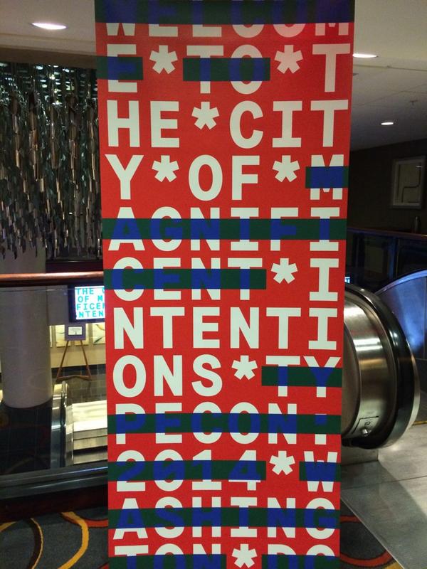](/images/2014/08/BuOKwRDCEAAbjGY.jpg)Typecon banner, photo by [Akira Himei](https://twitter.com/ashlight/status/496392946757812224/photo/1)
Typecon Bureau of Dining, Imbibing, Navigating, and Inconspicuous Tourist Operations
[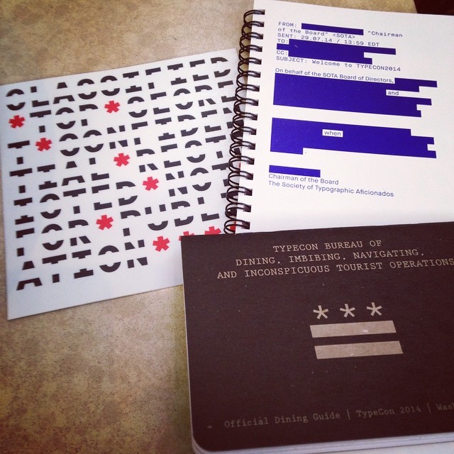](/images/2014/08/dining-and-imbibing.jpg)Typecon Dining and Imbibing Guide, pic by Deirdre Saoirse Moen
Behold the Video Monitors
Here’s a link to the video one saw going down the escalators to the conference. (Note: Seizure disorder warning.)
All Neatly Leading into the Keynote
Tobias Frere-Jones speaks on the topic of In Letters We Trust. It was a fascinating talk I’ll write about in an upcoming post.
[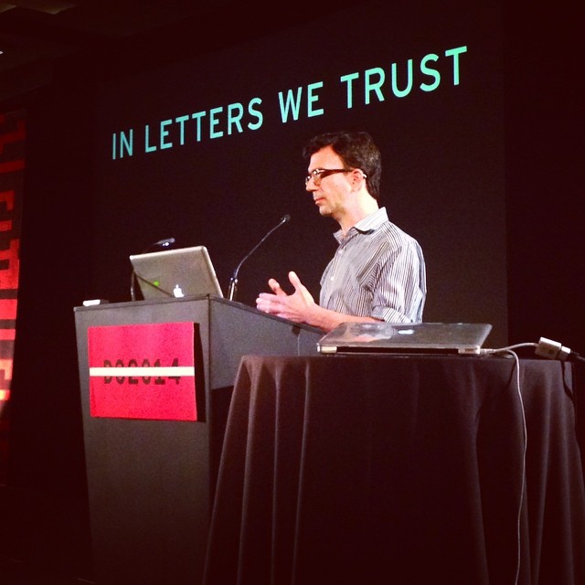](/images/2014/08/10570202_262734890586143_1722358510_n.jpg)In Letters We Trust, photo by [Helen Lysen](http://instagram.com/hcdarling)