Archive of posts with tag 'graphic-design'
Mar 2019: Why I'm Quitting Zazzle
In 2014, I signed up as an artist with Zazzle. Now, don’t get me wrong, I’ve never really put in a lot of elbow grease onto that site as I vastly prefer Redbubble and Society6.
One of Zazzle’s terms is that they won’t pay royalties if the amount’s under $50. New rule: if a company accepts orders for smaller than they will pay in royalties, they are looking to make bank off the artists, not their customers.
Mar 2016: Book Covers and Stock Photos
I’ve heard a few things lately about book covers and stock photos that have been bothering me. First, let’s go into a primer of how stock photos work with regard to book covers.
How Stock Photography Works from the Photographer’s Perspective
When a photographer takes photo sessions of a model (or a landscape), they add keywords to each photo they wish to sell. A given photographer may have relationships with as many as 15 or 20 different stock photo agencies, but not all photos may be uploaded to all agencies. Each agency has different audiences and different plans.
May 2015: Creative Market Raising Money for Nepal Earthquake Relief
I’m one of 474 Creative Market shops donating some or all of their shop proceeds for the Month of May to Nepal earthquake relief efforts. Creative Market will match shopowners up to $20,000. I’m donating 50%.
Here is the announcement and a list of participating shops:
Throughout the month of May, participating Creative Market shops will donate up to 100% of their earnings to Nepal disaster relief. And in partnership with the Autodesk Foundation, we’ll also match the first $20,000! These funds will be sent to All Hands, a non-profit organization that addresses the immediate and long-term needs of communities impacted by natural disasters. So purchase great design assets, and join us in our efforts to help Nepal.
Together, we can make a difference.
At this point, I only have one product in my shop grunge textures photographed off the front of an M60 Sherman tank. It sells for $7, my usual royalty is 70% ($4.90), so half of that ($2.45) will be going to All Hands for each sale.
If that’s not your thing, and you buy some other participating store’s products by starting at this link, you’ll help both Nepal relief and me.
Thank you!
(Note: I did previously post this on my desamo.graphics blog, but the way the two blogs propagate to third parties is different.)
May 2015: Like an Octopus
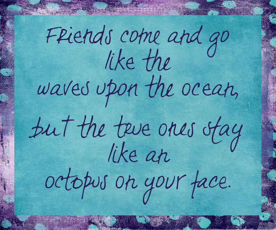
Someone on facebook mentioned wanting this in a plaque form, so I decided to get out the spiffy digital papers and have a go at it.
Design element credits
Polka dotted background: Uber Grunge 13 by Joyful Heart Designs
Solid inner: Solidified Seven by Joyful Heart Designs
Typeface: La Paz from TipoType
Jan 2015: Universal Blame Accepter T-Shirt
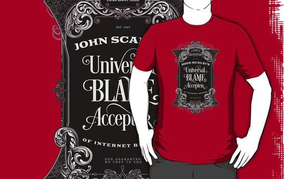
When someone edited John Scalzi’s Wikipedia article to include that he was a “universal blame accepter,” Scalzi tweeted:
To be clear, I TOTALLY OWN the “Universal Blame Accepter” title. Go on, blame me for anything! I can take it.
— John Scalzi (@scalzi) January 30, 2015
Now you can have your very own. IN ANY COLOR YOU WANT.
Except of course you want the RED SHIRT.
You know who to blame for that one.
Here’s the full art:

Buy this shirt at Redbubble.
Note: Redbubble uses American Apparel for their shirts. Available there in Unisex t-shirts, scoop neck, unisex tank tops, women’s t-shirt, v-neck, racerback tank, baseball 3/4 sleeve, long sleeve, organic t-shirt, organic women’s t-shirt, sweatshirt, pullover hoodie, and zipper hoodie.
Sneak Peak at Another Shirt
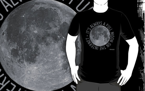
I’ve had this shirt done for a week, then came down with the flu before I could make all the ancillary art for other products. So, here’s the t-shirt.
It’s Always a Full Moon on the Internet at Redbubble.
Credits
For the Scalzi shirt (the other being a NASA photo and type only):
Fancy victorian frame from Cruzine Design.
I kept two of the typefaces Peter used in the frame design: the arched text is Goblin and the plainer text is Patua One. The swooshy type in the middle is Desire from Borges Lettering.
Jan 2015: Modern Hand-Made Value Fountain Pen with Dip Pen Nib
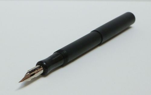
Desiderata Pens is a modern American maker of inexpensive fountain pens. Breaking tradition with other modern makers, instead of a traditional fountain pen nib, they use a dip pen nib. A Japanese dip pen nib.
Specifically, they use a Zebra G nib, often used for manga.
My Own Issues With Modern Steel Nibs
Generally I hate modern steel fountain pen nibs. Why? They tend to be super hard and scratchy. I’ve famously hated on the Lamy Safari, as I find its nib worse than most in this regard.
Yes, you can tune modern steel nibs to be less scratchy. (But why should I have to?)
They can even be tuned to be a tidge less hard, but not enough for me without some real expert work. At that point, you might as well have bought a better nib from the start.
There is, so far, only one modern steel fountain pen nib I like: Pelikan’s 200-series nib. I think it’s brilliant. It has some give and a tidge of line variation.
And Then There Are Dip Pen Nibs
Note: for dip pens, the pen is what fountain pen people call the nib, where the pen holder is what fountain pen people call the pen. Because a nib doesn’t provide the fountain part, the feed/ink reservoir does.
Famously, dip pen nibs have more line variation than all but the most prized vintage fountain pen nibs. However, they’re not intended to be used with any of the methods that fountain pens feed ink.
This is both an advantage: dip pens work well with inks that’d clog fountain pen feeds, e.g., India ink, white inks, and metallic inks.
It’s also a disadvantage: you’ve also got to work with an open bottle of ink.
I don’t know about you, but I do not lead an open bottle of ink kind of life. If you’ve ever seen my hands on the day I’ve refilled my fountain pens, you’d understand. I use Amodex Ink remover, but it’s not perfect. And neither am I.
If you do want to learn more about dip pen nibs, here’s a great post to start.
Now, granted: dip pen nibs tend to be scratchier than fountain pen nibs, and many are known for catching paper. When I’m writing with a fountain pen, I want the attention to be on the words in my head, not on the awareness of the nib’s interaction with the paper. Drawing, however, is different, so my standards are different.
What Desiderata Has Done
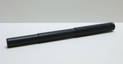
Desiderata’s figured out a way to put a dip pen nib onto a fountain pen feed, add a sac at the back, and make a fountain pen. Most of their pens run $100-120, but their matte black delrin pens run $50 plus shipping.
I haven’t spent a lot of time playing with my Desiderata pen yet, but so far, so good. I am trying to learn how to draw, and the line variation I get, even with the bog standard Visconti fountain pen ink I have lying around here in droves, well, it’s incredible.
Desiderata Has YouTube Videos
Here’s a very short one. You can hear the scratchy.
For dip pen people, this much longer video review may also be of interest.
The Big Wrapup
I’m trying to learn how to draw, so this seemed the perfect accessory for the analog portion of that endeavor. I can carry it around. It’s a dip pen, except it’s not.
Desiderata’s least expensive model is $50 plus shipping.
Sounds like a great deal to me.
Just want a dip pen for manga-like drawing? JetPens to the rescue. Don’t forget the brush pens. (JetPens has an amazing variety of pens and stationery, many of those items from Japan.)
Jan 2015: My New Creative Market Shop
I’m a huge fan of Creative Market. When I started to have items I wanted to sell, I applied for a shop there. I’ve been on a waiting list for a Creative Market shop for a really long time. Probably at least 8 months.
My first product is ready, too!
Last week, I got word that it was finally ready, which meant getting a ton of things done:
- Setting up e-commerce on desamo.graphics.
- Setting up a separate email list for desamo.graphics. Which I may have forgotten to complete. Ah well.
- Removing some of the suck from (you guessed it).
- Creating a header for my Creative Market site. (Shown below.)
- Fixing up a product that I’d thrown up on Gumroad a few months ago (and only two people looked at it, ever).
I’ve been working on everything I needed to do for several days, including re-tweaking the CSS on the site and re-generating all the image thumbnails until I was happy with them, and changing the site from the girly pink to a less girly mint—which has the added benefit of receding into the background, as cool colors are wont to do.
Here’s the facebook edition of my new shop header. Bibi is not my cat, but I’m glad that the virtual office mockup included a kitty. Mine would never pose like that!

It covers a bit of what I did last year:
- Poster (etc.) I did that’s on redbubble.
- Bora Bora photo from a year ago.
- One of my funny holiday cards.
- And a photo I sent out to my email list but haven’t otherwise shown publicly. Thank you to the 42.5% of you who saw it.
If you’re inclined to like facebook pages, here’s the link.
My Creative Market shop is here.
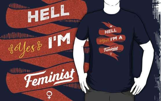
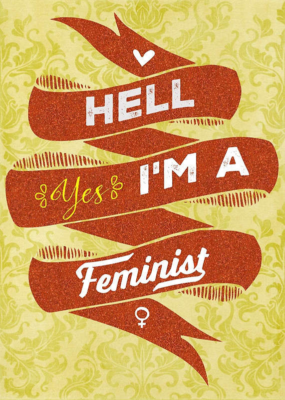
Dec 2014: New T-Shirt: Hell, Yes, I'm a Feminist
T-Shirts
Redbubble has American Apparel shirts. I totally get why some people won’t buy them, especially in this context, but Dov Charney’s out and the new CEO, Paula Schneider, is a woman. This doesn’t magically fix things, of course.
Zazzle has Hanes shirts (as well as other brands). Zazzle has more sizes, more types of shirts, and so on.
A Note on How the Glitter Prints
I thought I’d mention: this isn’t actually glitter, it’s a glitter-like effect. It prints as different hues, but is more subdued when printed on fiber. (I already knew the color would be, which is why I blew it out.)
I used that same effect when printing my purple 100 Countries pillow. Here’s a photograph:
Other Products
Redbubble also has prints and posters and cards and stickers and stuff.
And there are also man purses tote bags.
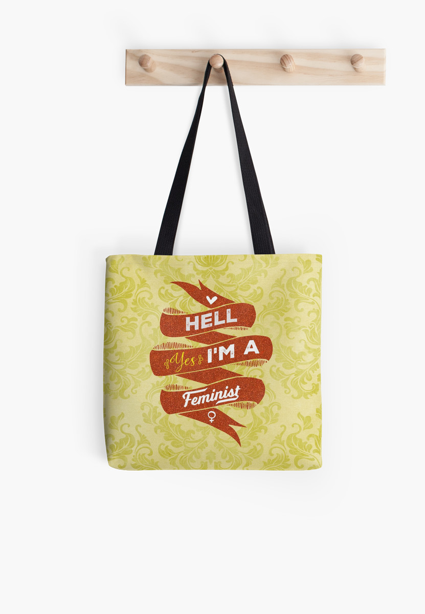
If you’d like some other format, let me know. Duvet cover, shower curtain, tech gadget covers, all possible.
Design Element Credits
Top to bottom:
- Heart: Out of a big pack o’ vector art from Callie Hegstrom over at Make Media, which I got several times over, including in a Design Cuts bundle. Here’s an interview with Callie.
- Background ribbon: from the same vector pack.
- “Hell” and “I’m A” are from the Nexa Rust type family, which was designed by four Bulgarian designers, Fontfabric, including Ani Petrova. Here’s a blurb about her.
- The flourishes around “Yes” are from Showcase, a type family from Chilean foundry Latinotype, and co-designed by Paula Nazal Selaive. I love this family. Here’s a profile of her.
- “Yes” is Nicky Laatz’s typeface, Stringfellows. She’s a South African designer.
- “Feminist” is Laura Worthington’s amazing Voltage typeface.
- Venus symbol is from Jolly Icons. I use their icons for my Twitter, Facebook, and email icons on my site. They’re a team of two, and Jucke’s female, but I don’t know if she drew this particular symbol.
- Glitter! Is from Nicky Laatz.
- (print only) Paper textures from Jennifer Howland at Joyful Heart Designs.
- (print only) Damask overlay from Designious.. They don’t credit individual designers for these, though. Also, not sure which of the many hundreds of damask patterns I have from them that I used….
Dec 2014: What to Do With a Rusty Dumpster

Note: this is a much simpler form of this tutorial from Spoongraphics.
The other night, a friend of mine and I were chatting, and she complimented something I’ve been working on (but haven’t yet posted). And I said, “ehh, it’s just a dumpster.”
She replied, “I would not have assumed dumpster.”
So, here’s my dumpster space scene mini-tutorial.
- Acquire a photo of a rusty dumpster. I used this one ($3), but many others are out there. Or—take your own! I used a blue (sea) + rust (land) combo, but there are many other combinations that work. Scratches, however, make it seem unrealistic (though you can mend those in Photoshop).
- Cut out a circular piece that you like the water/land shapes on. Spherize (in Photoshop: Filter > Distort > Spherize). Rotate it, if desired, to put the elements where you most like them. (I didn’t bother with this.)
- Create a black area the same size. Gaussian blur it with a big blur. Then blur it again. This is the most fiddly part, and you’ll need to fuss with it to make it look realistic.
- Expand the shadow region until it looks right.
- Add inner and outer glow to the planet so it has atmosphere.
- Find a good lens flare photo. I used one from Photography planet I had lying around and used it at 80% normal blend mode.
- A good background is black or near-black, and has stars. I happened to use one from here. You can use brushes to make star patterns, or use photos of sky or nebulae—whatever.
- I added a different layer above the lens flare, set it to lighten 70%, then filled in a few places (atmosphere, flare itself) with 50%, 70%, or 100% black to keep the stars from peeking through.
From there, the Spoon Graphics tutorial has lovely ideas on how to make the whole thing more realistic, including adding clouds and stuff.
Dec 2014: An Awesome Resource for Free Website Backgrounds
A few years ago, I came across an awesome resource for seamless patterns, far more professional than most I’d seen before. Best of all, these website backgrounds are free for both personal and commercial use!
These are free for both personal and commercial use, and someone asked about using them in products for sale and was told that was fine. So—knock yourselves out. I know I will. 🙂
The Webtreats site has some truly awesome resources. There’s a lot of broken image links, the search function is dodgy, and it can be frustrating figuring out what you want, but it’s almost certainly in there. Somewhere.
I don’t know how much they have posted, but I know that, over the years, I’ve downloaded 3.3 gigs of images. I’m trying to see what holes I have in my collection even as I write this.
The starry blog background for deirdre.net is from this set.
The almost-black wood background on Ryan Johnson’s fan site came from either the 270 or the 504 set I mention below. I have changed that one a couple of times, keeping within the same color range.
If you truly can’t decide, I’d suggest starting with two collections: 270 tileable backgrounds and 504 additional website backgrounds. These were designed to work with their Awake theme, but can be used with any website where you can change the background and/or control the CSS.
Not Sure You’ll Like It? Preview It!
First, remember that, like paint or wallpaper, the overall effect will be much more pronounced than it is in a small swatch.
Let me show you a trick.
Visit this page of smoky blue seamless patterns.
Click on the middle pattern.
You’ll be redirected to a page that shows that pattern used as the background for the page.

It won’t look the same as it would on your own site, but it will give you a sense of what the style looks like as a background.
Another Trick: Save Directly to Dropbox
If you have a Dropbox account (note: affiliate link), you can save the downloaded files to your Dropbox. The filenames end with:
.zip?dl=1
Cut off everything after .zip (the last five characters), and Dropbox will ask you if you want to save it. I find Dropbox’s mechanism for syncing with a dodgy network far more reliable than a browser download, so that’s what I would recommend if you have any problems.
Still Another Trick: Finding the Image’s Blog Post Again
So you’ve got these great backgrounds, right? And they’re all neatly in numbered folders. A friend asks you where you got it, but you can’t remember the link and God knows it can be hard to find something on a site with so much stuff.
Let’s take my space scene. Maybe your friend wants to check out some of the other color variations.
The file name is: 857-tileable-classic-nebula-space-patterns.zip
Take the numeric part in the front, and that’s the WordPress post number. So, http://webtreats.mysitemyway.com/?p=857 will get you to that package.
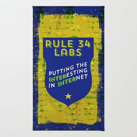
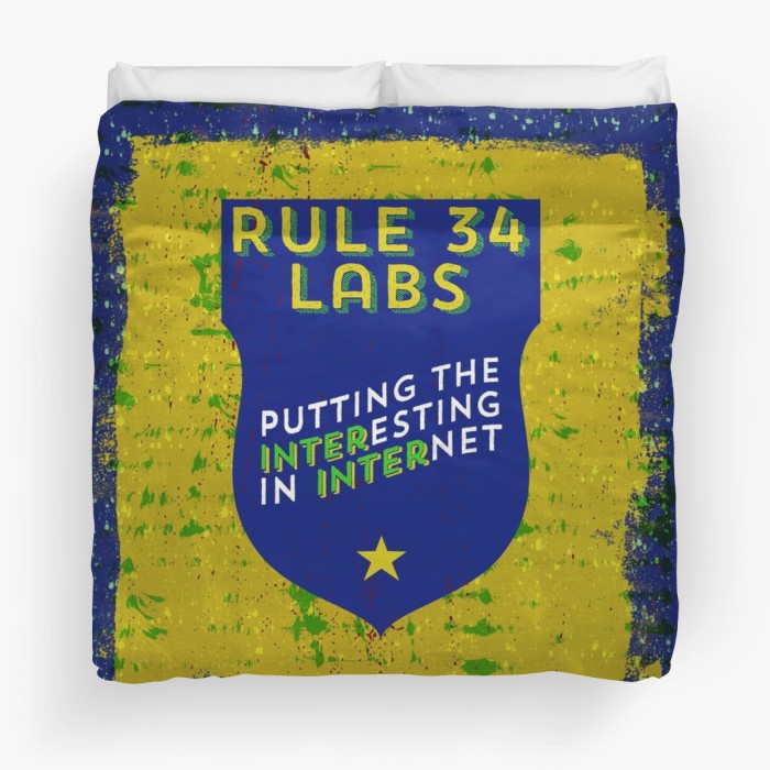
Dec 2014: Rule 34 Labs: Putting the Interesting in Internet
[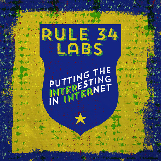](/images/2014/12/15954811_3065647_pm.jpg)
Rule 34: “If it exists, there is porn of it. No exceptions.”
I was making this sign for a book cover (where it’d appear on the wall as a framed print), then thought: why stop there?
Back when I worked at a backbone ISP, the first day HR training session was interesting.
“If you object to adult material, please do not walk through the art department. We make 2/3 of our revenue from adult content.”
Maybe you like the weird stuff. Maybe it just makes you hilariously happy that the weird stuff exists because then you’re something approaching normal. Maybe you just need a new shirt and randomly clicked on this page.
Whatever freak flag you fly (or, you know, don’t fly :wink:), Rule 34 is there for you.
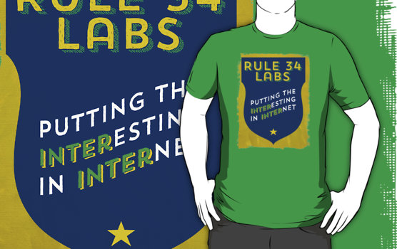
I have various products now available on Redbubble, Society6, and Zazzle.
In addition to the clothing options on all three of the above stores, the design’s also available in a bunch of other formats, including:
 |
Prints in various forms: Redbubble and Society6, including stickers, posters, art prints, and metal prints. Because metal. |
|---|---|
 |
Coffee mugs: Society6 |
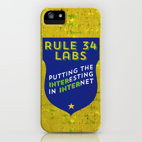 |
Tech Cases: Society6 |
 |
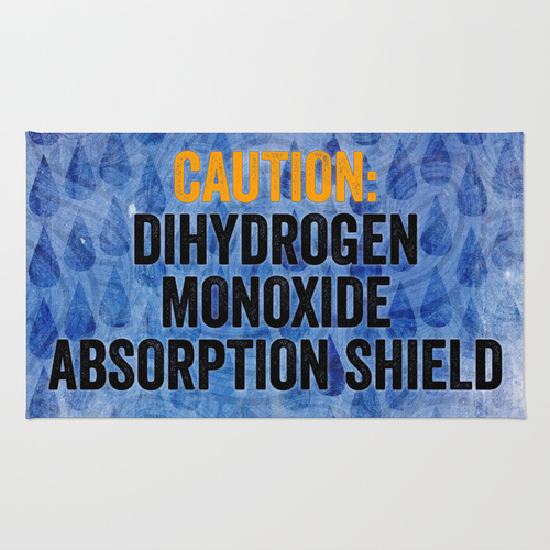
Rugs (for rug burn, obvs): Society6 |
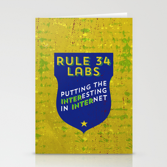 |
Greeting cards (for mailing your tribe): Society6 |
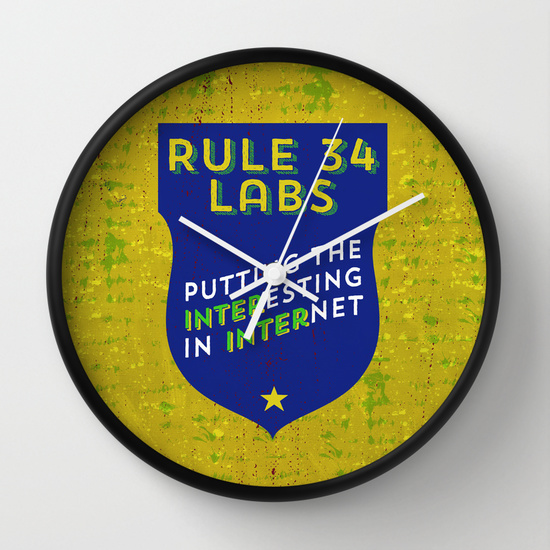 |
Clocks (for temporal fetishists): Society6 |
 |
Tote bags: Redbubble and Society6 |
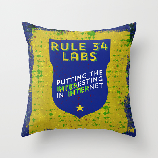 |
Pillows (save those knees!): Redbubble and Society6 |
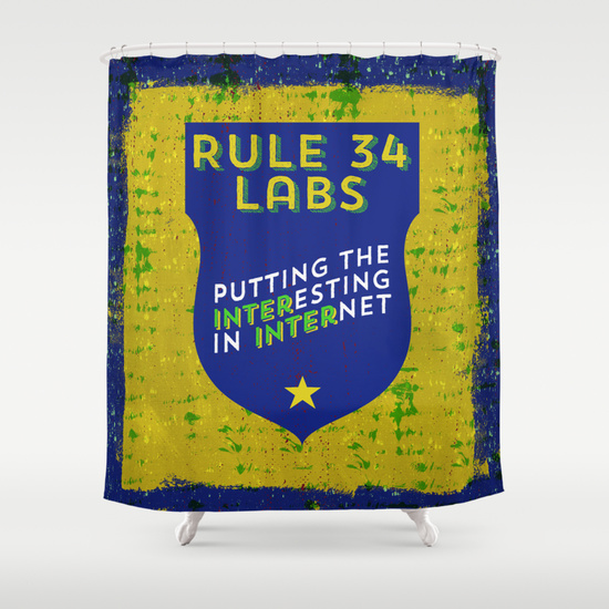 |
Shower curtains (no comment): Society6 |
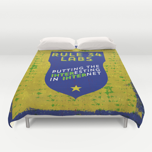 |
Duvet covers (because why wouldn’t you?): Redbubble and Society6. Redbubble has Twin, Queen, and King, while Society6 has Full, Queen, and King. Note: the Redbubble version requires almost twice the resolution source file, but I don’t know if it prints in higher resolution than the Society6 version. Usually, Society6 wants the higher-res file. |
King Duvet Cover (Redbubble):
Not enough?
Drop me a line and let me know. My email address is at the bottom of every deirdre.net page. (Hint: deirdre@)
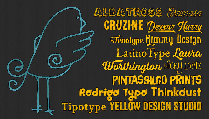
Nov 2014: My Favorite Indie Type Foundries
 I know you know I love type. And fonts.
Here are my favorite indie type foundries in alphabetical order. I seem to have a thing for Latin American foundries.
Albatross
Jay Hilgert’s an Oklahoma designer with some cool fonts like Altus and Boom! Featured up top is Oil Change.
Artimasa
Artimasa’s one of several Indonesian type foundries. Up above is Hipsteria, but I also love Zakia, Casually, and Prada.
Borges Lettering
If you’re going to start doing historical romance covers and want a great cover font, investing $99 (currently on sale for $89) in Borges Lettering’s Desire will go a long way. Sadly, I’ve not personally been able to justify it yet, but I do paw at the monitor every now and again while the page is open.
Cruzine
Peter, a designer from Bratislava, Slovakia does some great design, but he’s also done some great fonts. Up top is Brooklyn coffee. My personal favorite is Rocknroll, and when I look at Memento, I always think it’s an Indonesian design.
Dai Foldes
Dai’s font, Eubie Script, is fun and bouncy, and you really need to see the demo site for it. It has an amazing try me box (better than any other I’ve seen). Nicely done, and I’ve just picked it up. (Naturally, after I finished the header graphic.)
Dexsar Harry Fonts aka Majestype
One of the interesting Indonesian font designers, of whom there are several. Dexsar Harry has several lovely designs. Featured up top is Roverd. I haven’t yet picked up Bandung, but I’m looking forward to getting it soon.
Fenotype
Emil Bertell from Finland produces some lovely swashy faces like Alek (shown in the sample above).
Kimmy Design
Kimmy Design is based out of Santa Monica, California, about ten miles from where I’m typing this. (Away for the holiday weekend.) I have most of her fonts and some of her non-font graphics. I reuse this watercolor template frequently. Up top is Lunchbox Slab
Latinotype
Latinotype’s based in Chile and has lots of great fonts. Shown in the header image is Macarons. Up at the top of the page, my name’s in Courtney, and blog post headlines are in Four Seasons Pro. (So yeah, this entire site uses South American fonts.) I also use Showcase on desamo.graphics
Laura Worthington
I’m so pleased I got to meet Laura at Typecon. Awesome experience. I was tongue-tied and everything. I couldn’t remember the name of a single font when I was trying to tell her how many of hers I had.
One of the cool things about her fonts is that she has font families that are coordinating but dissimilar fonts, all designed to go together. Adorn, in particular, is a brilliant collection. Shown up top is Voltage, one of her newest.
Nicky Laatz
Nicky’s a designer from Cape Town, South Africa, who does awesome hand-drawn things including hand-drawn type. Here’s her shop. Shown in the pic above is Vanilla Frosting.
PintassilgoPrints
PintassilgoPrints is an amazing foundry from Brazil. If I had to describe their type collection, it’s of the type of fonts you’d expect to see on small label mid-century jazz covers. Some of their stuff draws from earlier (30s) and some later, but always with a fresh new twist.
The font I used above is called Brush Up, though I keep wanting to call it Olio because of one of the promo photos.
As a bonus, the bird is from a different font, Card-o-Mat Buddy Birds.
RodrigoTypo
Rodrigo Typo is from Chile and specializes in unusual and fun typefaes, especially display faces suitable for children’s work. Another aspect that may come in useful is that they always include Greek and Cyrillic letters, which is quite unusual for most indie foundries. Shown up top is Pequena.
Thinkdust
Thinkdust is based out of the UK and has made some pretty popular modern fonts. Shown is Nanami HM.
Tipotype
Tipotype’s the first type foundry in Montevideo, Uruguay. It produces, among other things, Quiroga, the typeface I use for the body face on this site. (Meaning: this paragraph is set in Quiroga as you read this if you didn’t override styles.)
Yellow Design Studio
Ryan Martinson’s Yellow Design Studio is the only foundry where I own all the fonts. I love them all. Shown is Veneer, one of my favorites.
Nov 2014: Make Your Own Story
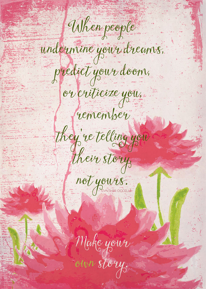
(Product link on Redbubble.)
I wrote this piece in July after a particularly frustrating week.
One of those pieces of writing advice came back up (like vomit) again this week, and I’ve been in more discussions than I’d ever hope to be about it. I’ve reduced it to two things that really annoy me.
Failing to Respect Other People’s Writing Processes
I wish I had an easy process. I’ve tried. It’s not some moral failure on my part that I can’t outline then write a book. It’s that the energy of the book fizzles when I do it that way, and then I can’t actually write anything interesting.
Your process is your process. You can fuss with it a bit, but not that much. I still think Karen Joy Fowler is absolutely correct.
Dumping One’s Frustration with the Business of Writing on Others
All that advice about what’s “easier” or “harder” to sell onto people? (Anything can sell if it’s done well enough. Sometimes even if it’s not.)
Telling people that won’t sell? (Is that useful in this day and age?)
Telling someone their story is fatally flawed? (All story structures have flaws.)
Anyone who’s been around the block more than a few times will have had some hard knocks along the way. They hurt, and they shape the directions we turn, because we turn to avoid the pain. Sometimes, like I did for years, we just stand frozen in place, paralyzed.
The Responsibility of Teachers
It’s the responsibility of teachers not to stomp all over fragile creative processes or invalidate them.
It’s also the responsibility of teachers to not dump so much of one’s own pain about creative endeavors that one quashes a fledgling voice.
And Now for a Word from Lady Gaga
Song starts 2:30 in.
Oct 2014: My New Greeting Card Line
Unique, distinctive, and humorous greeting cards sure to please. Now available from my Redbubble store. I’ve had greeting card products available for a while, but now I’ve got some items that are only available in greeting cards, including a few holiday cards.
I Am Not a Turkey
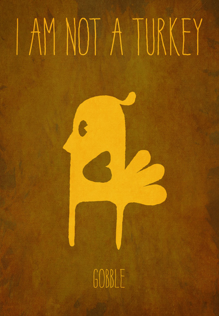
Whimsical fall holiday card. (link)
Tree? What Tree?
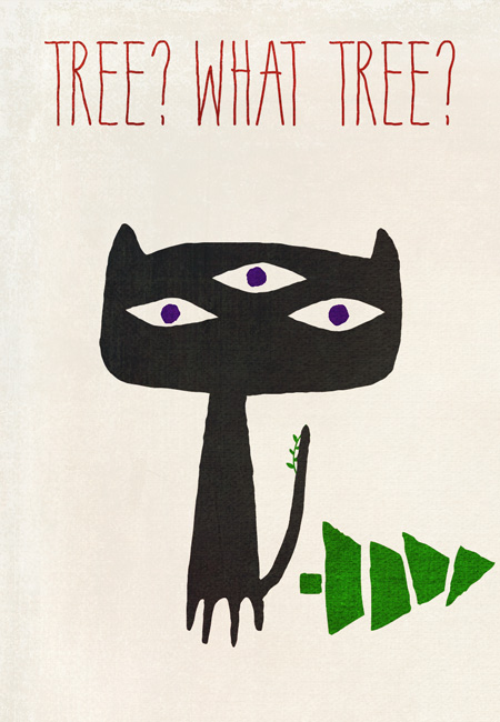
Whimsical Christmas or Yule card. Even alien cats get into trouble with trees. (link)
May Your New Year Be Cage Free
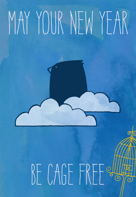
Happy New Year! May it be a good one. (link)
Honestly? I think that one’s my favorite.
Missed a Present? I’ve Got You Covered
This one’s in both a Christmas-y variant and a more generic variant.
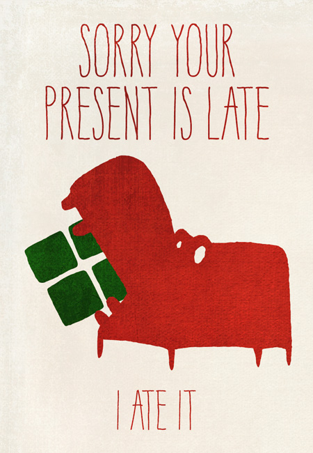
Link for the Christmas-y card.
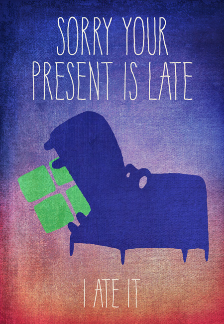
Link for the generic card.
Congratulations on the New Addition
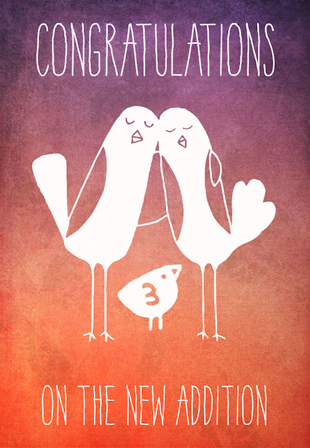
Great card for a family with a new baby. Works for a boy or a girl, and the birds aren’t gender specific. (link)
Designed for my favorite actor and his wife and their new baby.
More Cards
I have some great back catalog too! Click images to view the card. Most of these also have other products if you’re interested.
Free Speech Is Best Served #notchilled
This is of limited interest, and the poster’s not actually this big, but the mockup looks awesome so grant me some artistic license here.
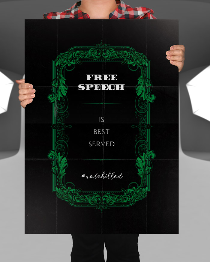
Credits
Believe it or not, the new card graphic elements are (except for the tree bits) all fonts.
- York Handwriting by Thinkdust.
- Monstrinhos by Pinstassilgo Prints.
- Card-o-Mat Buddy Birds, also by Pintassilgo Prints.
Oct 2014: Happy Halloween! With Treats!
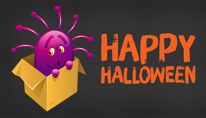
Happy Halloween!
As a kid, my favorite holiday. Still my favorite.
Last Day on Cat Grant’s GoFundMe to Get Her Ellora’s Cave Rights Back
I had the awesome privilege of meeting Cat Grant in person last weekend when I was in her area. We talked for several hours! She’s trying to buy the rights back to her three books still with EC. GoFundMe link.
All Treats for Design Cuts’ Birthday
I’ve spoken about my great love of Design Cuts ever since I discovered them earlier this year. They are re-running twenty-two of their prior deals.
The font used in the image above is Brush Up from Pintassilgo Prints, and is from the Monster Creative Font Bundle.
If I had to pick three of the above….
- The All Inclusive Design Bundle.
- Monster Creative Font Bundle. or any font bundle.
- Any 2 Lil Owls bundle.
This will be running for another week and a half in case you are just overwhelmed with choice. Hell, I was, and I already had 14 of the bundles being re-run. I now, uh, have 17 of them.
A Plug for DealJumbo
Peter of Cruzine Design also runs DealJumbo.com, where he pulls together a lot of great deals, often from Creative Market shops.
Cruzine has some really complicated vintage-style logos and frames that I can’t ever see myself using but want to hoarde all the same. Here’s one of the freebies where you can see what I mean.
The deals DealJumbo runs, though, are far broader in appeal. The “5in1” deals are from five different designers, which is a great concept.
Here are a few active deals I’ve bought:
- Only Best Sellers Mega Bundle vol. 3
This is so awesome, I don’t even know where to begin. - 5in1 Mega Bundle v.6
Frankly, the last thing I need is more logos, badges, and the like. I have tons, but none of them are as interesting as this set. Check out the secret society badges! - Decorative Vendor Bundle
I love the mid-century stuff in particular.
The monster in the box up top came from one of DealJumbo’s freebies, but it appears to be one only available to mailing list subscribers.
But, But, I Don’t Know How to Do Design Stuff
Another treat!
Look, I get it. I was a Photoshop idiot for years even after taking a couple of classes. These days, I consider myself intermediate in Photoshop skill.
Dustin Lee at Retro Supply started making amazing videos to show off how to use his products. Then he started adding extra videos when you bought his stuff, and they were useful enough that, well, hell with whether or not I need/want the product, I wanna see the videos!
He’s just opened Retro Academy which will feature tutorial videos.
And Now for Something Really Scary: Scientology
Last year, the EEOC sued Dynamic Medical Services for Religious Discrimination.
According to the EEOC’s suit, the company required Norma Rodriguez, Maykel Ruz, Rommy Sanchez, Yanileydis Capote and other employees to spend at least half their work days in courses that involved Scientology religious practices, such as screaming at ashtrays or staring at someone for eight hours without moving. The company also instructed employees to attend courses at the Church of Scientology. Additionally, the company required Sanchez to undergo an “audit” by connecting herself to an “E-meter,” which Scientologists believe is a religious artifact, and required her to undergo “purification” treatment at the Church of Scientology. According to the EEOC’s suit, employees repeatedly asked not to attend the courses but were told it was a requirement of the job. In the cases of Rodriguez and Sanchez, when they refused to participate in Scientology religious practices and/or did not conform to Scientology religious beliefs, they were terminated.
It was later settled for $170,000.
I saw this a lot from the Scientology side of the fence when I was on staff (except for the terminations).
For many years, Scientology’s big clients have been chiropractors, dentists, and related non-mainstream medical practices. There are Scientology-based consulting practices, such as Sterling Management Systems, whose entire goal it is to get everyone in an office “trained” in “Scientology tech.” And audited. And Clear.
Whether they want to be or not.
Most weeks, it was more than half the income of the local Scientology church I worked at.
At the time, I thought it was great. Now, of course, I want to wash all the ick off my psyche.
Oct 2014: My Twitter Halloween Outfit
Seasonal and timely. As usual, my holiday profile name is Dire Red Omen.
Update: I calmed this down because it was driving me crazy.
![]()
And the older versions….
v 1.0
![]()
v 2.0
![]()
v 3.0
![]()
Aug 2014: Optical Illusion Problems and Font Design Solutions
This post, clickbaitingly called Know If a Font Sucks actually has some fascinating tidbits about compensating for our eyes tricking us.
Hat tip to Janet Jia-Ee Chui.
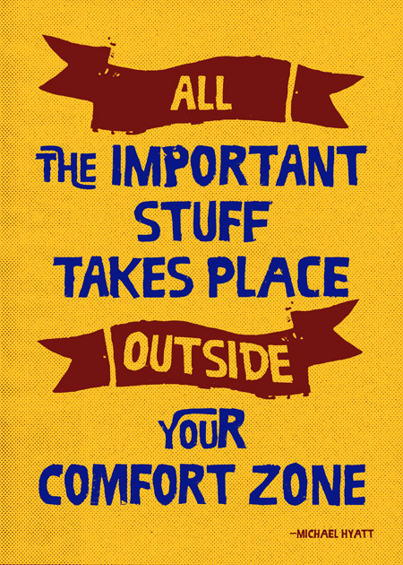
Aug 2014: All the Important Stuff
One of the valuable things to learn when you go outside your comfort zone, that it’s going to be okay.
Probably.
When I was at the World Domination Summit in Portland recently, speaker Michael Hyatt said this during his talk. It was one of the things he said that I found most profound.
Since then, at difficult moments, I’ve been able to give myself strength by repeating this.
Hope it helps you.
Available from Redbubble in: t-shirts, tanks, sweatshirts, hoodies, phone and iPad cases, prints, stickers, cards, throw pillows, and tote bags.
A version without the background is available on Redbubble for: t-shirts, tanks, sweatshirts, hoodies, and other clothing items.
Available from Society6 in: t-shirts, tanks, onesies, hoodies, iPhone and iPod cases, coffee mugs, laptop and iPad skins, shower curtains, and duvet covers.
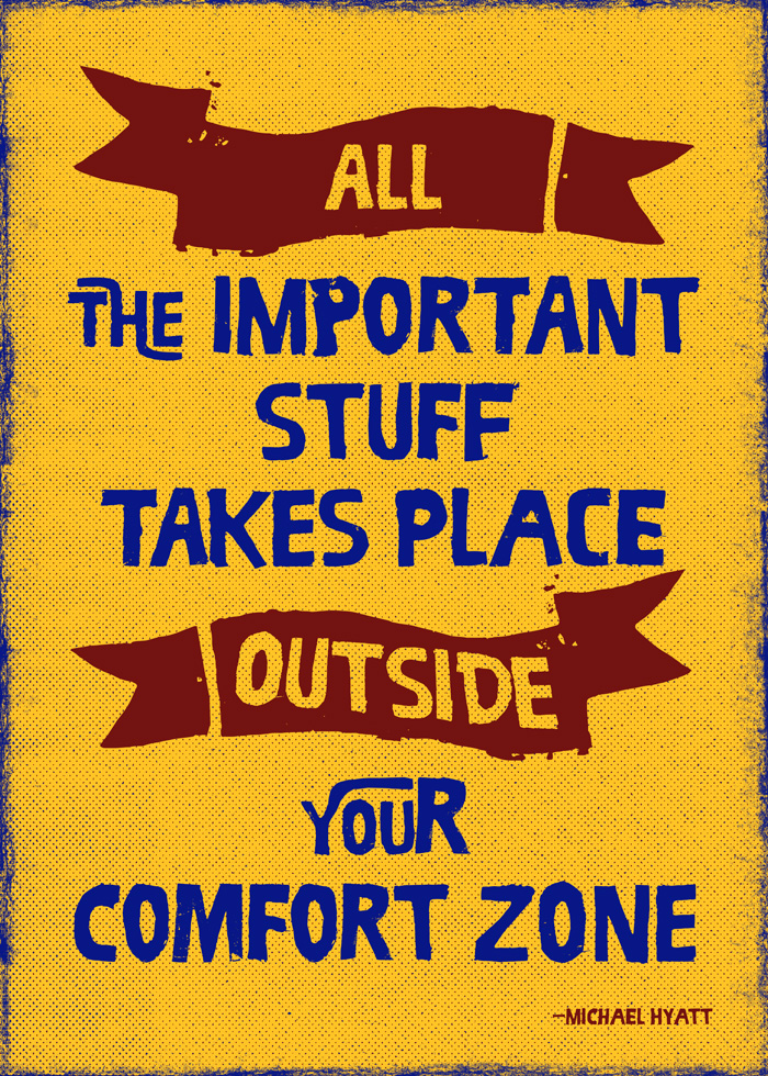
Credits
Thanks to Michael Hyatt for permission to use the quote.
The font is Ruba from RodrigoTypo. (Yes, purchased as a part of a Design Cuts deal.)
The halftone textures are from Rob Brink, purchased as a part of an (expired) My Design Deals bundle. The border edge (not on all products) is from Dustin Lee of Retro Supply. It’s from the Standard Issue Texture Brushes package, though I didn’t use them in a subtle manner. (Deliberately.) If you’re interested in weathered or aged effects, this is worth it just for the video that comes as a part of the package.
Aug 2014: Branding Done Right
I have to admit I’m not usually a huge fan of branding campaigns, but Typecon 2014’s branding, designed by Build really knocked it out of the park.
The conference theme was “Redacted,” and the name was “Capitolized,” both homages to the conference’s Washington D.C. location. The theme also included double-speak and information combined with (justifiable) paranoia.
Welcome to the City of Magnificent Intentions
Typecon Bureau of Dining, Imbibing, Navigating, and Inconspicuous Tourist Operations
Behold the Video Monitors
Here’s a link to the video one saw going down the escalators to the conference. (Note: Seizure disorder warning.)
All Neatly Leading into the Keynote
Tobias Frere-Jones speaks on the topic of In Letters We Trust. It was a fascinating talk I’ll write about in an upcoming post.
Aug 2014: Bad Book Covers: Comic Exaggeration
For Westercon, I made a Lousy Book Cover for comedic effect. After all, I had to have one to show at the panel, right?
So I picked a great photo. I picked a great typeface.
And deliberately made a grievous error.
Behold.
Courtney Milan Talks Type
I bring this up because Courtney Milan’s got a great blog post called How to Suck at Typography. Ironically, I missed it because I was at Typecon.
First, I absolutely love the Borges font she discusses. It’s called Desire. It is truly one of the showcase pieces of what can be done with OpenType.
What she says about free fonts is largely true, but there are some good ones out there. The one I used was Great Vibes, which is the free cousin to Good Vibrations. I mention this for a reason: sometimes there’s significantly better typographic features on the paid version of a font. And sometimes it’s the bad fonts that get thrown to the free bin. (Or packaged up by the hundred for seemingly low prices.)
Personally, I’d like less space between Te so it feels more like Ju. Similarly, I’d like a tidge more space between Da so it feels more like Ju. Given that the paid font seems the same at first glance, evidently the font designer disagrees with me on that point.
There Is One Point of Violent Disagreement, However
Font effects are the opposite of tasteful covers. They are harder to read at best, and migraine-inducing at worst. The worst fug in the world comes from font effects.
I’ll half agree with the last. Granted, she’s talking from a historical romance perspective.
I’ve been working on a poster off and on for a month. I just couldn’t get the right approach to say what I wanted to, so I put it away and get back to it.
Yellow Design Studio is one of my favorite indie font foundries. I love love love love love their font family Gist, which is really Gist and Gist Upright, Gist Rough and Gist Rough Upright, and GistX.
One of the things Gist has is the line version of the font along with the regular—so you can separately style/color. Let’s say you’re making a poster, in navy, for an upcoming nautical clothing line. Put the text in white, and make the line red (or green, as that’s another combo used for nautical clothing). Perfecto.
In this case, I’ve been fussing with this poster, and, once I decided on Gist, I started randomly clicking layer styles for the line until I got this:
I love it. I love how the beveling turns the corner between the u and the s.
The catch is, it’s applied on a relatively small part of the type. It’s the mint leaf served in your chocolate dessert.
Drop Shadows and Outer Glows
There is one reason to use these two features: to separate the type from the background. I used an outer glow in my sample bad cover. It’s subtle enough that if you don’t know what to look for, you’d miss it.
As a general rule, that’s how it should be. The secret is to reduce the opacity of the effect. I often reduce it from the default 75% down to 25-35%. Also, increase the radius of the effect from a few pixels to 20 or 30.
Coming Back Around
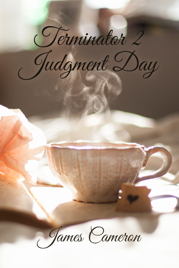
Getting back to the original picture, there’s one aspect that Courtney doesn’t talk about: appropriateness of the type for the project. It’s not just whether it’s a good font. It’s not whether the layer style, kerning, etc., works—there’s a bigger thing going on.
Is the font, the most appropriate (within reason) font you can use? I say within reason because I love Skolar, but it’s going to be a very long time before I’ll be able to afford it.
I recently heard a cover designer say that if the book got the person to read the blurb, the cover had done its job.
I agree in part and disagree in part. When they get to the blurb, they have a mindset in place that may lead them to interpret the blurb fundamentally differently than the blurb was intended.
Your cover needs to give the reader the feel for the book. Typography’s a huge part of that. As an example, a friend wrote a historical fantasy. Someone did a cover for her, but the fonts were all super-modern, so they’d lead someone to expect a really different book. For that reason, she went with a different cover entirely. Good call.
Remember that saying I found so profound? “A one-star review means the wrong reader has found your book.”
The purpose of a cover is to find your book’s five star readers and turn away the one-star readers.
The main problem with the cover I’ve given for Terminator 2? It would find mostly one-star readers. They’d be wanting something nice and cozy with tea and biscuits, and get something else entirely.
Find your five-star readers.
Aug 2014: Change the World, Have a Good Time
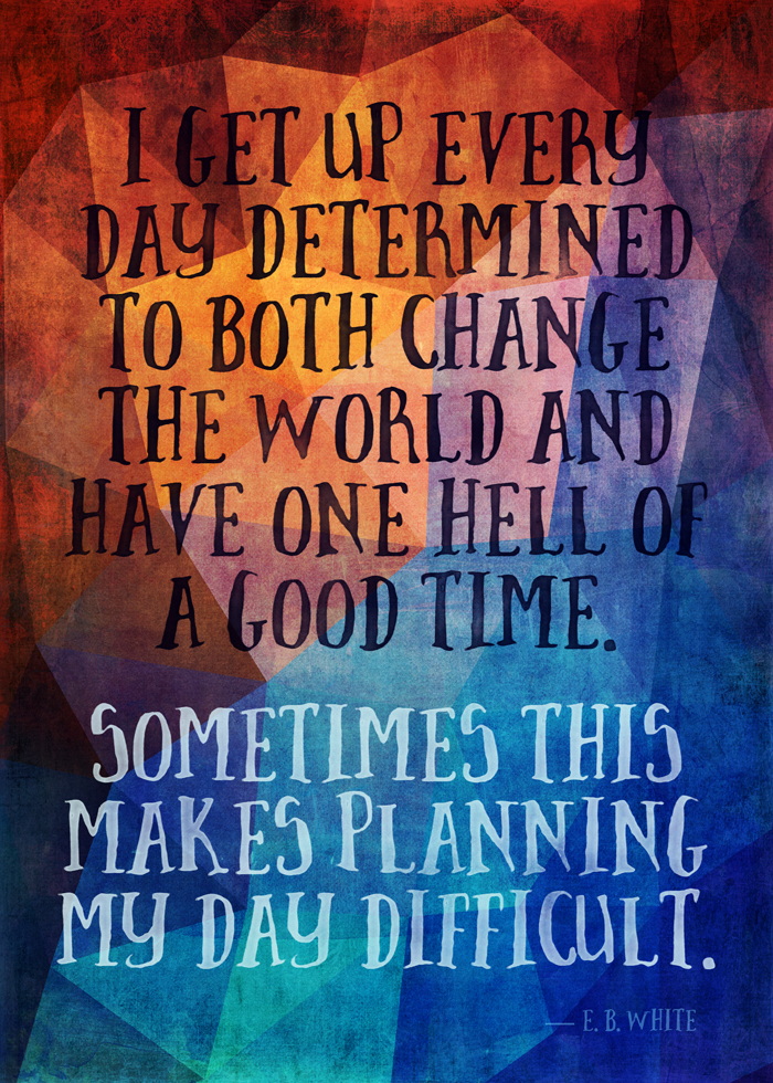
Now available on Redbubble: prints, posters, t-shirts, pillows, totes, phone cases, iPad cases, and greeting cards.
I love this E.B. White quotation.
I get up every day determined to both change the world and have one hell of a good time.
Sometimes this makes planning my day difficult.
Design element credits
Polygon background: Justin Thanks, Justin!
Pattern overlay layers: two from 2 Lil Owls (from a Design Cuts bundle) plus 2 from Joyful Heart Designs.
Font: Brave from Nicky Laatz. Post-processed with Ian Barnard’s Inkwell.
Jul 2014: Mockup: 307 Ale Bottles
I found this beer bottle mockup last night, and thought I’d have fun with it.
Catch is, this particular product would probably be better vended in something stranger—like a Klein bottle. Oh well.
Click for full size:
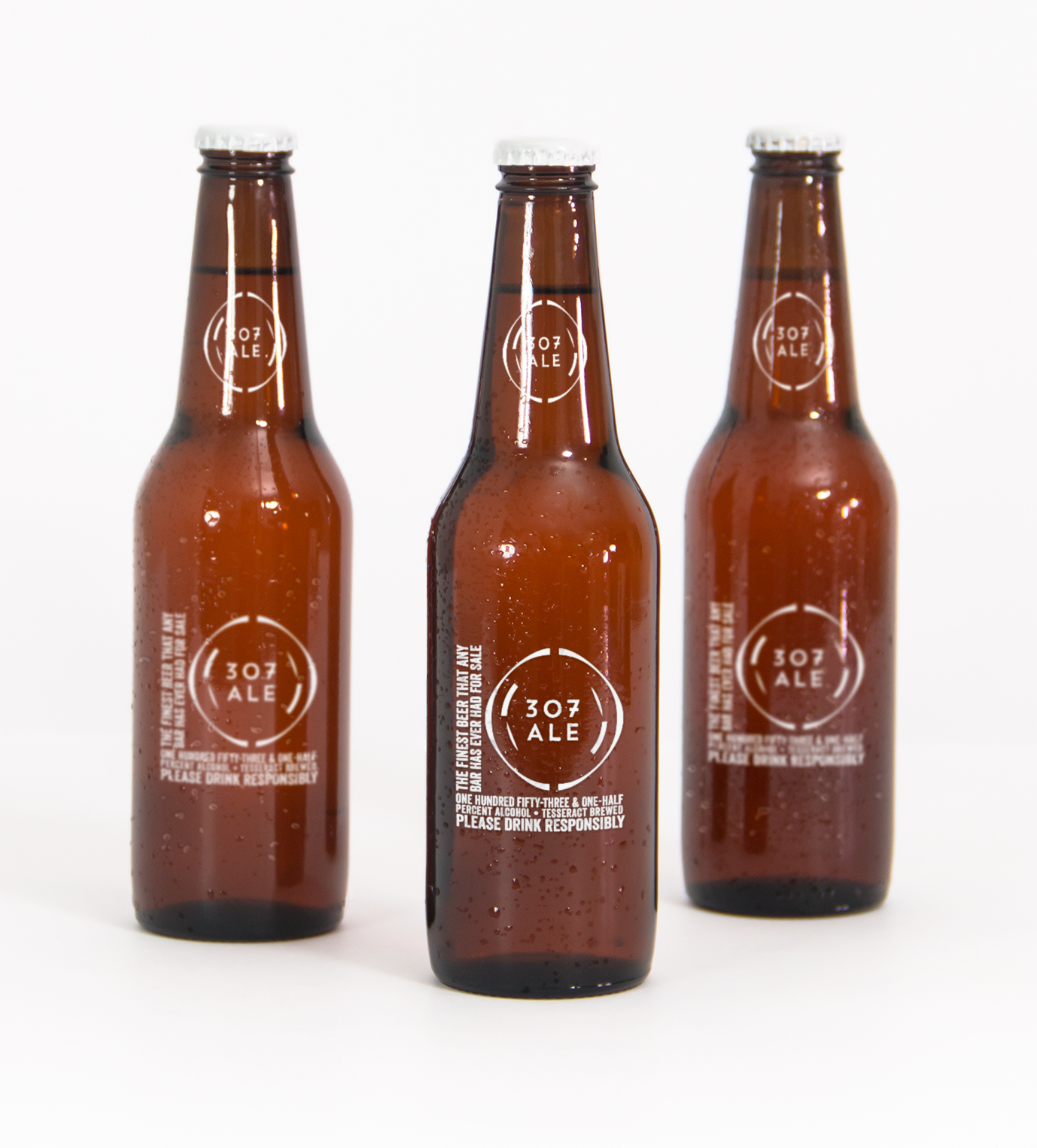
It’s an homage to a Tom Smith song of the same title:
There’s many drinks you’ll drink, me lads, but this one beats them all.
One hundred fifty-three and one-half percent alcohol,
A beer brewed in a tesseract, it’ll shoot you through the roof,
And if you don’t believe me, I’ve got lots and lots of proof.
Graphic Element Credits
Font: Veneer by Yellow Design Studio I love this font, use it all the time.
Logo font: Trend Handmade by LatinoType
(Both of the above via Design Cuts, as usual.)
Beer Mockup: Original Mockups
Logo: 12 Sci-Fi Badges from VoxelFlux
Jul 2014: Birthday Reflections: Favorites from the Last Year
I thought I’d go over some of the things I’ve discovered or loved in the last year, in no particular order.
- Johnny B. Truant’s essay, The universe doesn’t give a flying fuck about you. It’s an interesting head trip: by making everything you could possibly do look small, it help reduces fear for the consequences of what you do. Interesting NLP technique there.
If you want to be awesome in this life, do awesome things.
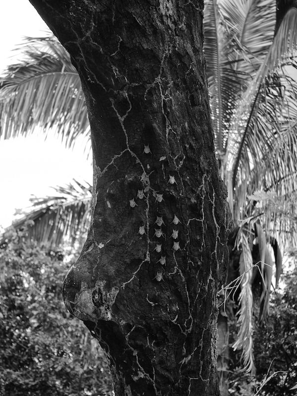
- Bats hangin’ out on a tree.
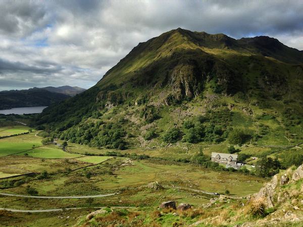
- Milford. Northern Wales and an amazing workshop.
- My whirlwind round-the-world tour featuring a visit with friends in New Zealand, more friends in Australia, even more friends in South Africa, and a play with an actor I like in London.
- Overwerk. Especially when used in the Air Tahiti Nui video.
- Tim Grahl and his tips on book and author marketing.
- Tiffany Reisz. Bookalicious Pam listed The Siren as one of her favorite novels of the past year. On her recommendation, I inhaled the first four books between Christmas and New Year’s. I think her new book, The Saint, is even better.
- James Mickens’s “The Slow Winter” is one of the few short stories ever where Rick and I have quoted random lines to each other. Most frequently, “This does not lead to rising property values in Tokyo!”
- Hard-hat behind-the-scenes tour of the newly-opened part of SFO’s Terminal 3. That was pretty sweet, especially the ability to go onto the roof and watch the planes land.
- The number of people who search my site for the mongoose joke. (two today!)
- All the fun I’ve been having with Society6, Redbubble, and Zazzle. Thanks, everyone.
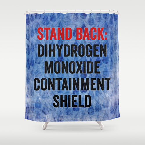
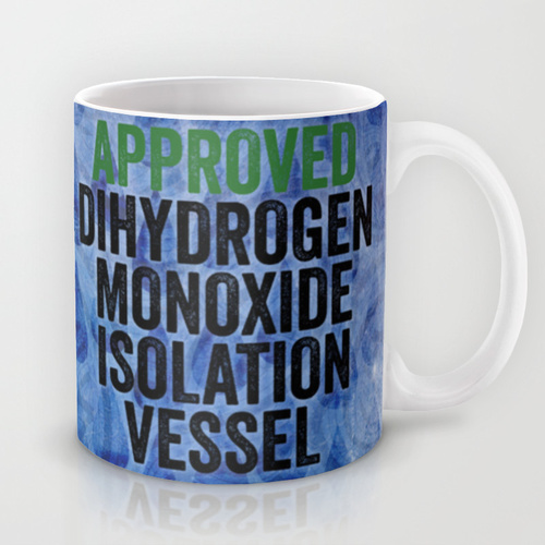
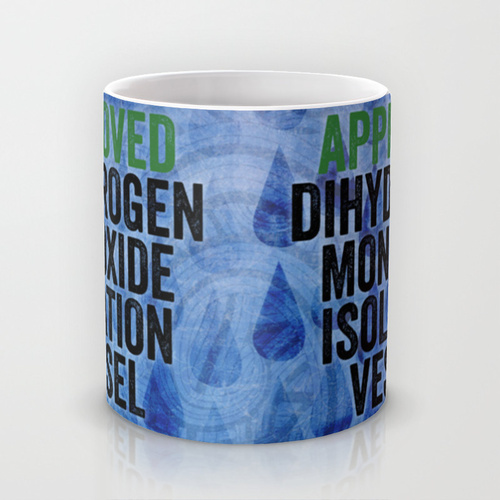
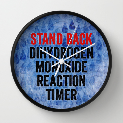
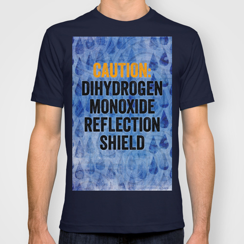
Here’s a Dihydrogen Monoxide Containment Shield shower curtain.
And, you know, related stuff….. (same link set as above)

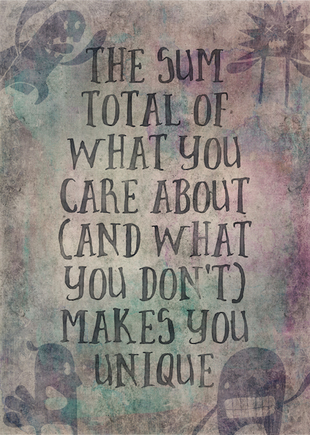
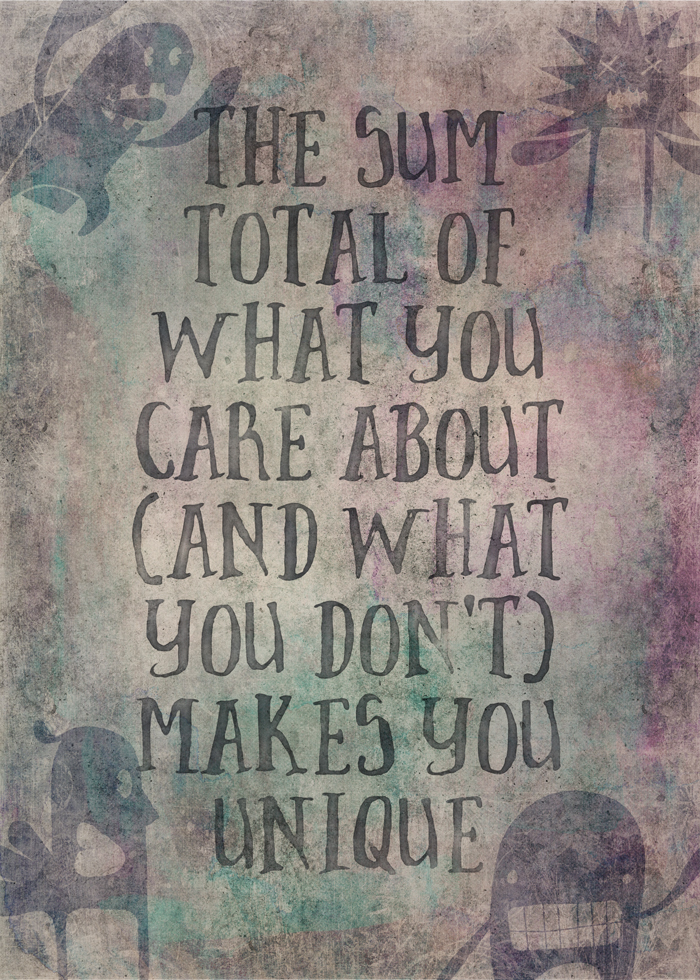
Jul 2014: The Sum Total
This is a saying of mine. I remember talking to a woman who wanted to go into technology, but felt she had little to offer because there were people with more expertise already. This is what I said to her. I hope it helped.
Credits
Main font: Brave by Nicky Laatz, purchased as part of the current Design Cuts font bundle. I also used the stone texture from the bonuses.
Monster font: Monstrinhos by Pintassilgo Prints, also in the same Design Cuts font bundle.
Background textures: Effervescent 16 and 17, by 2 Lil Owls from a previous Design Cuts bundle.
Ubergrunge background texture from Joyful Heart Designs.
Brave font was post-processed with Ian Barnard’s Inkwell.
Jul 2014: [Society6] Bora Bora Overwater Bungalow

Now on Society6, products including:
- Prints
- T-shirts (including v-neck), Tank Tops (including biker tanks), and Hoodies
- Clocks
- Rugs
- Shower Curtains
- Stationery Cards
- Phone, Tablet, and Laptop Covers and Skins
- Tote Bags
- Throw Pillows
Jun 2014: [Redbubble] You Know What to Do
Now available in t-shirts, posters, prints, cards, and stickers from Redbubble.
This is one of those pieces where I sat on it overnight and took an entirely new approach when I did.
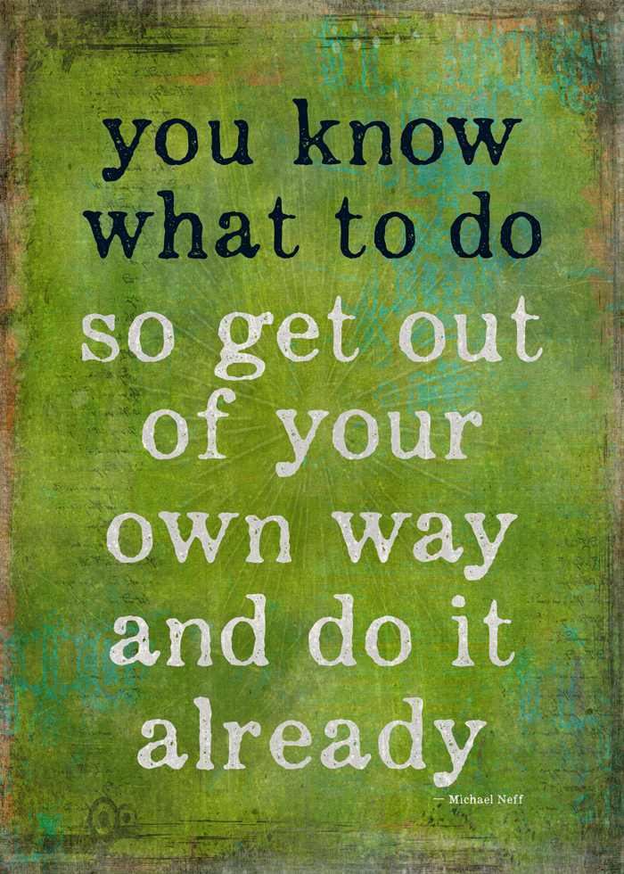
100% detail:

Pretty much everything remained the same except the background, but that’s so dramatically different now.
Credits
The background itself is a freebie this week on Creative Market from Joyful Heart Designs.
The font is Appareo from Kimmy Designs, also a Creative Market regular, but I picked it up from a Design Cuts bundle a few weeks ago.
The sunburst, well, I have a lot of them. This particular one is from Thunder Pixels.
There are also brushes in there from another Design Cuts bundle, but I can’t point to them, because they are pretty darn subtle.
What’s less subtle, though, is the effect of Matt Borchert’s Distress Texture Pack, the concrete-like overlay over everything, including the text.
The most important part: thanks to Michael Neff for the verbal kick in the ass.
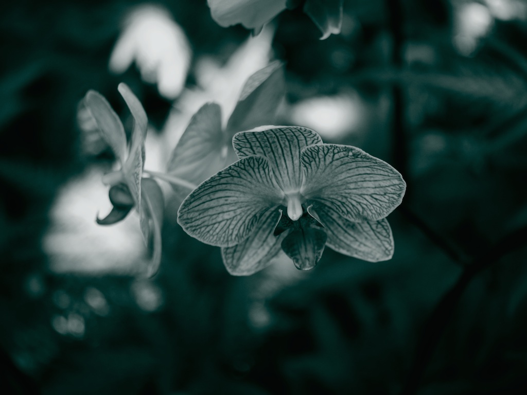
Jun 2014: [Society6] Hawaiian Orchid
This is a photo I took in 2010 when I was on the big island of Hawai’i.
Available now from Society6 in prints, cards, pillows, shower curtains, coffee mugs, tote bags, clocks, rugs, and laptop, phone, and iPad skins and cases.
Note that while the coffee cup is available, the flower’s center is opposite the handle.
Jun 2014: Font Monsters: Squee with Me
I know you know me now. I’m mad crazy for fonts. I’ve largely suffered this in silence.
I can be silent no more.
I know I’ve mentioned Design Cuts before and their current font bundle tickles me in a way no other font offering ever has.
I know I talk about them a lot, but honestly their offerings are a) full of more taste than anyone else’s, and b) a great value. Oh, and c) a lot of fun.
This particular bundle has 14 fonts. I already owned one of them, Eveleth, which I’ve talked about before on my graphics blog.

Only now there’s extras, too.
But of the 14, I actually squeed at one of the font variants of Monstros.
Because monsters.
Squee with me, people!
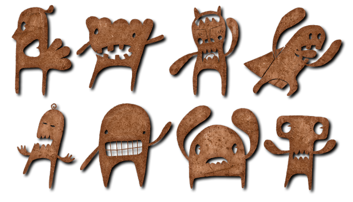
Aren’t they just adorable?
Because they’re fonts, you can use all the font tricks like rendering them with patterns and shadows and stuff.
As for the rest of the fonts included, half of them were on my wish list already. The other half I hadn’t found yet.
I’ll Tell You A Secret
Design Cuts runs one deal for two weeks. Sometimes, they rerun a prior deal too.
Here’s the one they’re rerunning now.
I just did a project with DIY recently, and also did part of the Do the Right Thing piece with it.
I love Brush Up.
I used Amorie for Tool of the Matriarchy.
I use Showcase Script for the headline font on desamo.graphics.
I used Thirsty Rough for part of this poster I designed.
It’s not like I do this all day, every day, but I still find these fonts (okay, typefaces) are amazingly useful and fun.
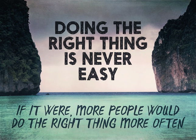
Jun 2014: [Design] Doing the Right Thing
I was talking to Bri the other night, grumbling about why people don’t do the right thing when they should, and out of her mouth came these words.
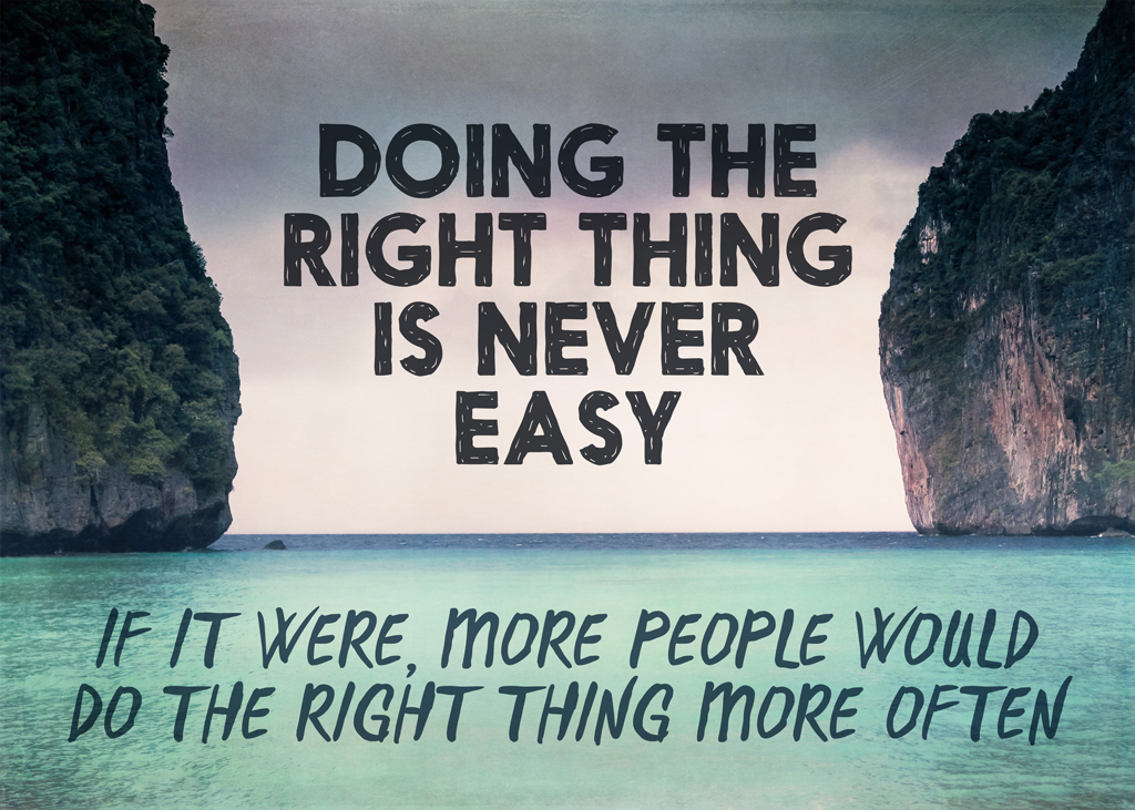
T-Shirt Mockups
Note: trust Redbubble for truer colors, as these are mockups.
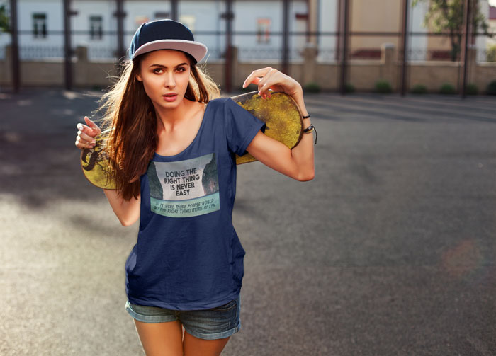
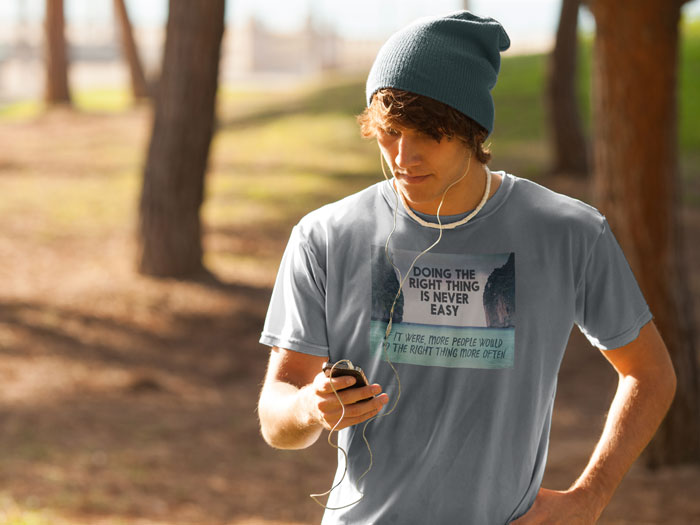
Purchase on Redbubble in shirts, prints, posters, stickers, greeting cards and postcards, and probably a few things I’ve forgotten.
Credits
- Photo: Monika Majkowska
- Top font: Nanami from Thinkdust
- Bottom font: D.I.Y. Time from Latino Type from Design Cuts’ Monster Creative Font Bundle
- Overlay textures (Effervescent 2 and Faded Crinkle 3) from the 2 Lil Owls bundle at Design Cuts. When I first saw one of these collections, I thought they couldn’t possibly be that useful, right? I was so wrong.
The original photo was all gloom at the top, but the 2 Lil Owls textures softened the gloomy part and gave more interest to the light grey sky.
Other Artists
I just picked up this shirt design from Mark Greyland. This looks best on a dark shirt because they’re underprinted with white, which isn’t true on the light shirts, so the colors are more saturated. I ordered an American Apparel shirt in turquoise, but other colors work really well too. Just remember that you and the space kitty will be wearing the same color shirt. Use code SUMMERSAVING for 15% off through tomorrow.
…which also applies to my designs on Zazzle.
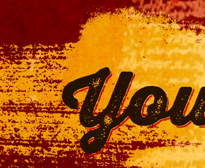
Jun 2014: New Design: Your Book Needs You to Finish It
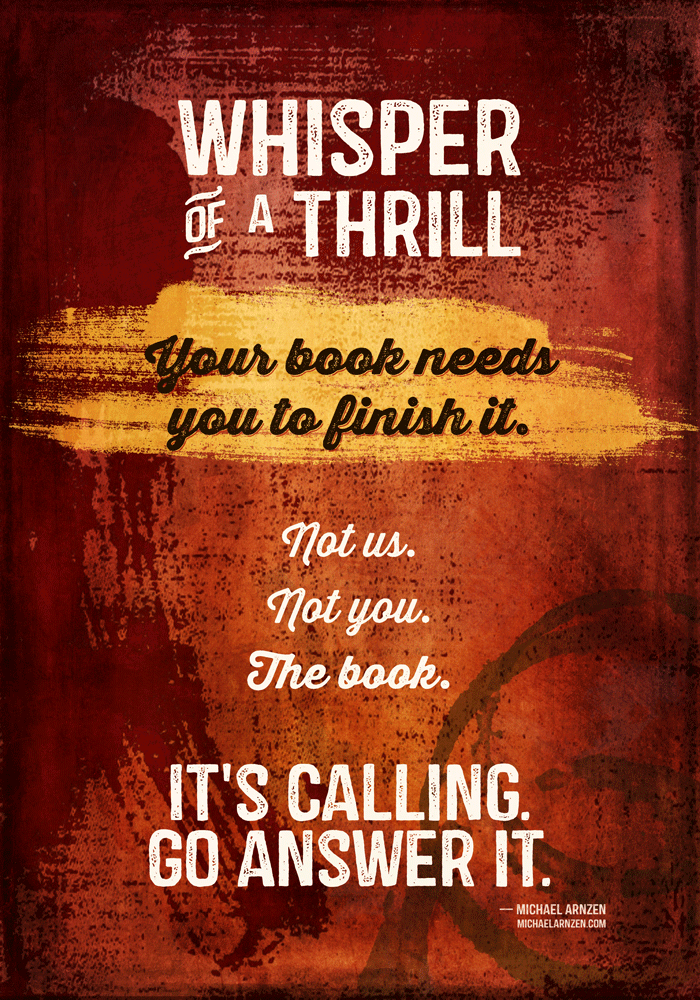
Available from Redbubble in posters, prints, t-shirts and hoodies, greeting cards, and stickers.
I’ve had this saying around on my hard drive since grad school in 2003, when Seton Hill University professor Michael Arnzen said this. Neither of us can remember the precise context, though.
He is a horror writer, and I can totally hear that evil horror writer cackle at the end, so I went with a red theme, leaving it open to interpretation if that’s actual writerly blood running down the left side.
Oh, hey, there’s coffee rings in the lower right.
100% detail:
Credits
This time, I decided to use my favorite packager of graphic elements I love, Design Cuts. Every one of these came from one of their bundles; they run a single bundle every other week.
- Font: Castor and Castor Catchwords from Albatross.
- Font: Thirsty Rough from Yellow Design Studio. This is the script font. The detail shows the regular font plus the outline font, which is a really neat look.
- Two textures from 2 Lil Owls. One on the very bottom and one on the very top. The bottom one has some subtle text that you can kind of see hints of. As I write this, these are out of the current Design Cuts bundle. One’s from the Grandeur pack, and one from the Relic pack.
- The yellow swath is from Robyn Gough, who also did a few other brush textures used very lightly in the background.
- The red on the top and left is a vector element from Offset’s Vector Texture kit.
- The coffee rings are a set of Photoshop brushes from FanExtra.
Apart from that, I used one linear gradient and one radial gradient.
That’s it!
Jun 2014: My Bag of Fuckall: Now for Real
A week ago, I made and posted this bag mockup.
A couple of people have expressed interest in actually buying one. Sadly, that specific kind of bag is only available for printing in $BIGNUM quantities at $BIGNUM++ prices, which isn’t going to happen.
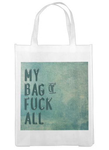 The Zazzle version is a white poly market tote, but has the design front and back.
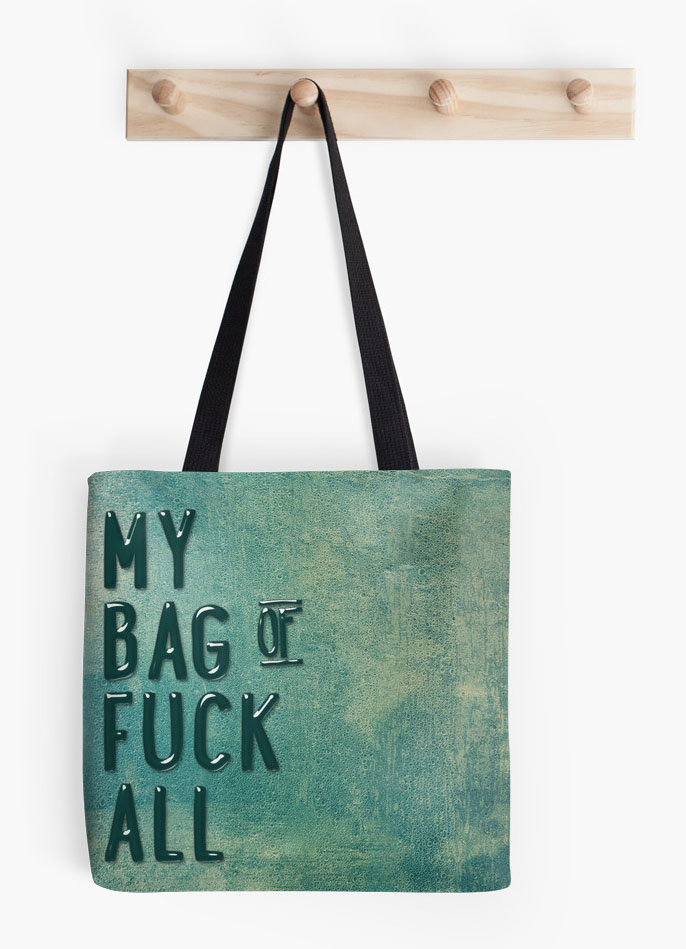 The Redbubble version is an over-the-shoulder tote. (Yes, it also shows as a pillow, which makes no sense, especially with that layout, but they’re the same “product” as far as graphic uploads go.)
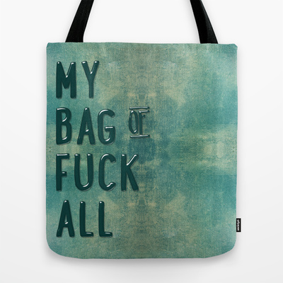 The Society6 version is my personal favorite. It’s a shoulder bag available in three sizes. The small size is the same as the Redbubble, but it’s also available in two larger sizes. The small size is one penny different in price than Redbubble, but I’ll say this: the artwork is much higher resolution. I think the strap placement is probably better. I can’t speak to any quality differences between the two, though.
I happened to make it in one of my favorite colors, but I’m open to making it in different colors if you’d like.
Jun 2014: Using Contests for E-Book Covers
The subject of using contests (like 99 Designs) for making e-book covers has created huge controversy in the graphic design world, including complaints of driving down prices, etc.
My own feeling is that not every designer works the same way, and e-book contest covers can be a compelling way to get a decent cover at an affordable price.
Below is a comment I submitted to this post on Joel Friedlander’s blog, The Book Designer, about using contests for e-book covers.
I’m a writer who has, in the past, done graphic design for a living—everything from layout to burning plates and occasionally minding the paper folder. Catch is, that was the 80s, and it’s a huge technology shift that I haven’t kept current on. In the 80s, I joined a consultancy that had a mix of software engineering and graphic design clients, though we also did some music-related stuff for a gaming company.
At one point, my partner and I decided that we were too unfocused and we should concentrate on one thing, so however we earned the most money in the next six months would narrow our focus. We made more money in software engineering, thus gave up the design part of our business. In retrospect, I think that was a mistake.
In between software gigs, I did still work in graphic design on occasion, though not through the partnership. After the company folded, I went back to graphic design for several months before heading off to Ireland. I was burned out and fried, and working on setting travel agency ad copy and laying out restaurant menus was far less stressful. I was the first to use the new typeface Lithos for Mexican restaurant menu design (for El Torito), and every time I see another Mexican restaurant using the face, I smile. It may be a super-small trend I set, but it was a move away from more stereotypical ethnic typefaces.
I’ve done cover designs on 99designs. Never won a gig, but I’ve been in the final round several times (mostly for hidden contests). I get asked to submit designs every now and again.
There are good and bad things about it, so I’m going to be frank with what I feel works and doesn’t work about 99 designs—and why I bother to do it at all.
First, I’m not an illustrator in any sense of the word. I’d love to have that skill, but not so much that I take the thousands of hours it’d need to really develop it. I’m really, truly at the “daisies like a six-year-old draws” stage of illustration skill. After I get my current book done, it’s actually part of my commitment to myself that I’m going to learn how to draw better as well as finally learn Illustrator.
I view the contests as “Photoshop homework where I have a risk of making some money.” That’s it. I’m looking for a challenge as an artist: what do I feel I have to say about this topic? And what can I challenge myself to learn? Also, do I have a photo that I think works for this?
Especially where there are photo-based covers, sometimes 99designs can feel like a race to find the killer stock art. For Tim Rymel’s forthcoming book Going Gay, when I saw the artist submit the winning cover, I inwardly folded. What I’d found was nowhere near as good. Tim obviously agreed, as he ended the contest early. Could he have gotten a better cover? Possibly. But I think it does an awesome job. In that contest, only a handful of designs were submitted.
The other extreme I’ve seen is where the client just keeps chewing up designer time. This contest had a mind-boggling 1265 entries. But, because they were paying $450 (rather than the more typical $200 or $290), people kept on submitting. I don’t want $450 that badly; I’m so glad I was eliminated early. I’m guessing the winning designer probably earned around $2 an hour.
Another problem is the person who’s self-published a book with an awful cover, then comes back to get a better one when their book isn’t selling. Catch is, if their taste was that appalling to begin with, it isn’t much (or any) better now. They’ve only decided it’s worth spending (more) money for. For you great designers out there, these people were likely never your customers. They’ll often reject good design. The beauty of 99designs for these kinds of situations is that you can look elsewhere for how you make your money. There are plenty of people willing to be awful for the client.
Look, I get that those of you who are real designers for your day job feel that these contests are a threat. And those of us who design a cover every now and again when we have the time aren’t really in your business at all. I’m far more interested in the one-off client where there’s no future implied obligation because I’m a writer first and designer second. You generally would prefer to have repeat business or at least referral business.
For those of us who find this kind of thing a bizarre form of entertainment, one of the reasons I do it is to hone my sense of design. To play with my font library. To try to figure out how someone else did something and have a go at it myself (not to knock off the design, but just to learn). To see what I like (and don’t like) about other people’s entries, and try to articulate why it does or doesn’t work for me. For me, that’s what the real benefit is: not the money, but the education.
One of the things I’ve had to spend a lot of time on is documenting the rights I have. Do I have rights to use this in a commercial project?
Speaking of fonts, I’ve learned how much of a font freak I really am. When some unexpected money came my way, I decided to go to TypeCon in July. Their program and workshops sound fabulous. So that’s a direct result of 99designs contests.
Almost every penny I’ve earned this year is as a designer. (I’ll have books out later this year, and I expect that, at year’s end, design will only be a minor part of my income. One hopes.) Did I design my own covers? Yes I did. Ultimately, that’s why I’m doing this: so I can do a better job for myself. Even if I get to where I think hiring someone else is a better choice, I will be better working with a designer because of my experience.
Until then, I’ll just write every day, publish books when they’re ready, and sell a bunch of t-shirts and the occasional clock or shower curtain.
Note: Book mockup template in header by Picseel.
Jun 2014: My Bag of Fuckall
I love product mockups, so since I had fuckall to put on a bag (and needed a place for all my zero fucks of late), here it is. Mockup from PSD Covers, the font is Lunchbox and Lunchbox Ornaments from Kimmy Design, the chalkboards (two of them) are from BMachina, and the bag texture is from Florin Gorgan and is a freebie here. In addition, I used a glass effect layer style (probably from mysitemyway.com), a shadow light that comes from the upper left (probably from the same place), and a shadow layer to sort of give a “shelf” effect on the flat chalkboard.
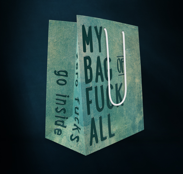
Note: Now available for sale in several places, see this post.
Took me about half an hour, fwiw.
For those who’ve never seen how they work, you paste in the normal flat artwork and the script takes over and makes cool stuff out of it.
Graphicburger has some really awesome mockups. Some are free, some are commercial.
May 2014: Typecon, a Typography Conference
One of the things about Doing New Things This Year is the fact that I get to, you know, do new things this year.
It’s interesting to review various fields to see when “indie” started becoming mainstream and more than a curiosity. For type, it hit earlier than others. I remember that even in 1994 there were indie type designers making money, though it really took e-commerce and font sites like myfonts.com before anyone could make a career at it.
A convention I didn’t know about until a few days ago is Typecon. In the long tradition of using horrible pun names for convention titles, this year’s conference is in Washington D.C. and is therefore called Capitolized.
Typography’s a layer between script systems and the reader, one that communicates a lot of meta information about the message.

(Fonts, in order: Downcome by Misprinted Type (free), Eveleth, by Yellow Design Studio, Holden, by AlterDeco typefoundry, and Showcase Script by Latinotype.
Most people wouldn’t think the last really wasn’t communicating danger in any meaningful sense.
Anyhow, back to the conference.
The keynote speaker is Tobias Frere-Jones, one of the designers of some of the most amazing modern type. And also the plaintiff in the largest career divorce in recent typography history. The company that used to bear his initials, HF&J, is now Hoefler & Co.
Then there’s the program, which includes awesome things like type foundry ephemera, the typography at Medium, Victorian-Era calling cards, designing for audiences with low literacy skills, typography in medically-critical contexts, typography of food packaging in America, the evolution of Korean typesetting, typography of the American record industry from 1898 to 1967, problems of Hebrew typography, including Karmeli script, the special issues of typography for software development, the problems of creating Arabic typeface variants of fonts like Zapfino. I love the description of this talk:
As the Arabic companion to Zapfino, the first question that Zapfino Arabic had to address was: does it slant forward or backward? The next question that quickly followed: which Arabic calligraphic style would be a suitable companion to the distinctive flair of Zapfino?
I can’t even begin to imagine the issues in bidi (bidirectional, meaning mixed left-to-right and right-to-left lines) of a typeface as calligraphic as Zapfino.
Are we done yet? We are not.
We haven’t covered the workshops yet.
There’s a full-day workshop on calligraphy and fonts; one on developing Devanagari typefaces; the workshop where you bring a glyph design, use a CNC router to make a wooden version of your design. A second workshop is about letterpress printing, where one can bring one’s wooden glyph created the day before. The Letterpress Poster Sprint & Print sounds really awesome, but I went for the other option: flourishing rules. There’s a full day workshop in Hebrew type design, as well as a half-day one in watercolors. (And there are more.)
The one I’m really waiting for is called Pen Dance. Here’s the description:
Make a pen using a soda can and explore the marks it makes! This workshop will get your hands dirty as you experience the visceral pleasures of pushing ink through a pen. We will make our own writing tools, then learn how they work, starting from the simplest marks and working up to letters and words. Freeform letter styles with a lot of expression are the result … your letters will be unique and extraordinary.
Sounds like fun.
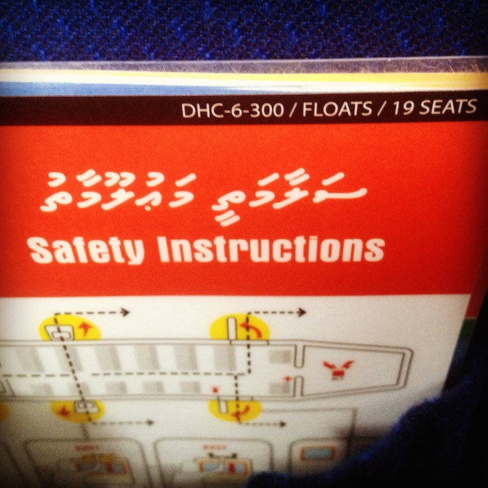
Random photo that I always think of when I think of typography: Maldivian Air Taxi’s safety card, complete with Dhivehi script.
May 2014: Book Mockups
Recently, I’ve become impressed with some of the stuff available on Creative Market, and some of the categories of things I didn’t feel I needed until I saw them.
Now, this is a pretty good business card if I do say so myself.
But this? Looks compelling on an entirely different level.
The above is one of the mockups included in this package of 4 business card mockups from Silviu Stefu of Pixelglow. $7 (and you’ll need Photoshop)
So, what does a book mockup look like then? I’m so glad you asked.
Here’s a sample cover.
But here’s the mockup, using another mockup package from Pixelglow, also $7:
May 2014: I Think My Guardian Angel Is on an Acid Trip
This was my response to someone’s line about their guardian angel.
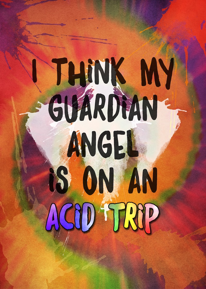
Available Now
On Redbubble in T-shirts and stickers.
On Søciety6 in prints, pillows, mugs, tote bags, wall clocks, and as a shower curtain. Styles for tech cases will be uploaded soon.
#3 Design element credits
- Font is Daft Brush from Pintassilgo Prints, purchased as a part of a Design Cuts bundle.
- Splotches, including angel body and wings, are from the Splatter Brushes bundle from Robin Gough designs, purchased as a part of the Beautifully Artistic Brushes bundle that’s still got three days left to purchase. I’ve been really happy with their design elements. Even though I don’t do design for my primary income, the bundles I’ve purchased (five so far) have already paid for themselves.
- Background is a watercolor texture from Kimmy Designs.
- Blended into that layer is a tie dye layer, using techniques I picked up from this video.
Bonus
Feel free to spread around the image at the head of this post or the following earlier version:

It’d be nice to have a link back to desamo.graphics, deirdre.net, redbubble.com/people/desamos, and/or society6.com/desamo, but it’s not required.
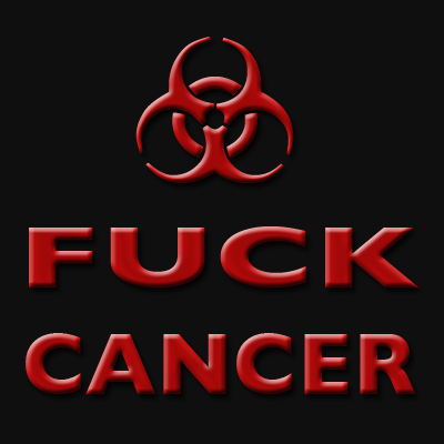
May 2014: Fuck Cancer: New Art, New Shirts & Prints
Recently, I deleted my Flickr account, which meant I deleted the only public repository of my oft-used “Fuck Cancer” graphic. The original is still as free to use as ever and is at the bottom of this post.
Over the weekend, I decided to re-make the graphic to be high enough resolutions for t-shirts and prints.
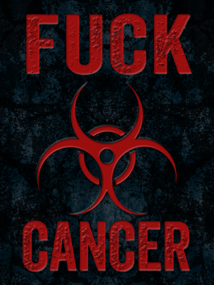
It’s on RedBubble in several formats:
- T-shirts and hoodies
- Stickers
- Prints
- Small posters
I’ve made this image so it prints well on both light and dark t-shirts (as it has a background)
Older, Free Image
The above images isn’t one I want circulating on its own, but if you’d like me to adapt it to some other need you have, (e.g., a poster or event), contact me.
You can always use the image below for free. Sorry, this is as large as it ever came:
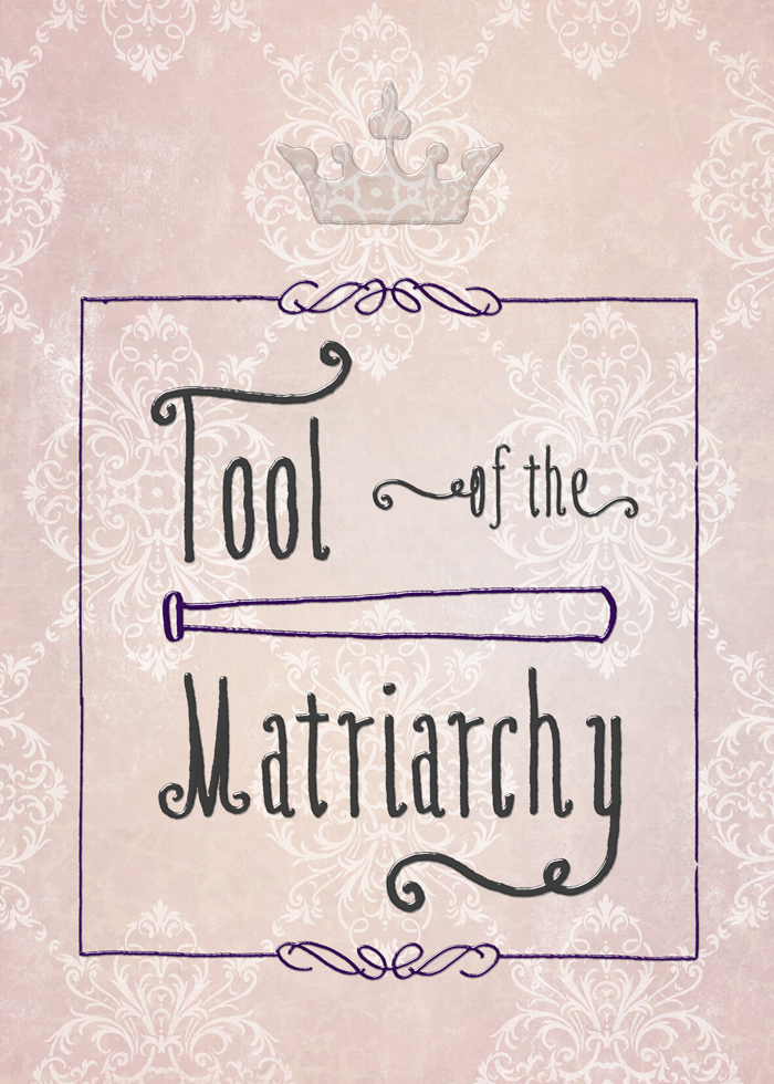
May 2014: Scalzi "Tool of the Matriarchy" T-Shirts and Stuff
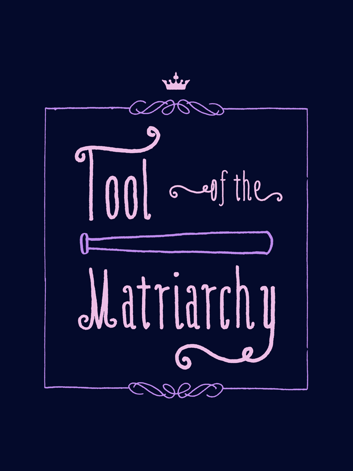
So, dark shirts outsold light ones by about 20:1, so I’m going to make only ones intended for a dark background this time—unless you ask for light shirts.
John Scalzi gives the background in this post, but the short version is that his wife Krissy was harassed by a man in a bar, and she backed the guy against the wall. This got conflated by a redditor with a photo of Krissy holding a baseball bat…but that wasn’t actually part of the self-defense story.
As John Scalzi said in a tweet: HOW DARE I approve of my wife defending herself. I AM A TOOL OF THE MATRIARCHY.
Believe in women’s rights to defend themselves against their harassers (while mocking those who do not)? This may be the thing for you.
Places to buy:
T-shirt and garments
Redbubble uses American Apparel, sizes to 3x. Zazzle has other shirt manufacturers and more styles, but is more expensive. Sizes to 5x plus pocket tees.
Prints and Stickers
Design Stuff
No matter what I wanted to do with this meme, the baseball bat kept wanting to be front and center. So it is.
The font (as well as the border and the lines and curves used to compose the baseball bat) are the work of Kimmy Kirkwood aka Kimmy Design. I bought it as a part of Design Cuts’s Monster Creative Font Bundle that’s still going on. She’s very talented. I also love her watercolor textures pack.
On the t-shirt, the only element not from there is the crown, which is from the Altus font by Jay Hilgert of Albatross, purchased in the prior Design Cuts font special. Because it’s not a matriarchy without a crown.
As usual, the print/sticker version is more complicated. 15 layers in total vs. the t-shirt’s 4.
My thought was neat graffiti behind the king’s throne, where the script was so neat and tidy one couldn’t help but have a few curlicues.
I used a transparent layer style to make all the elements look like they were squeezed out of a tube. It’s this text effect from mysitemyway, which has oodles of great free stuff. If you look hard enough, you’ll find the background image to my website in there somewhere.
Oh, and that layer style is truly transparent, as you can see with the crown. In order to get it to apply to the other layers, I had to duplicate them: one layer in color, one layer with the effect.
I used a grunged-up layer that I did over a solid color. Then I used a damask screen from Anissa Craig of le paper cafe, purchased from a Design Cuts vintage bundle. But, you say, it doesn’t look like any of those. Right. I used it in screen mode. (Or maybe inverted and used screen; it was an early choice and I’m very tired now.)
It still needed something something.
So I pulled out a scaleable vector texture from Offset, again purchased as a part of a Design Cuts vintage bundle. (I told you I had a lot of stuff to use! I haven’t even scratched the surface.) I made that a beige, which looks a bit green against the pink, so it just looks like veining that makes the wall surface feel more lived in.
And, you know, it’s got to be an actual wall surface that actual humans spent time painting. Because royalty.
Detail:
Full size:
May 2014: Coming Monday: "Tool of the Matriarchy" T-Shirts
“Tool of the Matriarchy” is an expression mentioned in the series of John Scalzi’s tweets that led to the “Traitor to the Mens” t-shirts.
I’ve been working on getting the right look to try to communicate the intended tone with something that’d print well. I just haven’t been feeling really well (yay fibro), so I’m going to take the weekend off and have it ready Monday morning.
I’m really enjoying this t-shirt thing. Back in the day, I used to do abstract screen prints in like 5-10 layers and print my own shirts, doing all the photo separations myself. I’ve always enjoyed screen printing, though I haven’t done any in ages.
Then, once upon a time, there was a very limited series of Deirdre’s Pet Geek t-shirts.
I’ve designed other t-shirts, including a convention t-shirt for BayCon one year, and a couple of commissions over the years.
May 2014: Deviant Art's Dark Patterns: Ripping Off Indie Artists
Rismo made this rather awesome piece and posted it on Deviant Art. Hot Topic started selling the t-shirt.
No one paid Rismo.
Did Hot Topic rip off Rismo?
See below for update.
Here’s DA’s Submission Policy.
Check out d:
the right to sublicense to any other person or company any of the licensed rights in the Artist Materials, or any part of them, subject to the terms and conditions of this Agreement.
and 6:
6. Payment Unless otherwise agreed between Artist and deviantART in a writing from deviantART, the license granted to deviantART under this Agreement is royalty-free.
Royalty. Free.
In other words, by uploading your artwork to Deviant Art, you allow them to sell to Hot Topic—and anyone else worldwide—and pay you nothing.
And there’s no way to opt out, at least not on my account.
Update: Deviant Art’s Response
We intend to employ similar methods to allow syndication of art work, like the daily top favorites and even the ability to stream your gallery to your personal website. We couldn’t do this and things like this without third party rights because RSS feeders, blogging services and the like are third parties.
So they say that it’s just for promotion of your work on DA via normal service-type operations that involve DA.
Fact is, though, they absolutely could do what was originally claimed if I’m reading the submission terms correctly.
Update 2: Deviant Art’s Denial of Art Sale to Hot Topic
Text here. Thank you to commenter Kira Spoons for finding it, as I hadn’t checked up on this topic today.
Still, 3d of their submissions policy is overly broad and appears to permit that royalty free.
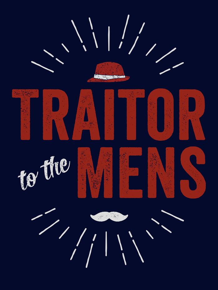
Apr 2014: Scalzi "Traitor to the Mens" T-Shirt & Prints
Available now: dark background t-shirt, light background t-shirt, and prints, stickers, posters, and cards.
If you need a size bigger than 3x or don’t like American Apparel shirts, then I also put them on Zazzle, which is slightly more expensive than Redbubble. dark background t-shirt, light background t-shirt.
John Scalzi said: I think I’m going to make a t-shirt that says “TRAITOR TO THE MENS” on it.
I offered to do the design.
He replied: DO EEEET
So here we are. Here’s John Scalzi’s background story for the phrase.
I offered in part because the very night before I was on a graphics site and had skipped over a free mustache graphic element because, and I quote, “I’ll never use that.”
When Scalzi mentioned the t-shirt idea, of course, it was the first thing that came to mind. As it turns out, I didn’t use that one I’d seen, I used one in a font I had.
Plus, thanks to Design Cuts and their awesome graphics bundles, I had—no joke—twelve gigabytes of new graphics toys chomping at the bit waiting to be used. I really wasn’t kidding about collecting grunge textures.
I want to give credit to the designers for the elements I’ve used, top to bottom.
- Sunburst, from Outdoor Logos by Ian Barnard of Vintage Design Co. (Purchased as a part of a Design Cuts bundle.) Initially, I just wanted a sunburst as a design element, but then I realized the kind of people who think feminist men are traitors are just, well, puckery assholes. So there you have it.
- Fedora, from Shona Dutta’s Retro Hats collection. Hey, someone local to me!
- Veneer font, from Ryan Martinson of Yellow Design Studios. Purchased as a part of the Design Cuts Monster Creative Font Bundle which is a great deal. While it’s a past bundle, if you buy the current bundle, you can also buy this one if it floats your boat. I love this, so I’ll talk about it more below.
- Roverd font, from Dexsar Harry Fonts. (“to the”) Indonesia represent.
- Veneer Extras font, also from Yellow Design Studios. (This is the mustache.)
- Grunge texture is from Vintage Textures by Ghostly Pixels, used on the fedora and “to the.” (Purchased as a part of a Design Cuts bundle.)
- (paper goods only) See the chalkboard in there? No? That’s the beauty of textures. It doesn’t have to be obvious to add to the whole. From Bruno Maioral/BMachina.
- (paper goods only) The book-like texture is from Cruzine. (Purchased as a part of a Design Cuts bundle.) I tried a bunch of textures, but I liked the feel of this one.
- (paper goods only) The folded paper texture is from Simon Berkey Hartmann/The Shop. (Purchased as a part of a Design Cuts bundle.) Metaphorical nod to the well-worn arguments that follow only a few lines of thought.
Veneer and Why I Love This Kind of Font
Bottom type layer: Veneer, color white.
Middle type layer: Veneer 2, color yellow.
Top type layer: Veneer 3, color red.
Cool effect, huh? That’s just three of the six variations. That said, I didn’t think multiple colors worked as well for the t-shirt. Usually, you’d use colors closer together, too, but I was illustrating the concept rather than using it in a larger design.
Mar 2014: Business Card Backs
I’m redesigning my personal business cards, so thought I’d show off the backs of the ones I used to have.
It had a few requirements:
- A lot of people at conferences have told me they like to write on the backs of business cards, so I deliberately didn’t use an obtrusive design.
- Because people could write on it, it had to be a simpler form of what was on the front, and with none of the writing to interfere with whatever the recipient wanted to do with the back.
- The logo was on the front of the card as well, just flipped and in color.
Specific steps:
- Copy the image later to a new Photoshop document the same size as the front.
- Edit -> Transform -> Flip Horizontal
- Image -> Adjustments -> Desaturate
- Set the layer opacity to 10%.
- Create a new layer beneath that, fill with 100% white.
Feb 2014: Society6 Art: Iceplant
Based on seeing a friend’s pieces on Society6, I decided to start uploading photos there for sale in various forms. They have prints, iPhone cases, computer cases, pillows, tote bags, and stuff like that.
My first piece (my plan is to upload one per week) is called Iceplant.
I know, I know, it doesn’t look like iceplant, right? I prefer to think of it as iceplant in someone’s acid trip.
Actually, the photo is really of iceplant. Rick and I were walking around Pigeon Point Lighthouse one day. I had my finger on the shutter button, as you do, and misstepped, setting off the trigger. I got a lovely streaky blurry photo of a patch of iceplant.
Honestly, it really wasn’t very fetching, but there was something about it, so I played with it.
My friend Joe (zeruch) also has a shop on Society6, and I like this piece in particular. Note that some of his figurative work is NSFW, but I’ve linked to an abstract. I think it looks pretty awesome as a pillow or clock.
Jan 2014: Self-Publishing and Quality
Chuck Wendig has a great post out: Self-Publishing Is Not the Minor Leagues
I have to admit something: I’ve only ever submitted fiction to a semi-pro market once.
The letter I got wasn’t a rejection, it was more “You misread the guidelines, but if you do A, B, and C, I’ll publish it.” Though I don’t think the publisher figured out that I’d misread the guidelines. I wrote a near miss story despite that.
I withdrew the story, because what they wanted wasn’t the kind of story I wanted to write.
It’s a good thing I did withdraw, because the story happened to have an unfortunate trope in it, and now I can cringe at the Bad Trope in the drawer and not be embarrassed every time someone calls me out on it. Some day, I may pull the stuff I like out of that story and evict the Bad Trope.
In all other cases, I held my stories until I thought they could go to a pro market, and basically wasn’t going to go to semi-pro markets until I was selling more consistently to pro markets.
It really only was for the reason of wanting to avoid the obvious stupid mistakes. I figured I’d probably learn something by then, and there might be more pro markets–or at least some different editors at the same pro markets. I’ve avoided having a lot of stupid stuff published because I haven’t bothered digging down to the “Bazooka Cannibals in Space” tier of possibilities.
I’m at the stage of personal rejection letters, which is a nice place to be, but it hasn’t been translating into sales. That is likely more a function of my paucity of submissions.
On the other hand, because I am really selective about submissions, I can say that “A Sword Called Rhonda” sold both the first and second time I submitted it anywhere.
So you can imagine how I felt, given that I’ve just confessed to basically being an obsessive perfectionist, when I was at a NaNoWriMo meeting and someone said they wanted to self-publish their book because they “didn’t want to do all that extra work readying it for market.”
You’ll be very proud of me: I did not leap over the table at the pizza place with an editorial pen of my own devising.
Meanwhile, for a book I’m planning to come out with later in the year that’ll be both in paper and e-book form, I realized that Pages wasn’t going to cut it, and it was driving me crazy anyways. Pages does allow you to save to EPUB, but the book templates are really only designed for PDF books, and no one’s making ones for common trade sizes.
Which leaves InDesign, and I have forgotten so much about using production aspects of PageMaker/InDesign it’s not even funny. Back in the day when I worked at agencies in between contract programming gigs, I would frequently wind up at a specific ad agency doing page layout. I’ve always enjoyed it.
I’ve continued doing it over the years, but some of the advances in book publishing in InDesign were features I’d never learned. I’m not going to argue that it’s brain surgery, but it takes a non-zero amount of time to pick up.
There’s also a lot of frustration to it. Like, say you want a PDF version of your book. Your main book design has spreads so you can have odd/even pages (because odd/even headers are A Thing). By default, that means you can’t make an interactive PDF (with live links) that doesn’t have spreads.
Honestly, if you think editing your book is all that complicated, you shouldn’t be self-publishing. There’s a lot to it, and it’ll show if you don’t respect that–and I’m not just talking typos or grammar.
For the same reasons, I’m delaying production of a couple of other titles by a bit until I can finish up the conversion to InDesign. In one case, I got pretty close to final draft before realizing I was barking up the wrong toolchain.
So that will be fun.
On the other hand, I’ll have lots more experience with current multi-document production in InDesign, and that could come in handy.
One never knows.