Scalzi "Tool of the Matriarchy" T-Shirts and Stuff
04 May 2014
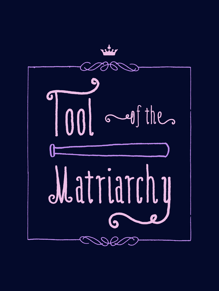
So, dark shirts outsold light ones by about 20:1, so I’m going to make only ones intended for a dark background this time—unless you ask for light shirts.
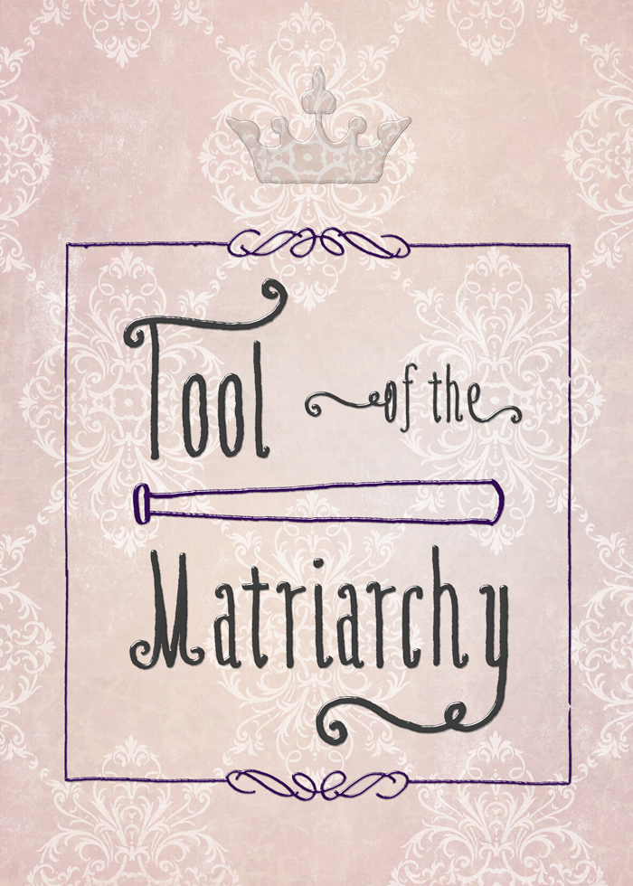
John Scalzi gives the background in this post, but the short version is that his wife Krissy was harassed by a man in a bar, and she backed the guy against the wall. This got conflated by a redditor with a photo of Krissy holding a baseball bat…but that wasn’t actually part of the self-defense story.
As John Scalzi said in a tweet: HOW DARE I approve of my wife defending herself. I AM A TOOL OF THE MATRIARCHY.
Believe in women’s rights to defend themselves against their harassers (while mocking those who do not)? This may be the thing for you.
Places to buy:
T-shirt and garments
Redbubble uses American Apparel, sizes to 3x. Zazzle has other shirt manufacturers and more styles, but is more expensive. Sizes to 5x plus pocket tees.
Prints and Stickers
Design Stuff
No matter what I wanted to do with this meme, the baseball bat kept wanting to be front and center. So it is.
The font (as well as the border and the lines and curves used to compose the baseball bat) are the work of Kimmy Kirkwood aka Kimmy Design. I bought it as a part of Design Cuts’s Monster Creative Font Bundle that’s still going on. She’s very talented. I also love her watercolor textures pack.
On the t-shirt, the only element not from there is the crown, which is from the Altus font by Jay Hilgert of Albatross, purchased in the prior Design Cuts font special. Because it’s not a matriarchy without a crown.
As usual, the print/sticker version is more complicated. 15 layers in total vs. the t-shirt’s 4.
My thought was neat graffiti behind the king’s throne, where the script was so neat and tidy one couldn’t help but have a few curlicues.
I used a transparent layer style to make all the elements look like they were squeezed out of a tube. It’s this text effect from mysitemyway, which has oodles of great free stuff. If you look hard enough, you’ll find the background image to my website in there somewhere.
Oh, and that layer style is truly transparent, as you can see with the crown. In order to get it to apply to the other layers, I had to duplicate them: one layer in color, one layer with the effect.
I used a grunged-up layer that I did over a solid color. Then I used a damask screen from Anissa Craig of le paper cafe, purchased from a Design Cuts vintage bundle. But, you say, it doesn’t look like any of those. Right. I used it in screen mode. (Or maybe inverted and used screen; it was an early choice and I’m very tired now.)
It still needed something something.
So I pulled out a scaleable vector texture from Offset, again purchased as a part of a Design Cuts vintage bundle. (I told you I had a lot of stuff to use! I haven’t even scratched the surface.) I made that a beige, which looks a bit green against the pink, so it just looks like veining that makes the wall surface feel more lived in.
And, you know, it’s got to be an actual wall surface that actual humans spent time painting. Because royalty.
Detail:
Full size: