Archive of posts with tag 'accessibility'
Oct 2013: Usability and Contrast Loss
My father, Owen, is legally blind due to contrast loss. This is not your typical form of blindness. Essentially, everything mushes into grey. Note that some contrast loss with aging is normal, so the problems noted here do affect many people as they age, just not to the same degree.
When I first saw iOS 7, I knew it would be a problem for him and that he would not be able to see it as well as iOS 6 (which had problems, too, but fewer of them), but I didn’t want to make assumptions about what specifically was a problem until we’d had that conversation.
Last night, I managed to talk to Owen long enough (before the call dropped) to get some of his complaints.
Specifically, he can’t see the UI to unlock his phone. Let’s look at the before (iOS 6) and after (iOS 7) examples here:
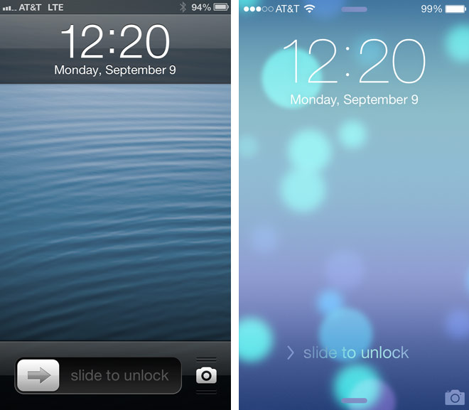
(image from wired.com)
Now, imagine that you’re only able to see high-contrast well, like Owen is. Which has greater accessibility? This is an effing lock screen, people. No one should have to go around with their internet pants down because they’re blind.
This is actually a really good argument for the iPhone 5s: it doesn’t matter how awful the accessibility is on a feature if it’s irrelevant. So, I’m going to help my dad get an iPhone 5s and set it up.
After my complaints on Twitter, several people suggested that Owen go into the Settings app and increase the font size and boldness.
Exercise for the reader:
- Assume you’re legally blind from contrast loss (and haven’t locked yourself out of your phone because you’re blind).
- Find the Settings app on iOS 7.

(clipped out of a larger image here)
Note how much less accessible (from that perspective) the iOS 7 icon is than the iOS 6 one is. Some of the iOS 7 icons are better, some are way worse, and some are about the same. This one is decidedly worse, and it wasn’t that great to begin with.
In addition to lower contrast, the detail is much finer, making it harder to see (than the iOS 6 icon) by most visually impaired people.
And that’s what the settings to improve accessibility are hidden behind?
Fail.
Now, let’s get back to the point about increasing the font size and boldness. In general, this never hurts. However, for someone blind from contrast loss, these options may not help. It is the contrast, rather than the font weight or size per se, that is the issue.
Looking up at the lock screen, note that the time is a larger font than it used to be. Assuming it were also the same weight, it would still be less accessible for Owen — because contrast is more important. Also note that shadows, gone from the iOS 7 UI, help define edges and thus improve accessibility for those with contrast loss. Personally, I like shadows so long as they’re not overdone.
Per Owen, it’s also easier to see white text on a dark field rather than dark text on a light field. For him, light-colored backgrounds flare. I don’t know if this is true for all who have contrast loss, though.