Archive of posts with tag 'arts'
Sep 2015: Letter to FDA re International Cooperation on Cosmetics Regulation
Dear FDA,
Sadly, I can’t attend the meeting in College Park, Maryland today regarding public comments in preparation for the International Cooperation on Cosmetics Regulation conference in November, but I’m emailing my input.
Issue 1: Sunscreen Approval
My first issue: the United States treats new sunscreen UV filtering agents as though they are new drugs, where the industry leaders (meaning: EU, Japan, Australia, and Korea) in sunscreen research and development treat them as cosmetics. Therefore, there is a huge burden in bringing new UV filtering agents to market.
Thus, the United States lags almost two decades behind these other countries in sunscreen agents. In the last ~18 years, we’ve had one UV filtering agent approved for one single SPF 15 (!) sunscreen.
While I can certainly see reason for caution, we’re far more permissive in other things that go directly on a consumer’s skin which may not provide the results alluded to by the marketing hype.
If a UV agent’s already approved in the EU and Japan, how about we allow it to be used in the US?
Issue 2: Allergens
I know the cosmetic industry will never agree to this, but I have to bring it up: it’s easy to label cosmetics for things like hydrolyzed wheat protein and hydrolyzed wheat gluten—because they’re used in almost zero cosmetics. Though, as a celiac, I do appreciate the labeling even though it’s not the limiting factor for me.
What would be hard to do is to label cosmetics for tree nuts, because that would include coconut.
Coconut derivatives are in almost all facets of cosmetic formulations: from the stearic acid that thickens mascara, the sodium laurel and laureth sulfate that comprises one of the first two ingredients of almost all commercial shampoos, and the surfactants, emollients, and emulsifiers that make commercial products look and feel like they do (and stay in solution through several coconut-derived versions of PEG, as well as many that are not coconut-derived).
However, it really would be nice to actually not have to look up ingredients to see if they’re likely to be coconut derived. Then I won’t have to wonder why I suddenly reacted to this one product, as I might actually know if they changed from a palm source to a coconut one.
A surprisingly large number of people react to coconut-derived sulfates and coconut-derived fatty acids, among other things, and that’s not even getting into the palm sources of, say, glycerin.
But please, given how prevalent coconut is, could we possibly consider it an allergen some day? I was married to a soap chemist and had 34 new-to-me brands of shampoo to try (driven in from Canada) to determine what my allergy was. Most people just have the mystery acne, and are given dermatology formulas that, no joke, contain more of the exact same allergens.
Thank you for listening. I’m really looking forward to hearing more of the conference’s progress.
Signed,
Deirdre
Why I Wrote In….
Two years ago, I ran out of sunscreen before arriving in the Maldives. I went to the gift shop, where the only thing they had was something they described as a “total block.” Which, short of a space suit, seemed rather optimistic and improbable.
I didn’t know how to evaluate the ingredients on the label, but I did notice that the two physical sunscreen blocking agents I knew about—zinc dioxide and titanium oxide—were nowhere to be found.
Fortunately, the hotel had another gift shop. I strolled over there, only to find that they had a very reasonable SPF 50 sunscreen.
What I didn’t know at that time was how incomplete my understanding of sunscreen was, nor why my lack of knowledge was so important.
A Quick Primer on UVA and UVB
UVB (think “burning”) penetrates the epidermis with rays between 290 and 320 nm.
UVA (think “aging”) was initially thought not to cause skin cancer. Unfortunately, it’s highly associated with cancer. It penetrates down to the bottom of the dermis. Tanning also happens with UVA, so for a long time it was thought that if you blocked UVB, you’d encourage a nice healthy tan while preventing burning and skin cancer. UVA is broken into two wavelength bands: UVA1 (340-400 nm) and UVA2 (320-340 nm).
SPF ratings are only for UVB. There is no rating system, nor any requirement to even mention UVA in American cosmetics. Sure, a product can use the “broad spectrum” phrasing, but there’s still no requirement that it be world-class UVA protection.
Japanese and Korean skin care uses a PA rating system with pluses to rank effectiveness of UVA blocking up to a maximum of four pluses. There are also other methods in use outside the US. Some are better than the Japanese/Korean system ## Why US Sunscreen Is So Awful
In the US, sunscreen is considered a drug, thus new blocking agents have to be approved by the FDA. That means a company needs to sponsor the research (which costs millions) and lead the blocking agent through the whole approval process.
Which is fine if you’re a company that is patenting a drug where the exclusivity will, one hopes, pay for the approval process.
In the case of sunscreen blocking agents, however, they aren’t patentable (they’ve been in use too long), so one company would be spending a ton of money to allow other companies to profit equally, but without having spent the cost for approval.
So if a sunscreen agent is past the useful life
Hence, there is zero corporate incentive to get new blocking agents through the approval process, and we all suffer as a result. Yay, capitalism.
Worse, there had been at least eight new (to the US) sunscreen ingredients waiting for approval for more than five years. The ironically named Sunscreen Innovation Act, passed in 2014, was supposed to help us catch up with the rest of the world.
Speaking of Capitalism…
Thus, Americans respond to signs of aging after the fact rather than with prevention. This is a big part of the reason the US share of the global botox market is predicted to reach $2 billion annually by 2018.
While botox is used in non-cosmetic procedures such as stroke rehab and migraine prevention, much of the US market is about wanting to reverse aging signs in skin—aging that could have been prevented, in part, by better sunscreens.
Chemistry: Which Agents Are Approved Where
I’m only going to show US ??, Australia ??, EU ??, Japan ??, and Korea ?? since that will cover most of my readers as well as the products I’m talking about. Heavily borrowed from the Wikipedia Sunscreen page and this skincancer.org page; where they disagree, I’ve used the Skin Cancer site’s answer. Note: I’ll use the French flag ?? instead of EU flag ?? as there is no emoji support in Mac/iOS yet for this emoji.
Korea ?? information is currently incomplete as I’m only listing agents I’ve looked up that are included in Korean sunscreens or which were on a 2008 chart. Also, as there are almost a dozen sunscreen agents on that chart approved only in Japan, I’ve omitted those.
| Ingredient | Other Names | Approved In | Protects Against |
|---|---|---|---|
| 4-Methylbenzylidene camphor | Enzacamene, Parsol 5000, Eusolex 6300, MBC | ?? ?? ?? ?? (may be endocrine disruptor) | UVB |
| Amiloxate | Isopentyl-4-methoxycinnamate, Isoamyl p-Methoxycinnamate, IMC, Neo Heliopan E1000 | ?? ?? ?? ?? | UVB |
| Avobenzone | 1-(4-methoxyphenyl)-3-(4-tert-butyl phenyl)propane-1,3-dione, Butyl methoxy dibenzoylmethane, BMDBM, Parsol 1789, Eusolex 9020 | ?? ?? ?? ?? ?? | UVA1, UVA2 (some sources say UVA1 only) |
| Cinoxate | 2-Ethoxyethyl p-methoxycinnamate | ?? ?? ?? ?? | UVB |
| DEA Methoxycinnamate | ?? ?? | UVB | |
| Dihydroxybenzophenone | Benzophenone-1 | ?? ?? | UVA2, UVB |
| Dioxybenzone | Benzophenone-8 | ?? ?? | UVA2, UVB |
| Ecamsule | Mexoryl SX, Terephthalylidene Dicamphor Sulfonic Acid | ?? ?? (limited ?? use via new drug approval, L’Oréal exclusive) | UVA2 only |
| Homosalate | Homomethyl salicylate, HMS | ?? ?? ?? ?? ?? | UVB |
| Menthyl anthranilate | Meradimate | ?? ?? | UVA2 only |
| Mexoryl XL | Drometrizole Trisiloxane | ?? ?? | UVA2 |
| Neo Heliopan AP | Bisdisulizole Disodium, Disodium phenyl dibenzimidazole tetrasulfonate, bisimidazylate, DPDT | ?? ?? ?? | UVA1 |
| Octocrylene | Eusolex OCR, 2-Cyano-3,3-diphenyl acrylic acid, 2-ethylhexylester | ?? ?? ?? ?? ?? (increases ROS) | UVB |
| Octyl methoxycinnamate | Octinoxate, EMC, OMC, Ethylhexyl methoxycinnamate, Escalol 557, 2-Ethylhexyl-paramethoxycinnamate, Parsol MCX | ?? ?? ?? ?? ?? | UVB |
| Octyl salicylate | Octisalate, 2-Ethylhexyl salicylate, Escalol 587 | ?? ?? ?? ?? ?? | UVB |
| Oxybenzone | Benzophenone-3, Eusolex 4360, Escalol 567 | ?? ?? ?? ?? ?? | UVA2, UVB |
| p-Aminobenzoic acid | PABA | ?? ?? ?? ?? (banned in ?? because of DNA damage) | UVB |
| Phenylbenzimidazole sulfonic acid | Ensulizole, Eusolex 232, PBSA, Parsol HS | ?? ?? ?? ?? ?? (genotoxic in bacteria) | UVB |
| Padimate A | Pentyl-dimethyl PABA, Amyl p-Dimetyamino PABA | ?? ?? (withdrawn from ?? in 1989; never approved in ??) | UVB |
| Padimate O | OD-PABA, octyldimethyl-PABA, σ-PABA | ?? ?? ?? ?? (not currently supported in ?? and may be delisted) | UVB |
| Parsol SLX | Dimethico-diethylbenzalmalonate, Polysilicone-15 | ?? ?? ?? | UVB |
| PEG-25 PABA | Uvinul P-25, Ethoxylated ethyl-4-aminobenzoate | ?? ?? | UVA2, UVB |
| Sulisobenzone | 2-Hydroxy-4-Methoxybenzophenone-5-sulfonic acid, 3-Benzoyl-4-hydroxy-6-methoxybenzenesulfonic acid, Benzophenone-4, Escalol 577 | ?? ?? ?? ?? | UVA2, UVB |
| Tinosorb A2B | Tris-Biphenyl Triazine | ?? (very new) | UVA2, UVB, limited UVA1 |
| Tinosorb M | Bisoctrizole, Methylene Bis-Benzotriazolyl Tetramethylbutylphenol, MBBT | ?? ?? ?? | UVA1, UVA2, UVB |
| Tinosorb S | Bemotrizinol, Bis-ethylhexyloxyphenol methoxyphenol triazine, Bemotrizinol, BEMT, anisotriazine | ?? ?? ?? ?? | UVA1, UVA2, UVB |
| Titanium dioxide | CI77891 | ?? ?? ?? ?? (not approved in ?? as a UV filter, but permitted as a colorant) | UVA2, UVB |
| Trolamine salicylate | Triethanolamine salicylate | ?? ?? | UVB |
| Uvasorb HEB | Iscotrizinol, Diethylhexyl butamido triazone, DBT | ?? ?? | UVA1, UVB |
| Uvinul A Plus | Diethylamino Hydroxybenzoyl Hexyl Benzoate | ?? ?? | UVA2 |
| Uvinul T 150 | Octyl triazone, ethylhexyl triazone, EHT | ?? ?? ?? ?? | UVB |
| Zinc Oxide | ?? ?? ?? ?? ?? | UVA1, UVA2, UVB |
Even excluding Japan-only sunscreen agents, there are about as many approved only outside the US as approved for the US.
Two Sunscreen Videos
The first video is from British beauty blogger Lisa Eldridge. I mention this because some of what she says is from a very EU-centric viewpoint, specifically when she’s talking about approved sunscreen agents.
YouTuber Lisa Eldridge has a rundown on sunscreens, focusing on European brands.
YouTuber faceturtle has a review of 9 Asian sunscreens.
https://youtu.be/JKAXnwoankU
Random Interesting Things I Found While Writing This
- L’Oréal is the top nanotechnology patent holder in the United States.
- Rick brought the Jessica Alba Honest Company Sunscreen backlash to my attention. After looking at the ingredients, I agree with much of this Forbes piece. The real problem is one of user psychology: people don’t want to be white all over from their sunscreen. By using only a single physical filter (zinc oxide, famous for lifeguards’ white noses), they aren’t offering protection to people who spread it too thinly. So, an admirable goal that has issues in the real world.
Also, apparently there was a reformulation, then the reformulation led to unexpected drops in effective SPF due to the product settling out of emulsion (it sounds like from my reading of the article, anyway). How many people obey labels to shake the bottle? - My current sunscreen, The Face Shop Natural Eco Sun Sebum Control Moisture Sun SPF 40 PA+++ uses only chemical sunscreen agents, four of which are UVB (it does have good UVA coverage through the fifth agent). Huh.
What Sunscreens Do I Use?
I have three.
The Face Shop Natural Sun Eco Sebum Control Moisture Sun SPF40 PA+++ is a Korean Sunscreen also available in US Face Shop stores. It only uses chemical filters.
La Roche-Posay Anthelios XL has some of the L’Oreal patent goodness (and nanotechnology research goodness) in it. Not for sale in the US, but you can import it from overseas; it’s cheaper to import from Europe, IME.
Bioré UV Aqua Rich Watery Essence SPF 50+ PA++++ is also really awesome.
Questions? Comments? Errors?
What sunscreen do you like?
Dec 2014: What to Do With a Rusty Dumpster
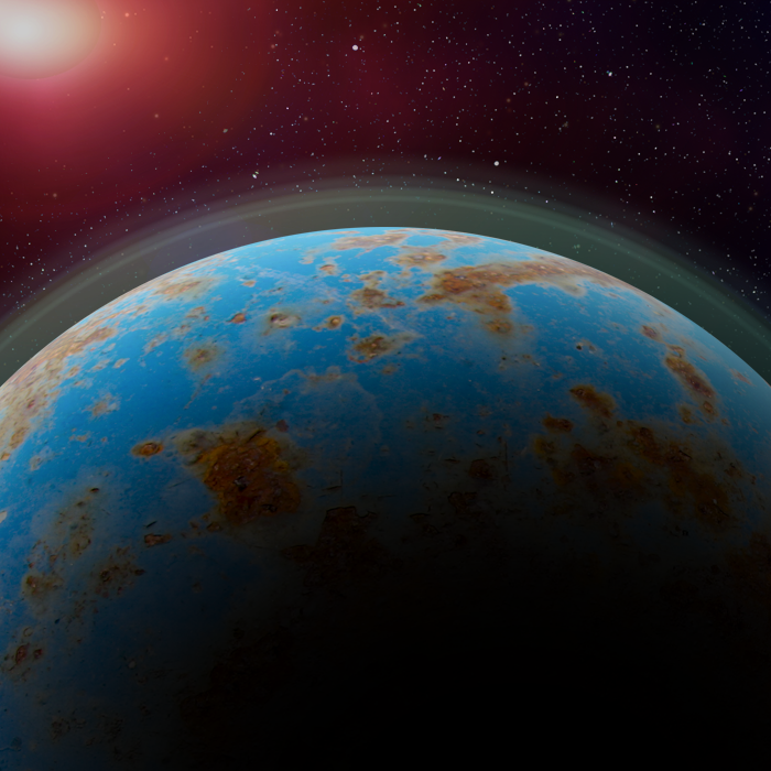
Note: this is a much simpler form of this tutorial from Spoongraphics.
The other night, a friend of mine and I were chatting, and she complimented something I’ve been working on (but haven’t yet posted). And I said, “ehh, it’s just a dumpster.”
She replied, “I would not have assumed dumpster.”
So, here’s my dumpster space scene mini-tutorial.
- Acquire a photo of a rusty dumpster. I used this one ($3), but many others are out there. Or—take your own! I used a blue (sea) + rust (land) combo, but there are many other combinations that work. Scratches, however, make it seem unrealistic (though you can mend those in Photoshop).
- Cut out a circular piece that you like the water/land shapes on. Spherize (in Photoshop: Filter > Distort > Spherize). Rotate it, if desired, to put the elements where you most like them. (I didn’t bother with this.)
- Create a black area the same size. Gaussian blur it with a big blur. Then blur it again. This is the most fiddly part, and you’ll need to fuss with it to make it look realistic.
- Expand the shadow region until it looks right.
- Add inner and outer glow to the planet so it has atmosphere.
- Find a good lens flare photo. I used one from Photography planet I had lying around and used it at 80% normal blend mode.
- A good background is black or near-black, and has stars. I happened to use one from here. You can use brushes to make star patterns, or use photos of sky or nebulae—whatever.
- I added a different layer above the lens flare, set it to lighten 70%, then filled in a few places (atmosphere, flare itself) with 50%, 70%, or 100% black to keep the stars from peeking through.
From there, the Spoon Graphics tutorial has lovely ideas on how to make the whole thing more realistic, including adding clouds and stuff.
Jul 2014: Mockup: 307 Ale Bottles
I found this beer bottle mockup last night, and thought I’d have fun with it.
Catch is, this particular product would probably be better vended in something stranger—like a Klein bottle. Oh well.
Click for full size:
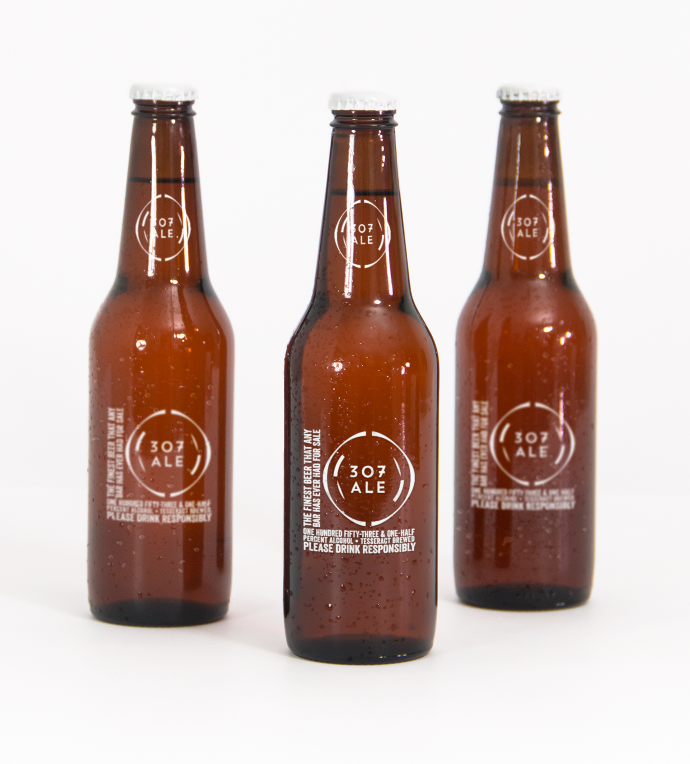
It’s an homage to a Tom Smith song of the same title:
There’s many drinks you’ll drink, me lads, but this one beats them all.
One hundred fifty-three and one-half percent alcohol,
A beer brewed in a tesseract, it’ll shoot you through the roof,
And if you don’t believe me, I’ve got lots and lots of proof.
Graphic Element Credits
Font: Veneer by Yellow Design Studio I love this font, use it all the time.
Logo font: Trend Handmade by LatinoType
(Both of the above via Design Cuts, as usual.)
Beer Mockup: Original Mockups
Logo: 12 Sci-Fi Badges from VoxelFlux
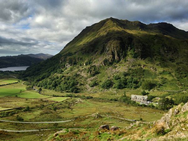
Jun 2014: Welsh Countryside

Taken on our day outing after Milford.
May 2014: Car Crusher Grunge
This is a photo from a visit we took to the Military Vehicle History Foundation. It’s the battering surface of an M60A1 tank that’s privately owned. Every once in a while, they’d throw a party, invite people over, bring a couple of car wrecks up, and run over them with this tank.
This is what you call hard-earned real grunge texture.
May 2014: Coming Monday: "Tool of the Matriarchy" T-Shirts
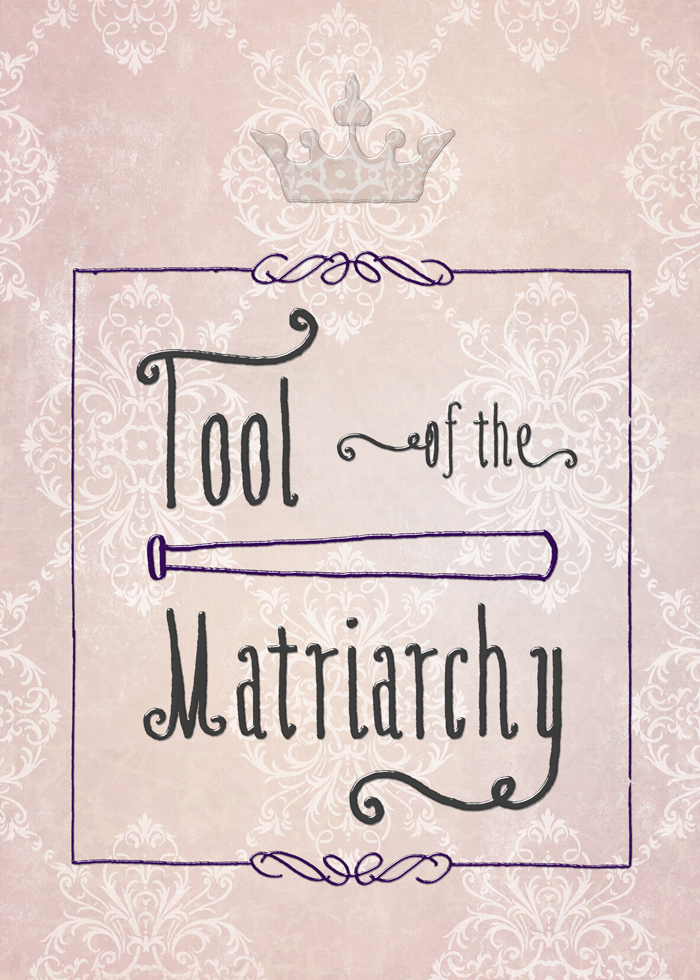
“Tool of the Matriarchy” is an expression mentioned in the series of John Scalzi’s tweets that led to the “Traitor to the Mens” t-shirts.
I’ve been working on getting the right look to try to communicate the intended tone with something that’d print well. I just haven’t been feeling really well (yay fibro), so I’m going to take the weekend off and have it ready Monday morning.
I’m really enjoying this t-shirt thing. Back in the day, I used to do abstract screen prints in like 5-10 layers and print my own shirts, doing all the photo separations myself. I’ve always enjoyed screen printing, though I haven’t done any in ages.
Then, once upon a time, there was a very limited series of Deirdre’s Pet Geek t-shirts.
I’ve designed other t-shirts, including a convention t-shirt for BayCon one year, and a couple of commissions over the years.
May 2014: Deviant Art's Dark Patterns: Ripping Off Indie Artists
Rismo made this rather awesome piece and posted it on Deviant Art. Hot Topic started selling the t-shirt.
No one paid Rismo.
Did Hot Topic rip off Rismo?
See below for update.
Here’s DA’s Submission Policy.
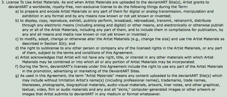
Check out d:
the right to sublicense to any other person or company any of the licensed rights in the Artist Materials, or any part of them, subject to the terms and conditions of this Agreement.
and 6:
6. Payment Unless otherwise agreed between Artist and deviantART in a writing from deviantART, the license granted to deviantART under this Agreement is royalty-free.
Royalty. Free.
In other words, by uploading your artwork to Deviant Art, you allow them to sell to Hot Topic—and anyone else worldwide—and pay you nothing.
And there’s no way to opt out, at least not on my account.
Update: Deviant Art’s Response
We intend to employ similar methods to allow syndication of art work, like the daily top favorites and even the ability to stream your gallery to your personal website. We couldn’t do this and things like this without third party rights because RSS feeders, blogging services and the like are third parties.
So they say that it’s just for promotion of your work on DA via normal service-type operations that involve DA.
Fact is, though, they absolutely could do what was originally claimed if I’m reading the submission terms correctly.
Update 2: Deviant Art’s Denial of Art Sale to Hot Topic
Text here. Thank you to commenter Kira Spoons for finding it, as I hadn’t checked up on this topic today.
Still, 3d of their submissions policy is overly broad and appears to permit that royalty free.
Apr 2014: Scalzi "Traitor to the Mens" T-Shirt & Prints
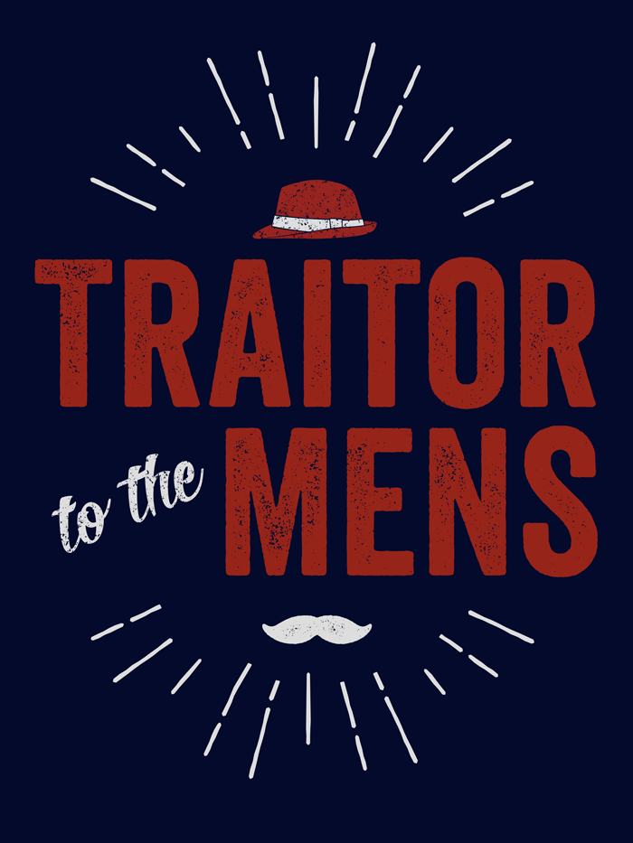
Available now: dark background t-shirt, light background t-shirt, and prints, stickers, posters, and cards.
If you need a size bigger than 3x or don’t like American Apparel shirts, then I also put them on Zazzle, which is slightly more expensive than Redbubble. dark background t-shirt, light background t-shirt.
John Scalzi said: I think I’m going to make a t-shirt that says “TRAITOR TO THE MENS” on it.
I offered to do the design.
He replied: DO EEEET
So here we are. Here’s John Scalzi’s background story for the phrase.
I offered in part because the very night before I was on a graphics site and had skipped over a free mustache graphic element because, and I quote, “I’ll never use that.”
When Scalzi mentioned the t-shirt idea, of course, it was the first thing that came to mind. As it turns out, I didn’t use that one I’d seen, I used one in a font I had.
Plus, thanks to Design Cuts and their awesome graphics bundles, I had—no joke—twelve gigabytes of new graphics toys chomping at the bit waiting to be used. I really wasn’t kidding about collecting grunge textures.
I want to give credit to the designers for the elements I’ve used, top to bottom.
- Sunburst, from Outdoor Logos by Ian Barnard of Vintage Design Co. (Purchased as a part of a Design Cuts bundle.) Initially, I just wanted a sunburst as a design element, but then I realized the kind of people who think feminist men are traitors are just, well, puckery assholes. So there you have it.
- Fedora, from Shona Dutta’s Retro Hats collection. Hey, someone local to me!
- Veneer font, from Ryan Martinson of Yellow Design Studios. Purchased as a part of the Design Cuts Monster Creative Font Bundle which is a great deal. While it’s a past bundle, if you buy the current bundle, you can also buy this one if it floats your boat. I love this, so I’ll talk about it more below.
- Roverd font, from Dexsar Harry Fonts. (“to the”) Indonesia represent.
- Veneer Extras font, also from Yellow Design Studios. (This is the mustache.)
- Grunge texture is from Vintage Textures by Ghostly Pixels, used on the fedora and “to the.” (Purchased as a part of a Design Cuts bundle.)
- (paper goods only) See the chalkboard in there? No? That’s the beauty of textures. It doesn’t have to be obvious to add to the whole. From Bruno Maioral/BMachina.
- (paper goods only) The book-like texture is from Cruzine. (Purchased as a part of a Design Cuts bundle.) I tried a bunch of textures, but I liked the feel of this one.
- (paper goods only) The folded paper texture is from Simon Berkey Hartmann/The Shop. (Purchased as a part of a Design Cuts bundle.) Metaphorical nod to the well-worn arguments that follow only a few lines of thought.
Veneer and Why I Love This Kind of Font
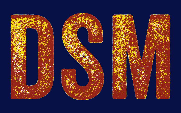
Bottom type layer: Veneer, color white.
Middle type layer: Veneer 2, color yellow.
Top type layer: Veneer 3, color red.
Cool effect, huh? That’s just three of the six variations. That said, I didn’t think multiple colors worked as well for the t-shirt. Usually, you’d use colors closer together, too, but I was illustrating the concept rather than using it in a larger design.
Mar 2014: Expressiveness and Disbelief
I’ve been kicking this post idea around in my head almost a year, ever since I sat in front of a computer working on a fan site wondering if I’d gone mental. Adding to the surreality was working at a glass desk over the shallows of the Indian ocean — hardly normal for me.
Backing up a bit, several of us were fans of a particular actor and role on a particular show that was, as is often the case, canceled. It was obvious the actor in question hadn’t found additional work in the US and would return home to Australia soon. One night, a Twitter direct message conversation spawned between myself and another fan, and I up and registered a fan site domain on the spur of the moment.
The Site That Almost Wasn’t
The following morning, I was scheduled to leave for Tokyo.
No worries, I thought, it’s a few bucks. If I still think it’s a good idea in when I arrive in Tokyo, I can do something about it.
Or, you know, not.
Honestly, I almost didn’t. It’s putting one’s self out there a lot and it’s a lot of work, not to mention an implied ongoing commitment. Making a fan site is adopting someone as “your people,” only they don’t really get a say the other way.
Plus, back when I was a teen, a friend of mine and I were singing at Disneyland in the annual Christmas Hallelujah Chorus thing, and Jimmy Stewart was the big actor there that night. My friend was a total fan. Just loved him. Unfortunately, he was a total jerk that night, and it broke her fannish little heart. Sometimes, we’d rather keep our fannish things to ourselves.
From the other end of things, I remember the first time I saw a positive review for one of my pieces. I was stoked. This person probably will never understand why I think they are so totally awesome—even if they never feel the same about anything else I ever do.
Back to the site…I got to Tokyo. Kinda freaked out. Emailed someone who ran a different fan site:
I’ve just bought a domain for a Ryan Johnson fan site, but it’s the morning after and I’m having cold feet, so please tell me that you’ve had some positive feedback from someone other than me. 🙂
This is where people you don’t know from Adam will leap to help you.
Most people in the limelight are happy with a fansite, as long as it goes easy on the gushing, treats them as human beings without objectifying them and respects their private lives.
Which is really good advice for dealing with anyone, and not different than I’d planned. I can’t handle the fan sites that are populated by stalkerazzi photos. I hope that fan site runner gets some happy feedback from their person eventually.
However, it was a couple more weeks before I told Rick about the fan site, though that was partly because I was in the Maldives and he was not….
Stuff I Learned
I’ve always thought of myself an audio person rather than a visual person. In high school, I was in band, marching band, orchestra, dance band, and choir at the same time. I studied sound recording (audio and film) in college. I’m generally more interested in how someone sounds than how they look.
I’ll often identify actors by voice long before I recognize their face (due to lighting, makeup, and the general chameleon-like nature of actors in their profession).
However, suddenly having (way) more than a thousand pictures of an actor’s career in front of me and having to pick and choose which made the cut and which didn’t — things started to click.
I’ve never really liked animated movies. Sure, I can enjoy them, but I never deeply bond with them. If you asked me why, I’d have said: the limited facial expressiveness doesn’t bridge my suspension of disbelief.
And that’s true, as far as that answer goes, but the real answer runs far more deeply than that, and I really had never put two and two together.
People’s facial expressiveness mattered to me far more than I realized. I tend to take people at face value, and I realized that I was getting far more of that “face value” from facial expression than I’d been aware of.
I started thinking about people I liked—the colleague you joke with, the person who sticks out at an event you attend—and realized that many of them had more expressive faces than average.
And, unfortunately, people whose faces are less expressive than average are generally people whose faces aren’t as memorable for me unless they say something that’s particularly memorable.
As I sorted through the pictures and tried to get good screen captures for the fan site I was building, I finally understood a whole lot more about why I hated YouTube so much, why I preferred Vimeo, why I liked BluRay and hated standard def, and why I generally loathed streaming media. The lossiness of video, particularly streaming formats, cuts a lot of the facial expression detail. I kept feeling like I was watching Odo from Star Trek: Deep Space Nine when his face was melting—not because of any issue with the acting or production, but because of the quality of the video I was viewing.
So while the fan site wasn’t a project I undertook to understand more about myself—it really was “Dude, I love your work”—it helped anyway.
I was nervous and strung out about announcing it, but he was very kind. It’s hard to pick a favorite out of all the pictures, but this one’s on my short list.
Mar 2014: Two Volcano Pics
Kilauea, of course.
Except for being resized, these are straight out of camera. Taken in 2010. These were taken with a wide-angle (28mm) lens half a minute apart.
Feb 2014: Four Hugo Awards Recommendations
Best related work: Fic by Anne Jamison, a history of fanfiction.
Best fan artist: Randall Munroe. Last cartoon of the year is 1311 and first of 2013 was 1155 (thank you @xkcdfeed). Three of note: 1158 (it’s all about physics), 1167 (Star Trek Into Darkness), 1177 (Time Robot). For those who feel he isn’t eligible, he was ruled eligible in 2011 and the rules have not changed. Further discussion here.
Best dramatic presentation, short form: Flying Tiare by Matthieu Courtois and Ludovic Allain. Made as a fan film for the airline’s 15th birthday, it’s a real look at the technology and work of commercial flying. The really cool part, though, is seeing someone go up into the jet engine and get to see the (running) engine from the inside.
I’d already posted a recommendation for: Short story: “The Slow Winter” by James Mickens, so just a reminder.
The Cambellian Anthology
The 2014 Cambellian Anthology is out! It features 860,000 words (eight-ish novels in size) from 111 different writers who are eligible for the Campbell award this year. Totally, completely free.
I want to offer my immense gratitude to Stupefying Stories for this. More than any other single award, I try to be well-read for the Campbell, and it used to be a real chore before Writertopia started keeping the eligibility list. Stupefying Stories took it to the next level with the clever idea to have an annual anthology.
Also, immense gratitude (and props) to the authors and publishers who’ve permitted their work to be included.
Special shout-out for Brooke Bolander, who is one of the eligible.
Addendum
Best dramatic presentation, long form: Sharknado. As billed. Loved it, and I’m not normally up for this kind of thing. Definitely smarter than it had to be.
Feb 2014: Society6 Art: Iceplant
Based on seeing a friend’s pieces on Society6, I decided to start uploading photos there for sale in various forms. They have prints, iPhone cases, computer cases, pillows, tote bags, and stuff like that.
My first piece (my plan is to upload one per week) is called Iceplant.
I know, I know, it doesn’t look like iceplant, right? I prefer to think of it as iceplant in someone’s acid trip.
Actually, the photo is really of iceplant. Rick and I were walking around Pigeon Point Lighthouse one day. I had my finger on the shutter button, as you do, and misstepped, setting off the trigger. I got a lovely streaky blurry photo of a patch of iceplant.
Honestly, it really wasn’t very fetching, but there was something about it, so I played with it.

My friend Joe (zeruch) also has a shop on Society6, and I like this piece in particular. Note that some of his figurative work is NSFW, but I’ve linked to an abstract. I think it looks pretty awesome as a pillow or clock.
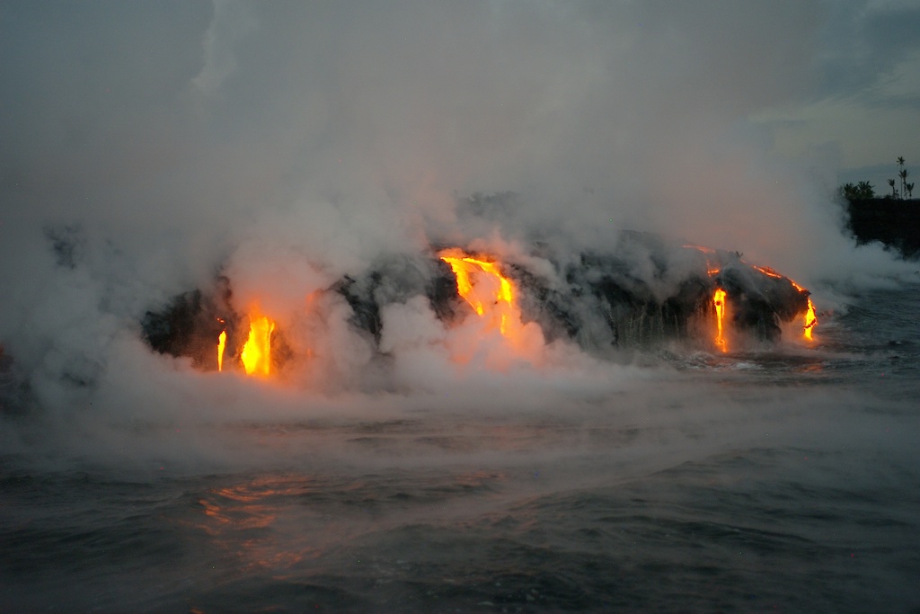
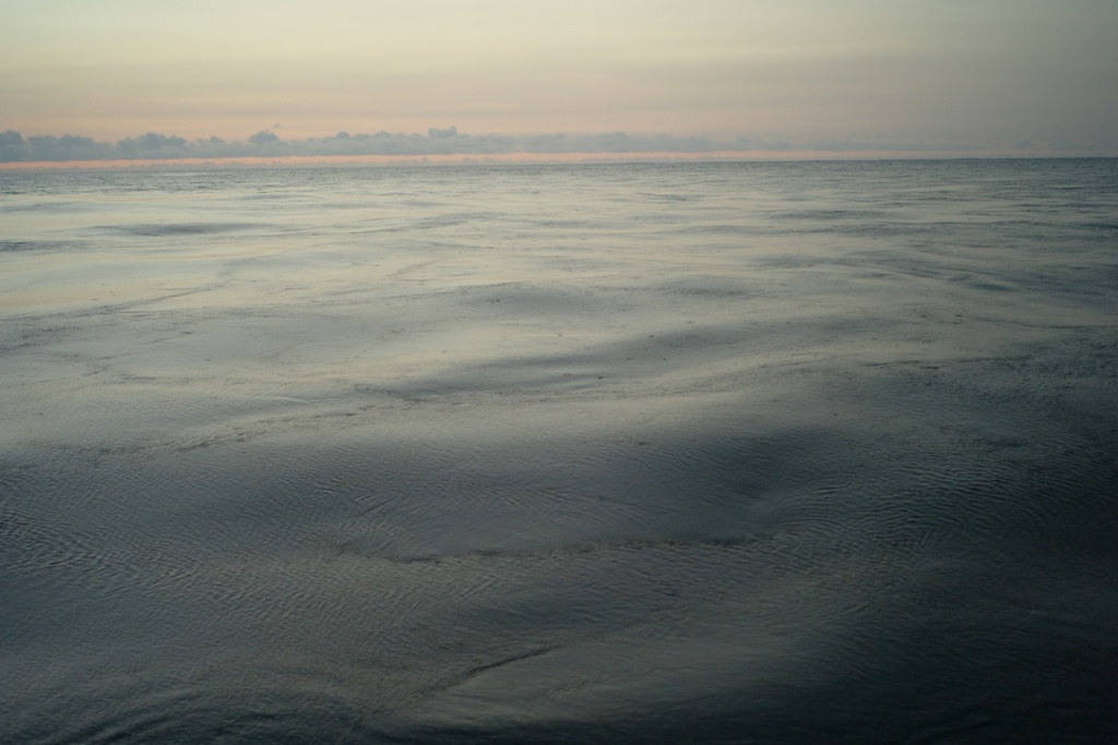
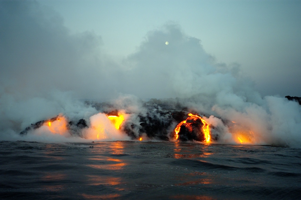
Feb 2014: Here, Have Some Lava
Taken Nov 22, 2011. I drove as far south as one could go south from Pahoa, which is south of Hilo on the big island of Hawai’i. The road ends near Kalapana, then there’s a dirt road that other cars were going on, so I went too. (Never a great idea.)
The “dirt” road turns out to have been a paved road that lava flowed over. A few hundred feet back, there’s a bit of road again, leading out to a parking lot ending in a guard shack with a bunch of scary signs. I parked there and got out, went to the guard shack. He made sure I knew where the safe boundaries were and that I had water, sunscreen, and a hat.
Walking in the sun on a Hawai’ian day is brutal enough, but the black lava just soaks up heat. As if that weren’t enough, you’re not actually that far above the actual real hot lava flows that are probably radiating even more heat.
Despite my SPF 85 haole basting sauce, I managed to get a sunburn.
Oh, and I’d been very close, only a few hundred feet away, the year before. Here’s what the view looked like from offshore back on Nov 23, 2010:
Jan 2014: Fun with Paper
Paper is an iPad app from fiftythree.com and it’s pretty awesome. So when my mom asked me what I wanted for Christmas, for once I actually wanted the stylus designed to go with it, Pencil. It’s got extra features when used with the Paper app, but it’ll also work as a regular stylus.
Now, I can’t draw for crap (though I have resolved to learn to draw better), but I had a lot of fun making this little pic.

Jan 2014: Bora Bora

Dec 2013: It Wasn't Always This Red
Because reasons, I started turning grey at age 16. Yes, in high school.
Early on in my software engineering career, this helped me because it made me look more experienced than I actually was.
A few years into my career, I was seriously dating a younger man, and it made him insecure because of my older appearance. He asked if I would consider coloring my hair. Note that it wasn’t a demand, just a request.
My natural hair color was a dark taupe, and I was never really happy with it. My skin color has a lot of red in it, and the lack of red in my natural hair color made it look odd. For a while, I tried to change my face color with makeup, but that looked even stranger to me. So I picked a random temporary dye color that I happened to like most. I didn’t think a lot about it, just grabbed a box.
He hated the color. Worse than the grey in his book. However, I happened to like it more because it went better with my coloring, and I’ve pretty much stuck with a similar hue ever since, though I do mix it up from time to time. Needless to say, the relationship didn’t last, though it wasn’t because of the hair color.
A few years ago, I decided to grow it out, then did a purple temporary color for a while. Here’s a picture of me after that had mostly washed out.
But here’s the look I prefer: 
(I don’t always get to go to my favorite salon, Shear Perfection in Hollywood, but I did that time.)
Note: This is my reaction to one of Jenny Trout’s tweets.
Nov 2013: 2014 Calendar: My Travel Photography
I started making calendars in iPhoto in 2007, using travel photos for the year.
I didn’t make one the last two years, which is really a shame, so this year I relaxed my rules a bit. Normally, I want photos from December of the year before to November of the current year for next year’s calendar, and I try to show the diversity of places we’ve visited.
This year, the goal is to show as many of the Travelers Century Club regions as I’ve been to in the last couple of years. Most of these are iPhone photos, by the way.
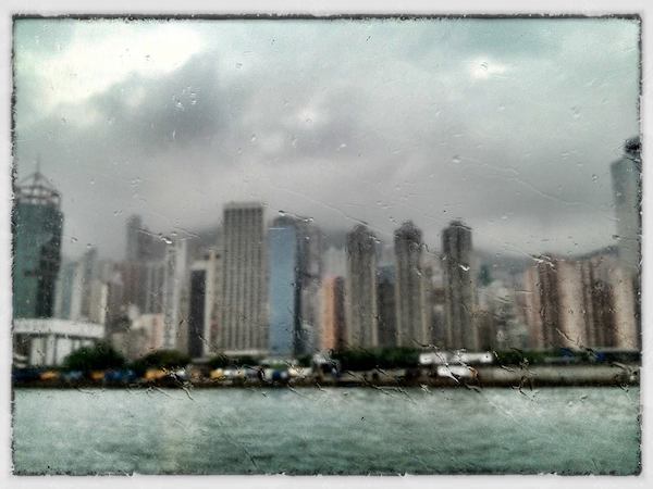
Cover photo: Hong Kong (June, 2012), Asia
This photo was taken from the Macau ferry on what was obviously a very wet day. The focus on the window was accidental, but it was a happy accident.
January: Chuuk, Federated States of Micronesia (January, 2013), Pacific Ocean
This photo was taken out of the window of a United flight as we were landing in Chuuk. In my case, I continued on to the next stop, Pohnpei, which became one of my favorite places in the world.
February: Narita Hilton Wedding Chapel, Japan (January, 2013), Asia
Finally a use for the oil paint filter in Photoshop!

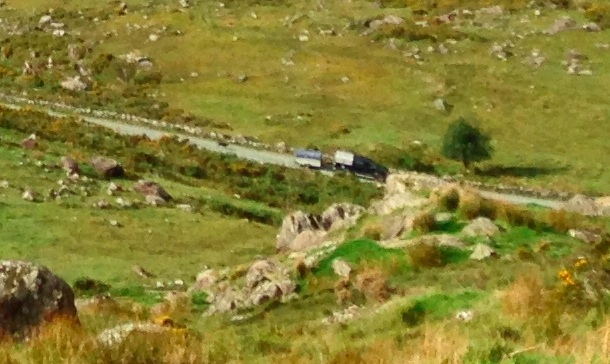
March: Wales (September, 2013), Europe
After Milford, we did a field trip around Northern Wales. I need to figure out where this was on the map. What’s not obvious from the big shot, but is in the detail below, is the dog chasing the vehicle.
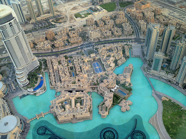
April: View down from the Burj Khalifa, Dubai (June, 2012), Middle East
In my only visit to the middle east (yet), the group tour to the Burj Khalifa was definitely one of the highlights. The wind was pretty fierce, and I was afraid I was going to drop my iPhone from the tallest building in the world.
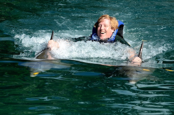
May: Rick Swimming with the Dolphins, Tortola, British Virgin Islands (December, 2012), Caribbean
Professional photo, and the best of the lot of them. They have other locations (and there are other providers), but this was a lot of fun. Our first SeaDream cruise, and we loved them so much we ripped up our other cruise plans and rebooked.
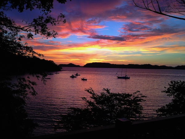
June: Sunset, Guanacaste Region, Costa Rica (August, 2012), Central America
Picture was taken on one of my several crazy miles-using trips last year. Out on a Friday night red-eye, arrive in Central America around noon, take the noon-ish flight home the following day, arrive home Sunday night. Total trip time: around 48 hours, of which half was spent on a plane. Crazy. This trip cost me about $150 (plus miles and points), and most of that was the shuttle to/from the airport.
After one of these weekends, one of my coworkers looked at me Monday morning and said, “Oh, look what United dragged in.” That’s about how I looked, too.
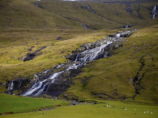
July: Waterfall, Faroe Islands (September, 2012), Atlantic Ocean
I like weird cruise itineraries, so we went on one from Denmark to Norway to Faroes to Iceland to Scotland to Ireland and back to Denmark. Some of the seas were super-rough (even I got seasick and I’m not prone to it) and it was bitterly cold at times, but we got to go to some awesome places and have some awesome pictures to show for it. The Faroes were amazing.
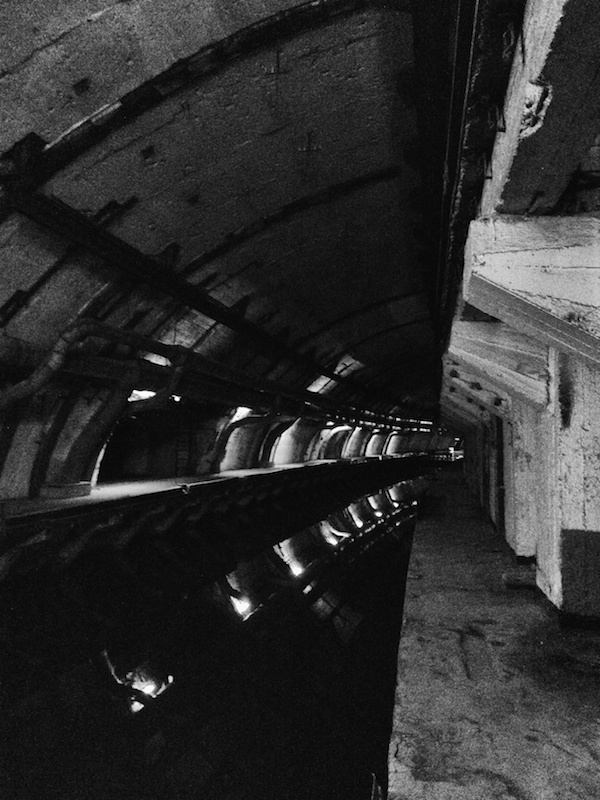
August: Ex-Soviet Submarine Base, Balaklava, Ukraine (June, 2013), Europe
We missed BayCon this year because we took a Black Sea cruise on Seadream. It was a very similar itinerary to a cruise Rick had taken before the collapse of the Soviet Union–just a very different cruise for him. For me, it was all new. This place haunts me. It was very strange to be walking through a place that was built to withstand such high megatonnage blasts and staffed by 1000 people. Because they were afraid of us.
Here’s a link that gives more context to the submarine base.
Another SeaDream cruise.
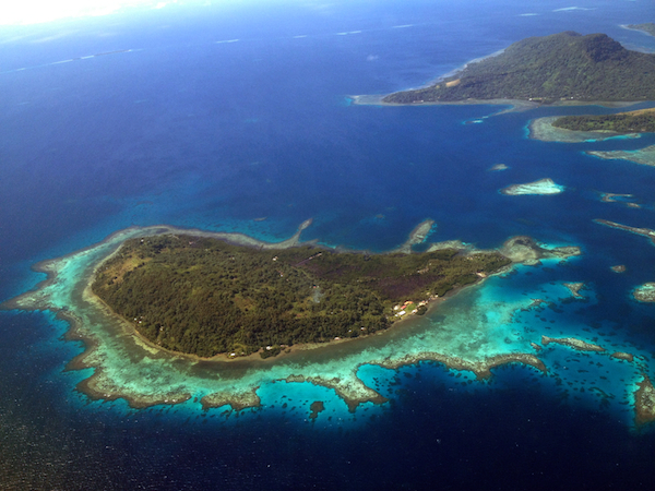
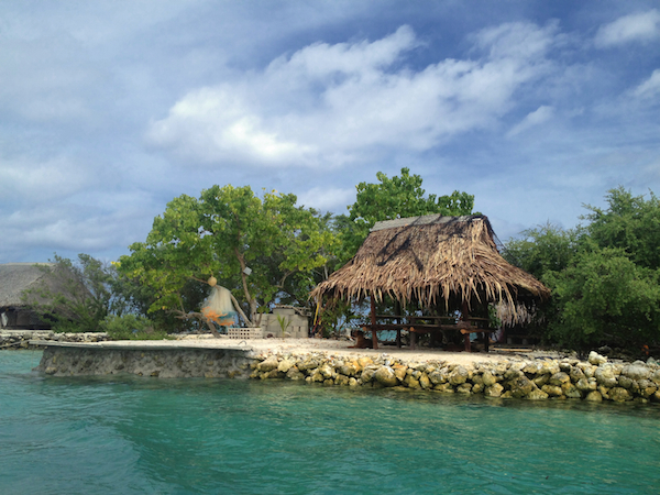
September: Island in the Lagoon, Pohnpei, Federated States of Micronesia (January, 2013), Pacific Ocean
This is about the entire size of the island: a small house, a thatched-roof outdoor picnic table (with a dog underneath), a fishing net to catch dinner, a handful of trees for shade, and a ledge to make getting on and off a boat easier. Someone really lives there.
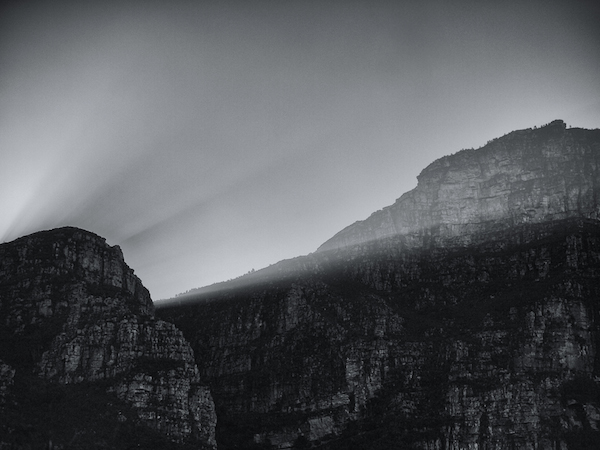
October: Sunbeams on Table Mountain, Cape Town, South Africa (July, 2013), Africa
My third trip to Africa, but the first time I got to see any impressive mountains there.
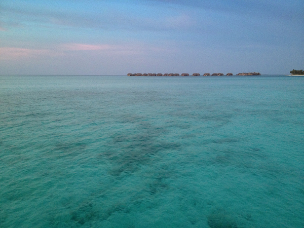
November: Sunset, Maldives (April, 2013), Indian Ocean
Taken from my own over-water bungalow at the Conrad Maldives.
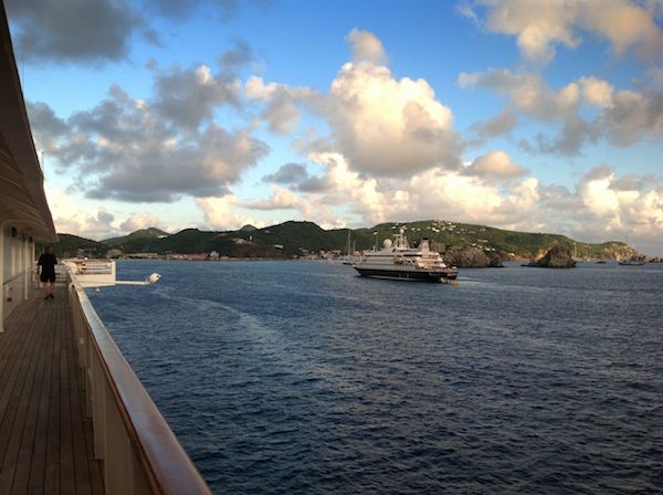
December: Gustavia, St. Bart’s, French West Indies (December, 2012), Caribbean
I thought it would be kind of cool to have the calendar end with Rick walking away, sort of a metaphorical end of the year. The ship in the harbor is SeaDream II, and we’re on the sister ship, SeaDream I.
I learned that one of the yachts we saw had anti-paparazzi lasers. Way.
Back Cover: First Man, Street art, Brisbane, CA (July, 2011), North America
Taken in an old burned out building in Brisbane, this remains one of my favorite photos. Here’s the original version of the photo, though I prefer the highly-processed version.
Oct 2013: Usability and Contrast Loss
My father, Owen, is legally blind due to contrast loss. This is not your typical form of blindness. Essentially, everything mushes into grey. Note that some contrast loss with aging is normal, so the problems noted here do affect many people as they age, just not to the same degree.
When I first saw iOS 7, I knew it would be a problem for him and that he would not be able to see it as well as iOS 6 (which had problems, too, but fewer of them), but I didn’t want to make assumptions about what specifically was a problem until we’d had that conversation.
Last night, I managed to talk to Owen long enough (before the call dropped) to get some of his complaints.
Specifically, he can’t see the UI to unlock his phone. Let’s look at the before (iOS 6) and after (iOS 7) examples here:
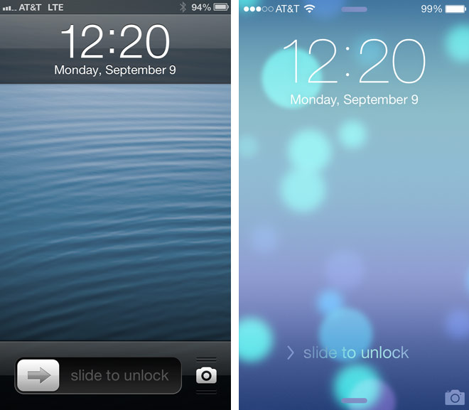
(image from wired.com)
Now, imagine that you’re only able to see high-contrast well, like Owen is. Which has greater accessibility? This is an effing lock screen, people. No one should have to go around with their internet pants down because they’re blind.
This is actually a really good argument for the iPhone 5s: it doesn’t matter how awful the accessibility is on a feature if it’s irrelevant. So, I’m going to help my dad get an iPhone 5s and set it up.
After my complaints on Twitter, several people suggested that Owen go into the Settings app and increase the font size and boldness.
Exercise for the reader:
- Assume you’re legally blind from contrast loss (and haven’t locked yourself out of your phone because you’re blind).
- Find the Settings app on iOS 7.

(clipped out of a larger image here)
Note how much less accessible (from that perspective) the iOS 7 icon is than the iOS 6 one is. Some of the iOS 7 icons are better, some are way worse, and some are about the same. This one is decidedly worse, and it wasn’t that great to begin with.
In addition to lower contrast, the detail is much finer, making it harder to see (than the iOS 6 icon) by most visually impaired people.
And that’s what the settings to improve accessibility are hidden behind?
Fail.
Now, let’s get back to the point about increasing the font size and boldness. In general, this never hurts. However, for someone blind from contrast loss, these options may not help. It is the contrast, rather than the font weight or size per se, that is the issue.
Looking up at the lock screen, note that the time is a larger font than it used to be. Assuming it were also the same weight, it would still be less accessible for Owen — because contrast is more important. Also note that shadows, gone from the iOS 7 UI, help define edges and thus improve accessibility for those with contrast loss. Personally, I like shadows so long as they’re not overdone.
Per Owen, it’s also easier to see white text on a dark field rather than dark text on a light field. For him, light-colored backgrounds flare. I don’t know if this is true for all who have contrast loss, though.
Sep 2013: Staircase iPhone/iPad Wallpaper
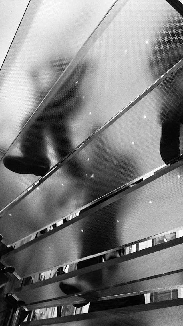
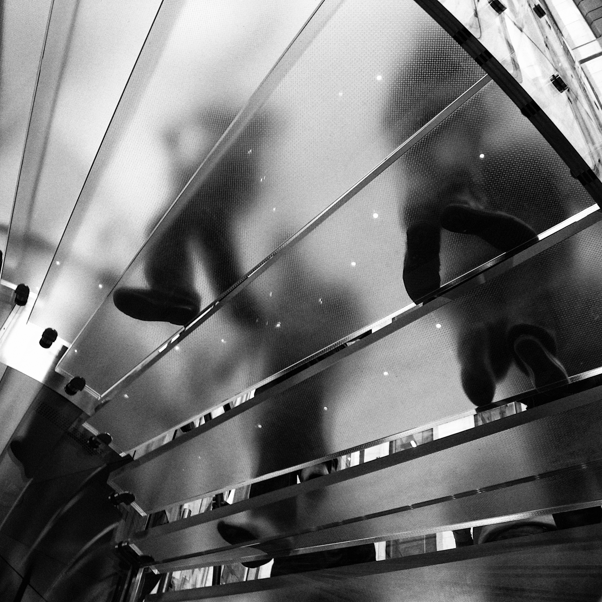
Rick took a great photo of the Apple store in Manhattan a few years ago, and I’ve been using a tweaked version of it (using Nik Silver Efex Pro) for my iPhone and iPad wallpaper for about a year.

Here are the files sized for the various iDevices. Feel free to use them on yours if you like.
iPhone 5 (640 x 1136)
Retina iPads (2048 x 2048)
iPad Mini, non-Retina iPads (1024 x 1024)
Sep 2013: Yahoo's New Logo — And Branding Changes
Almost invariably, I hate branding changes. Sometimes, they’re needed because of changes of business, but most are just sheer WTFery and large wastes of money.
But first, I’d like to incorporate this geeking out about Yahoo’s new logo by reference. There’s one quibble I have, though: I wouldn’t use the word “fashion” to describe Optima. I’d say “formal.” There’s a seriousness to it, but it’s also neither a fish-or-fowl entry in the serif vs. sans dichotomy.
It’s one of my favorite typefaces, and that’s one of the reasons I use it for the body text on deirdre.net. I use a funky serif font (Opuscula Serif) for the headlines, so the body text needed to be something that wasn’t quite the usual Helvetica or Times, but also needed not to be particularly far out there.
The old Yahoo logo wasn’t dated. It was friendly. The new one is just off-putting. Ugh. I feel sad for some talented designers, like Marco, who have to face that every day.
Here’s a branding change I think makes sense, even though I don’t like the logo change:
United Airlines had a classic logo designed by Saul Bass in 1974. It’s invariably referred to as “the tulip” logo.

I’ll skip a branding change here and go to the last pre-merger change to the monochrome tulip logo, which is my personal favorite.

Then there was the merger with Continental, which had the “lottery cage” logo (a change from their earlier “meatball” logo, which you can see on their wiki page).
So the goal was to really bring home that this was a merger. So the type saying “United” looks more similar to the historic look for United, but the tail logo was from the Continental side of the house. And there was much whining, but I actually think it’s brilliant integration of the history of both companies. They were keeping the United name, but they kept the significant part of the Continental logo: the tail of the plane.

This is the rare case where a logo change made unambiguous sense (more so than the similar change American made to their long-standing logo).
But Yahoo’s? Makes no sense to me. Being different isn’t being better. There are far more ways to fail than there are to succeed.
Aug 2013: Review: 20 Feet From Stardom
20 Feet From Stardom is an awesome documentary about backup singers and their trials and tribulations.
It has some awesome interviews, awesome footage, and, well, if you needed to think Phil Spector was any more of a bastard than you already thought, this film will provide you with a different kind of rage.
There are amazing performances. While it’s not exclusively about backup singers who are either women or people of color, the film focuses on the careers of six women of color. The youngest of the six is Judith Hill.
It’s this kind of movie that makes me really sad that I never really figured out what I wanted out of a musical career back when I was a teenager and in my early 20s. I never had a clearly-enough defined goal that I had something to aim for. Plus, I loved rock music and played (mostly) alto sax, but wanted to sing, and it just seemed all too confusing — like I had the wrong skill set.
In high school, I was in band (alto sax), marching band (alto sax and piccolo), orchestra (viola and oboe), dance band (baritone sax), and choir (first soprano) at the same time. I studied sound recording (audio and film) in college.
Despite a phone call with the man, one of my greatest life regrets (of which I have a handful) is not taking up Malcolm McLaren’s offer of an audition when he was trying to put a band together. I don’t think I would have gotten the gig, but I’ve always regretting not having the nerve to fly to London and have a go at it.
A couple of years later, I was offered a gig as a motion picture sound intern on a friend’s project, and I turned down a gig (a sure thing) to go to France to work on the film.
Those of you who know me will say, “Wait, Deirdre, that doesn’t sound like you at all.” Yes. That’s true. Regret changes you.
Each of the amazing women in this film have had victories and setbacks, and they’re interesting to hear about. Highly recommended.
Feb 2013: Artist: Art vs. Reality
My dad was a physicist. He’s retired now, but when I was a kid, we’d go out to a pizza place, he’d bring a lab notebook, a slide rule and a calculator, and he’d write equations and notes in it. Sometimes, he’d write jokes.
His entire work life is in those notebooks: everything from Synchrotron experiments to the work he did on the Viking Lander’s GCMS project to the TOMS project (for which he won a NASA prize) to the Hubble Space Telescope, just to name a few projects he’s worked on.
The notebooks were a good chunk of his work product, but they’re not that comprehensible to the uninitiated. It’s not like the next-door neighbor back in Vermont, a farmer, who used to take his kid out on a tractor with him. That kind of work is far more comprehensible to outsiders.
So I suppose it’s no surprise that writing as a career doesn’t seem odd to me. After all, it’s not that dissimilar to the scribbles my dad did in his notebooks way back when. It just has a different audience and result.
There’s a funny thing, though, about both acting and writing. It can be really difficult for others to know where the work ends and reality begins because we get so used to fluid movements in and out of artistic headspace. With actors in particular, that can include whole mannerisms and ways of being. (Maybe some writers are like that, too, but I’m not. I don’t think.)
I was in the shower one morning thinking about how a male character I was writing would approach women, and a thought came out fully formed.
My first reaction thought was, “Well, I’d never think that.” Quite aside from my being straight, I found his thought process compelling but repugnant.
Followed by the mental double-take because: I. Just. Had. Thought. That.
Once I got over my initial reaction, I found that it was comforting: I’d been able to distance the character in a way that made him easier to write now that I had a point of significant difference (from myself) to hang other actions on. I had bounced out of the art and bounced back in.
Sometimes, when others see us, they don’t know what part of us they’re seeing, and that can be disconcerting. It’s also easy to confuse the artist and the art.
With other art forms, the process and result is so much more concrete. My friend James (NSFW link), well, you never know where he is. “Where are you?” I ask. “On a hilltop on Maui chasing nude women on horseback.” Now, see, that’s a far more concrete thing than “I’m laughing my ass off in front of my monitor at two a.m. because I’m writing a funny scene that 61 people will ever read and two of them are in Malaysia.”
Feb 2013: Four Sunday Travel Moments
Confession: back in the day when I had custom-made suits, I wore men’s ties because they had better range and materials than the women’s offerings, plus they didn’t make one looked gift wrapped. I also, to this day, still covet one particular Italian silk man’s tie that a colleague used to wear.
One
As I’m getting up from the United club Sunday morning, a guy passes me and heads for the info desk, asking where his gate is. He’s dressed in a black wool newsboy cap, neatly trimmed brown hair, a grey seed stitch sweater that appears to be merino wool, nice jeans that are just a little too loose, and black short boots. He looks like he should be English, so I’m surprised by the American accent.
Two
I’ve left the club (he was still talking) and he breezes by me on the way to my gate, parting the crowd of no-status passengers to veer through to the elite line. As I’m also qualified to use that line, I follow him. He scans his boarding pass, and I see his first name’s Matthew. He’s also carrying a navy pea coat under his left arm, and in the right, he’s got a black Tumi bag with a copy of Esquire hanging out. As we walk to the plane, I have time to study his shoulders, which are awesome and broad. He probably wears an XL in shirts, but he has more of the build of a swimmer than a bicyclist. When we get to the plane, he turns left into first class, and I turn right into coach. (No upgrade for me.)
I wonder where he’s been traveling from that he needed both the sweater and the coat, because LA was cold, but not that cold. That a traveler like him had a paper ticket printed by a gate agent suggests that he’s been rerouted today.
Three
As I’m standing in the third row of coach to get out, I see him leaving the plane. Really nice tone-on-tone white jacquard shirt.
But that tie! Matthew, dear, you can do far far better than that tie. I don’t know what prompted you to wear a tie on a Sunday morning. You don’t strike me as a regular wearer of ties, which may be the problem. This one has the look of the “best a poor boy could afford for the high school prom” kind of tie, except that it at least looked like it was silk, not polyester. So it wasn’t a grade 1 fashion emergency, but it was a solid 2.
Dude, you read Esquire, how could you possibly wear a red-and-grey striped awful tie like that? C’mon.
Look, this tie is like carrying around that picture of the girl who dumped you after three dates in high school. At some point, you just need to move on. This is one of those times.
(There are nice red-and-grey striped ties, but this didn’t happen to be one of them.)
Four
Even though he got off the plane before me, I’m standing on the slidewalk on my way out of the airport. He breezes past me, brushing my hand with his as he passes. Definitely a merino sweater.
Oct 2012: Going for Memorable
Kate showed me this video of an an audition.
Not just any audition. One where a comedian with a character as a geek gamer crashes a music video dance audition and acts like a goofball (and specifically asks for a rules exception). Despite no formal dance training (but impressive dance skill despite that), he gets the gig.
It’s about rules, about expertise, about genius, about knowing when to throw away something perfectly usable and go for memorable instead.
There are a lot of solid, good dancers in the audition. No question. One comment, though. When people ask what reading slush is like, I point to the guy who does a solo right before Keith at around 47 seconds in. Imperfect execution, some solid grasp of concepts, but not able to stand out from the crowd.
For both of these, may be NSFW due to adult themes, but worth watching when you can.
And the resulting video, clearly re-written to take advantage of their new dancer…..
Oct 2012: In Bruges
When we were in Bruges, I heard what I thought was a pipe organ and headed for the campanile.
No pipe organ, just some awesome buskers. Enjoy. Sorry about the length of the clip — it had already started before I got there, and I was running out of space on my phone.
I think my single biggest regret of the entire trip is not picking up one of their albums.
Toccata & Fugue, Bruges from Deirdre Saoirse Moen on Vimeo.
Aug 2012: Earth: Time Lapse from the ISS
Great music (I recommend headphones), and if you have the bandwidth, do it high def and full screen.
Link to BoingBoing notes.
Only place I could definitively identify from this video without slowing it down was the Sea of Cortez, with Baja California closer to the center.

Nov 2011: Photo Friday: Hawai'i
Taken at the Hawai’ian Tropical Botanical Garden, just north of Hilo, on my trip last year.

Oct 2011: Photo Friday: Pug Dog In Chair
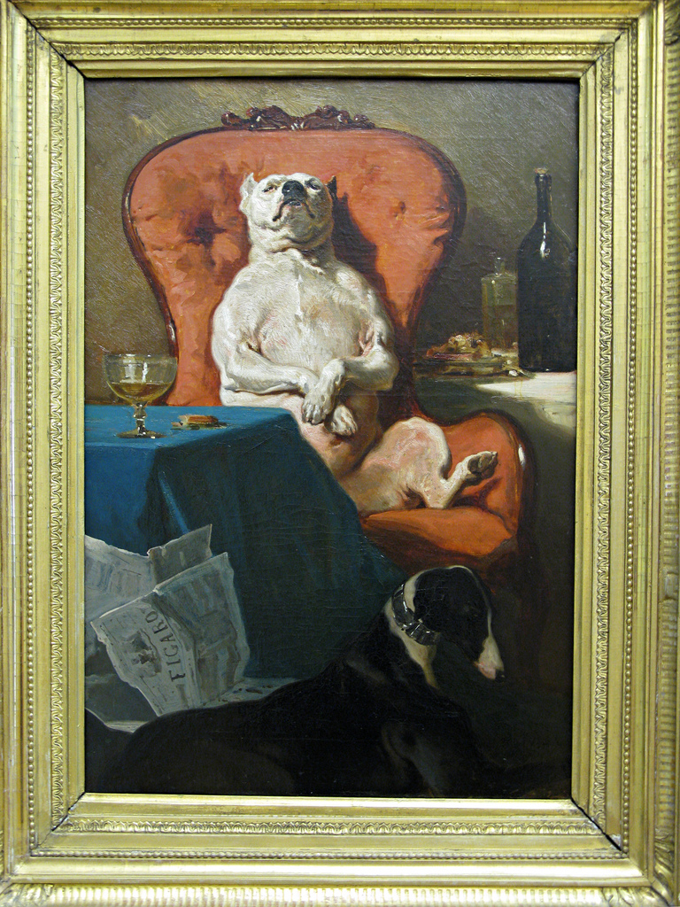
Photo taken by me at The Hermitage in St. Petersburg, 2008.
Oct 2011: Photo Friday: Antipodean Flower
I took this photo in 2010 when Rick and I visited the UC Santa Cruz arboretum, which specializes in southern hemisphere plants, specifically plants from South Africa, Australia, and New Zealand.
I used Nik Color Efex Pro to modify the photo from the original found here. The effects I used were Pro Contrast, correcting the color cast and brightness (with as little detail loss as possible given the great detail on the flower), followed by Vignette Blur to de-emphasize other elements. Nik’s products have rapidly become my favorite for photo editing.
Sep 2011: "A Landscape of Ruins" Show Opening
Today, the show with my photo “First Man” opens, though the reception is tomorrow.
Date: Tuesday, September 27
Time: 5-7 pm
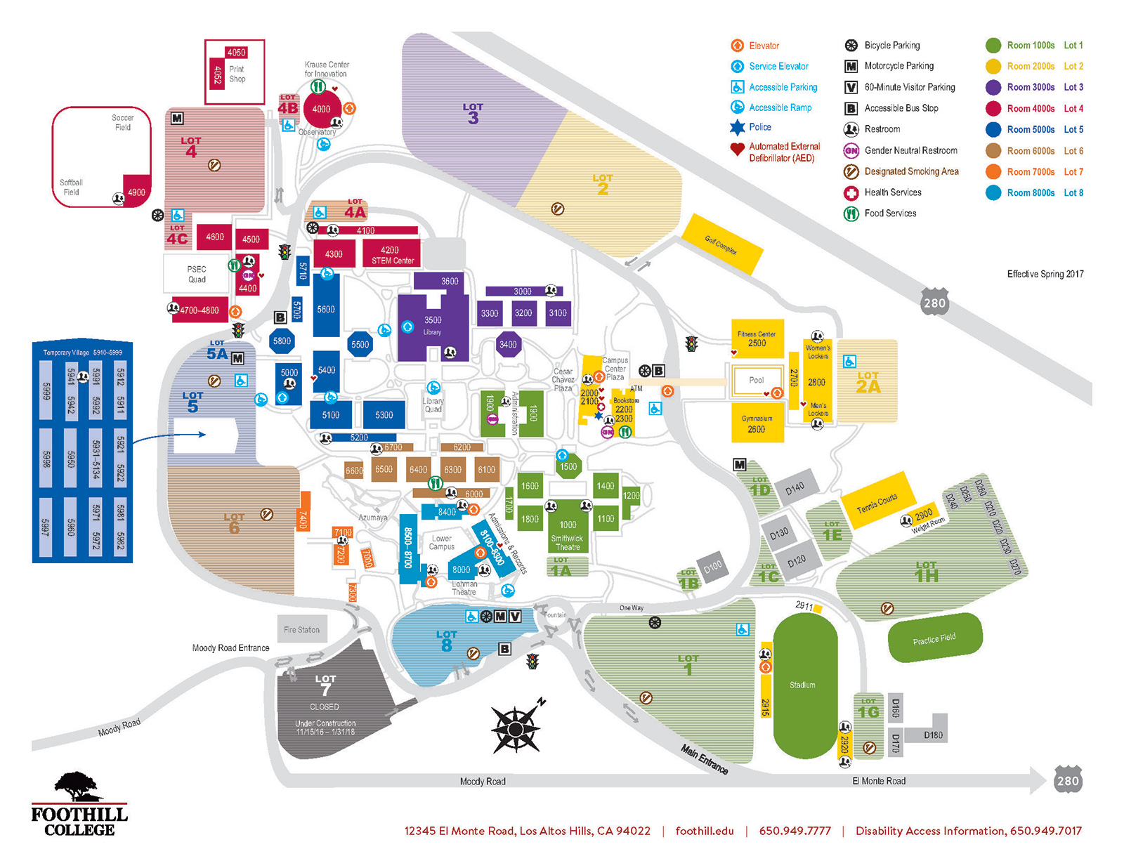
Place: Foothill college, building 6100, 12345 El Monte Road, Los Altos Hills, CA. Closest freeway exit is El Monte exit from I-280.
Parking costs $2 (in quarters) in marked spaces; handicap parking is free with appropriate handicap placard/plate. Parking logistics below.

Campus map here.
For handicap parking, lot 8 is your best bet (two elevators required), followed by lot 3-A, which is fairly level. However, campus construction may make 3-A impractical. Everything else is hilly or farther away.
Sep 2011: Coolest Video I've Heard in a While
Sound designer Diego Stocco plays a dry cleaner as an instrument.
Diego Stocco – Music From A Dry Cleaner from Diego Stocco on Vimeo.
Aug 2011: Urban Ruins Show
My photo, First Man, has been accepted for Foothill College’s Urban Ruins exhibit, which runs from September 26 – November 2nd.
I used two programs for this: Apple’s Aperture, which I used for straightening and cropping the image, and Nik Color Efex Pro, specifically the saturation stylizer effect.
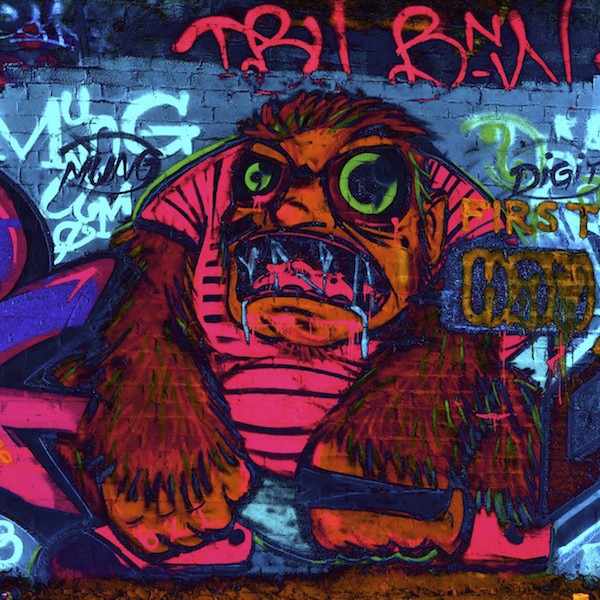
My thanks to Mung and Digit, whoever they may be, for such photographable street art.

Feb 2011: Early Plum Blossoms
 Usually we have plum blossoms sometime between mid-March and early April. This year, we’ve got them in early February.
Dec 2010: Bellingrath Gardens: Two
 So I turned a corner and saw this. Makes my sealife-loving self happy.
Dec 2010: Bellingrath Gardens: One
 Beautiful annual light display. I walked for hours.
Dec 2010: Fulton Street, Palo Alto
For the past 70 years, Fulton Street in Palo Alto has had an annual holiday light display. Rick and I walked the street for the first time, and I got a few shots I’m happy with.
Nov 2010: Venice Art Walls
 Saw a neat piece of street art in Venice today.
Nov 2010: Pigeon Point Lighthouse
 Every year on the anniversary (or close to it) of the first lighting, the fresnel lens at the Pigeon Point lighthouse is lit for a couple of hours. Hundreds, if not thousands, of people come to visit.
Sep 2010: Melbourne at Dawn
When we were in Melbourne, I woke up each and every day some time between 4:30 and 5:30. I’d go back to sleep, but it was odd that I woke up so consistently every morning at such an odd time. This is the view from our hotel room one of those mornings.
Sep 2010: Melbourne by Night
Melbourne, Australia has quite a few stunning features, one of which are these modern freeway overpasses lit inside in blue. I don’t know what to call them, exactly, so I’ve been calling them “hoops.” This was a rare break in the late winter cloud cover.
Aug 2010: Southern Hemisphere Plants
For the last two weekends, we’ve visited the UCSC Arboretum, which specializes in plants of the southern hemisphere, specifically South Africa, New Zealand, and Australia. One of my favorite discoveries is this Banksia. At first, I thought someone had added the brown “elf,” but then I realized it was a dried flower.
More photos.
Aug 2010: Photographic Revelations
One of the reasons I wanted a better camera is the options for faster lenses. Most point-and-shoot lenses are slow, slow, slow, and I'm a fast glass kinda gal. Sure, you can take brilliant photos with a point-and-shoot. This photo Rick took is an example:

Jul 2010: Our Garden
I got my new camera today, a Panasonic Lumix GF-1 in pink. I had to test it out, right?
So I took pictures of our garden, which can be found here.
Jul 2010: Thoughts in Camera
Three years ago, I bought a Canon SD 700 IS. As the saying goes, the best camera is the one you have with you. This whimsical shot in Heathrow airport is one of the first I took with it.

Last month, I got an iPhone 4. (more)
Jul 2010: The Joy of Fountain Pens
Sure, fountain pens are a bit fiddlier than your average ballpoint. But they do have their advantages.
- The colors you can write in is not a direct function of the manufacturer of the pen. Like the look of one pen and the ink colors offered by someone else? You can do that.
- More ink colors. For those of us with acute color discrimination, this can be really useful.
- Washable ink. For those unhappy accidents. Sure, some ink colors do stain.
- …which brings me to: waterproof and forgery-proof inks. Sure, there are ballpoints (Uniball Signo) that do that as well, but not in as many colors as are currently available for fountain pens. Note that these are not washable from clothing, so you can go to both extremes. Here are some torture test results.
I’ve seen fountain pens from $1 all the way up to “Oh my God!” levels, where that was seven figure to the left of the decimal point. Most expensive I’ve held in my hands was five figures. All of them can use the same inks.
Feb 2007: Great Photos of Africa
Grant Kruger found some fabulous aerial photos of Africa.
You know you want to see them.
Go look.
Now.