Bad Book Covers: Comic Exaggeration
06 August 2014
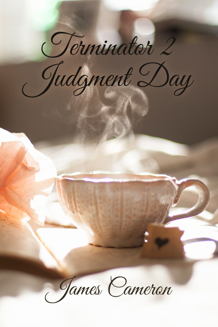
For Westercon, I made a Lousy Book Cover for comedic effect. After all, I had to have one to show at the panel, right?
So I picked a great photo. I picked a great typeface.
And deliberately made a grievous error.
Behold.
Courtney Milan Talks Type
I bring this up because Courtney Milan’s got a great blog post called How to Suck at Typography. Ironically, I missed it because I was at Typecon.
First, I absolutely love the Borges font she discusses. It’s called Desire. It is truly one of the showcase pieces of what can be done with OpenType.
What she says about free fonts is largely true, but there are some good ones out there. The one I used was Great Vibes, which is the free cousin to Good Vibrations. I mention this for a reason: sometimes there’s significantly better typographic features on the paid version of a font. And sometimes it’s the bad fonts that get thrown to the free bin. (Or packaged up by the hundred for seemingly low prices.)
Personally, I’d like less space between Te so it feels more like Ju. Similarly, I’d like a tidge more space between Da so it feels more like Ju. Given that the paid font seems the same at first glance, evidently the font designer disagrees with me on that point.
There Is One Point of Violent Disagreement, However
Font effects are the opposite of tasteful covers. They are harder to read at best, and migraine-inducing at worst. The worst fug in the world comes from font effects.
I’ll half agree with the last. Granted, she’s talking from a historical romance perspective.
I’ve been working on a poster off and on for a month. I just couldn’t get the right approach to say what I wanted to, so I put it away and get back to it.
Yellow Design Studio is one of my favorite indie font foundries. I love love love love love their font family Gist, which is really Gist and Gist Upright, Gist Rough and Gist Rough Upright, and GistX.
One of the things Gist has is the line version of the font along with the regular—so you can separately style/color. Let’s say you’re making a poster, in navy, for an upcoming nautical clothing line. Put the text in white, and make the line red (or green, as that’s another combo used for nautical clothing). Perfecto.
In this case, I’ve been fussing with this poster, and, once I decided on Gist, I started randomly clicking layer styles for the line until I got this:

I love it. I love how the beveling turns the corner between the u and the s.
The catch is, it’s applied on a relatively small part of the type. It’s the mint leaf served in your chocolate dessert.
Drop Shadows and Outer Glows
There is one reason to use these two features: to separate the type from the background. I used an outer glow in my sample bad cover. It’s subtle enough that if you don’t know what to look for, you’d miss it.
As a general rule, that’s how it should be. The secret is to reduce the opacity of the effect. I often reduce it from the default 75% down to 25-35%. Also, increase the radius of the effect from a few pixels to 20 or 30.
Coming Back Around
Getting back to the original picture, there’s one aspect that Courtney doesn’t talk about: appropriateness of the type for the project. It’s not just whether it’s a good font. It’s not whether the layer style, kerning, etc., works—there’s a bigger thing going on.
Is the font, the most appropriate (within reason) font you can use? I say within reason because I love Skolar, but it’s going to be a very long time before I’ll be able to afford it.
I recently heard a cover designer say that if the book got the person to read the blurb, the cover had done its job.
I agree in part and disagree in part. When they get to the blurb, they have a mindset in place that may lead them to interpret the blurb fundamentally differently than the blurb was intended.
Your cover needs to give the reader the feel for the book. Typography’s a huge part of that. As an example, a friend wrote a historical fantasy. Someone did a cover for her, but the fonts were all super-modern, so they’d lead someone to expect a really different book. For that reason, she went with a different cover entirely. Good call.
Remember that saying I found so profound? “A one-star review means the wrong reader has found your book.”
The purpose of a cover is to find your book’s five star readers and turn away the one-star readers.
The main problem with the cover I’ve given for Terminator 2? It would find mostly one-star readers. They’d be wanting something nice and cozy with tea and biscuits, and get something else entirely.
Find your five-star readers.