Archive of posts with tag 'marketing'
Mar 2015: KDSPY (formerly Kindle Spy): Amazon Market Research Tool
A few weeks ago, I slipped in a stealth screencap from an Amazon keyword research tool I use—Wesley Atkins’s KDSPY (formerly called Kindle Spy).
Amazon searches provides a lot of interesting information if you’re an Amazon customer, but if you’re an author or publisher, KDSPY will let you know a lot more than Amazon will tell you. Like:
- Not only how well your own marketing is working, but you can track how much any Kindle author’s marketing converts into Kindle sales with the Rank tracking feature.
- Look at entire groups of books, their rankings and estimated revenue at once.
- Export information to a spreadsheet so you can watch over time.
You can use it as a tool for estimating whether to write book A or B next, for example. Or whether now is a good time, market-wise, to publish something you’ve been waiting for the right time to publish.
 If you buy KDSPY through my link, you’ll also get my own short PDF: Amazon Keywords Tricks & Tips, which will give you some insider secrets into making your book more findable via Amazon’s search. And we all know, you can’t buy something you can’t find….
The Obligatory KDSPY Screenshot
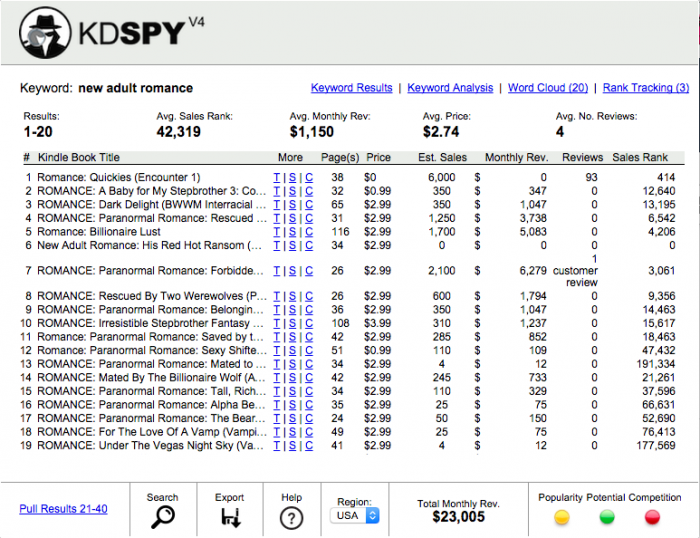
This is the top 20 Amazon hits for the phrase “new adult romance” on Amazon as of the time I took the screenshot. After I loaded the page in Amazon, I clicked on the KindleSpy icon in Chrome’s toolbar.
There are a few interesting things to note:
- The bestsellers don’t always come first. The top hits, especially the top 2, are ranked based on newness, generally. Half of the first sixteen hits were released in the last few weeks. This “new book” preference rank ensures a lot of freshness at the front, which makes it more interesting for buyers who are, as many romance readers are, heavy readers. The effect lasts 30 days, and it really hurts when that wears off. Also, relevance counts for a lot, and relevance is partly based upon keywords.
- The T, S, and C columns aren’t self explanatory. T means look at that single title in Amazon, S means do a web (Google) search with those terms, and C means do a Google image search on the cover image.
- The estimated sales is just that—estimated sales, based upon an educated guess and the book’s current sales rank. It is a moment in time.
- Sales revenue is the estimated sales times the current sales price. Note that this is also a guesstimate: that high-ranking book with a big sales revenue may have been free until yesterday, and may still be coasting on a big free bump.
Also worth noting: a borrow for a Kindle Unlimited book will bump your sales rank, but it won’t actually pay out until the reader’s read 10% of the book, which may never happen. The amount it pays out is not fixed. Essentially the pool of payable borrows is divided into the subscription fees for KU—and every author gets a surprise. - Columns are sortable. So if you really want to see how well a book of similar length to yours are doing, you can sort on that.
- KDSPY loads 20 books at a time, but you can load 100 total.
KDSPY’s a Chrome or Firefox browser extension, and it works on any Amazon Kindle searches.
 If you buy KDSPY through my link, you’ll also get my own short PDF: Amazon Keywords Tricks & Tips.
Note: Wesley’s other products are really more for non-fiction writers wanting to write to profitable niches.
Also, there are other tools for Amazon keyword research, and I’ll write about them at some other time.
Feb 2015: What I Learned from Google Analytics Today
I’ve been trying to be smarter about marketing, and part of that means understanding who finds your pages and how they find them.
Hence I’ve delved into the dark art of SEO, specifically landing pages: when people search and find/visit my site, what pages do they land on?
And…I was surprised! Who knew that 1,000 (~2%) people would visit my spork page?
What Surprised Me
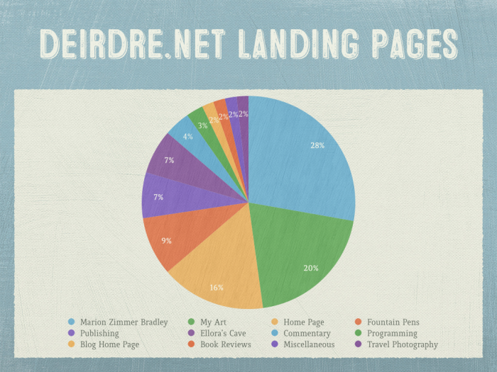
I only looked at the top 25 landing pages. Here’s what surprised me from those results.
- I’m unsurprised that Marion Zimmer Bradley brought in the largest chunk of hits, especially given that one post was linked to from The Guardian. What I am surprised is that, SEO-wise, it’s a smaller number than I expected. Then again, she’s been dead over fifteen years, so maybe I shouldn’t be surprised.
- Similarly, I get a lot of hits on Ellora’s Cave posts, but it’s only 7% of my incoming search traffic despite having a high Google ranking for the search term Ellora’s Cave. Which…should say something about EC: relatively obscure.
- 20% of my incoming search traffic leads to my various art projects, mostly t-shirts. Given that I’ve been posting them for less than a year, this is very interesting to me. I was in the middle of a quandary: given that I want desamo.graphics to focus mostly on graphic elements for sale, is it more off-brand to put those projects on deirdre.net or on desamo.graphics? The results say to me that I should keep these on deirdre.net.
Also a surprise was that this was my most-frequently-found art-related post. - 9% of my incoming search traffic leads to two posts about fountain pens. I should do more of these. Did you know there are relatively recent patents about cool fountain pen technologies? It’s true!
Finding Your Own Landing Pages
You can find your top pages by doing the following in Google Analytics:
- Log into google.com/analytics. If you haven’t set up tracking on your site, now’s a good time to do so.
- Click on Reporting.
- Click on Acquisition.
- Click on Search Engine Optimization.
- Click on Landing Pages.
You can see more about how to do that in this moz.com blog post.
Dec 2014: Out:think's Upcoming Free Course: Hacking Amazon

Tim Grahl of Out:think has a new free course coming up called Hacking Amazon. (Above graphic is from Tim.)
A few weeks ago, I published an article about how to launch your book with 25+ Amazon customer reviews. This article really exploded, and it got me thinking . . .
I know a lot of little hacks and tricks that make Amazon work better for authors. So I’ve decided to put them all together into a course titled “Hacking Amazon.”
I’m putting the final touches on it over the next couple days. It launches on Thursday at no charge so watch your in-box!
Here’s that blog post Tim referred to.
He’s also got a free book and author marketing course, and you can sign up for that on his Out:think site.
Oct 2014: Twitter Hashtag for Promoting Non-EC Books by EC Authors #nonECbook
Susan Garbanzo asked me:
@deirdresm Maybe a specific hashtag for use by EC authors on your support list? #notchilled
— Susan Garbanzo (@Soenda) October 10, 2014
::smacks forehead::
I didn’t think of that, that’s why. She’s a genius.
Therefore, if you’re tweeting/instagramming about your non-EC titles, that seems to be a good way to find people who are looking for EC authors to support in the midst of the Dear Author lawsuit and any uncertainty surrounding it.
This also neatly separates the #notchilled free speech issue tweets from the #nonECbook promotion opportunities. Not everyone reading #notchilled reads erotic romance or erotica.
Plus, @BooksFoodShoes has already used it once, so that seems a good enough reason to keep using it.
Note: there is no requirement that you be otherwise eligible for the Ellora’s Cave Author Exodus Support Thread.
There are only two requirements.
- You are (or were until recently) an Ellora’s Cave author.
- You have at least one non-EC book to promote.
…OR…
- You know someone who writes/wrote for EC
- You want to recommend one of their non-EC titles.
Just—try to keep the quantities of tweets reasonable.
Aug 2014: Bad Book Covers: Comic Exaggeration
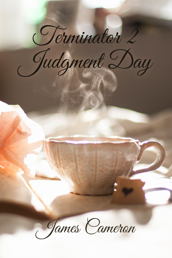
For Westercon, I made a Lousy Book Cover for comedic effect. After all, I had to have one to show at the panel, right?
So I picked a great photo. I picked a great typeface.
And deliberately made a grievous error.
Behold.
Courtney Milan Talks Type
I bring this up because Courtney Milan’s got a great blog post called How to Suck at Typography. Ironically, I missed it because I was at Typecon.
First, I absolutely love the Borges font she discusses. It’s called Desire. It is truly one of the showcase pieces of what can be done with OpenType.
What she says about free fonts is largely true, but there are some good ones out there. The one I used was Great Vibes, which is the free cousin to Good Vibrations. I mention this for a reason: sometimes there’s significantly better typographic features on the paid version of a font. And sometimes it’s the bad fonts that get thrown to the free bin. (Or packaged up by the hundred for seemingly low prices.)
Personally, I’d like less space between Te so it feels more like Ju. Similarly, I’d like a tidge more space between Da so it feels more like Ju. Given that the paid font seems the same at first glance, evidently the font designer disagrees with me on that point.
There Is One Point of Violent Disagreement, However
Font effects are the opposite of tasteful covers. They are harder to read at best, and migraine-inducing at worst. The worst fug in the world comes from font effects.
I’ll half agree with the last. Granted, she’s talking from a historical romance perspective.
I’ve been working on a poster off and on for a month. I just couldn’t get the right approach to say what I wanted to, so I put it away and get back to it.
Yellow Design Studio is one of my favorite indie font foundries. I love love love love love their font family Gist, which is really Gist and Gist Upright, Gist Rough and Gist Rough Upright, and GistX.
One of the things Gist has is the line version of the font along with the regular—so you can separately style/color. Let’s say you’re making a poster, in navy, for an upcoming nautical clothing line. Put the text in white, and make the line red (or green, as that’s another combo used for nautical clothing). Perfecto.
In this case, I’ve been fussing with this poster, and, once I decided on Gist, I started randomly clicking layer styles for the line until I got this:

I love it. I love how the beveling turns the corner between the u and the s.
The catch is, it’s applied on a relatively small part of the type. It’s the mint leaf served in your chocolate dessert.
Drop Shadows and Outer Glows
There is one reason to use these two features: to separate the type from the background. I used an outer glow in my sample bad cover. It’s subtle enough that if you don’t know what to look for, you’d miss it.
As a general rule, that’s how it should be. The secret is to reduce the opacity of the effect. I often reduce it from the default 75% down to 25-35%. Also, increase the radius of the effect from a few pixels to 20 or 30.
Coming Back Around
Getting back to the original picture, there’s one aspect that Courtney doesn’t talk about: appropriateness of the type for the project. It’s not just whether it’s a good font. It’s not whether the layer style, kerning, etc., works—there’s a bigger thing going on.
Is the font, the most appropriate (within reason) font you can use? I say within reason because I love Skolar, but it’s going to be a very long time before I’ll be able to afford it.
I recently heard a cover designer say that if the book got the person to read the blurb, the cover had done its job.
I agree in part and disagree in part. When they get to the blurb, they have a mindset in place that may lead them to interpret the blurb fundamentally differently than the blurb was intended.
Your cover needs to give the reader the feel for the book. Typography’s a huge part of that. As an example, a friend wrote a historical fantasy. Someone did a cover for her, but the fonts were all super-modern, so they’d lead someone to expect a really different book. For that reason, she went with a different cover entirely. Good call.
Remember that saying I found so profound? “A one-star review means the wrong reader has found your book.”
The purpose of a cover is to find your book’s five star readers and turn away the one-star readers.
The main problem with the cover I’ve given for Terminator 2? It would find mostly one-star readers. They’d be wanting something nice and cozy with tea and biscuits, and get something else entirely.
Find your five-star readers.
Jul 2014: Mockup: 307 Ale Bottles
I found this beer bottle mockup last night, and thought I’d have fun with it.
Catch is, this particular product would probably be better vended in something stranger—like a Klein bottle. Oh well.
Click for full size:
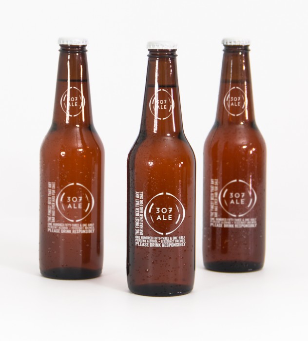
It’s an homage to a Tom Smith song of the same title:
There’s many drinks you’ll drink, me lads, but this one beats them all.
One hundred fifty-three and one-half percent alcohol,
A beer brewed in a tesseract, it’ll shoot you through the roof,
And if you don’t believe me, I’ve got lots and lots of proof.
Graphic Element Credits
Font: Veneer by Yellow Design Studio I love this font, use it all the time.
Logo font: Trend Handmade by LatinoType
(Both of the above via Design Cuts, as usual.)
Beer Mockup: Original Mockups
Logo: 12 Sci-Fi Badges from VoxelFlux
Jun 2014: Using Contests for E-Book Covers
The subject of using contests (like 99 Designs) for making e-book covers has created huge controversy in the graphic design world, including complaints of driving down prices, etc.
My own feeling is that not every designer works the same way, and e-book contest covers can be a compelling way to get a decent cover at an affordable price.
Below is a comment I submitted to this post on Joel Friedlander’s blog, The Book Designer, about using contests for e-book covers.
I’m a writer who has, in the past, done graphic design for a living—everything from layout to burning plates and occasionally minding the paper folder. Catch is, that was the 80s, and it’s a huge technology shift that I haven’t kept current on. In the 80s, I joined a consultancy that had a mix of software engineering and graphic design clients, though we also did some music-related stuff for a gaming company.
At one point, my partner and I decided that we were too unfocused and we should concentrate on one thing, so however we earned the most money in the next six months would narrow our focus. We made more money in software engineering, thus gave up the design part of our business. In retrospect, I think that was a mistake.
In between software gigs, I did still work in graphic design on occasion, though not through the partnership. After the company folded, I went back to graphic design for several months before heading off to Ireland. I was burned out and fried, and working on setting travel agency ad copy and laying out restaurant menus was far less stressful. I was the first to use the new typeface Lithos for Mexican restaurant menu design (for El Torito), and every time I see another Mexican restaurant using the face, I smile. It may be a super-small trend I set, but it was a move away from more stereotypical ethnic typefaces.
I’ve done cover designs on 99designs. Never won a gig, but I’ve been in the final round several times (mostly for hidden contests). I get asked to submit designs every now and again.
There are good and bad things about it, so I’m going to be frank with what I feel works and doesn’t work about 99 designs—and why I bother to do it at all.
First, I’m not an illustrator in any sense of the word. I’d love to have that skill, but not so much that I take the thousands of hours it’d need to really develop it. I’m really, truly at the “daisies like a six-year-old draws” stage of illustration skill. After I get my current book done, it’s actually part of my commitment to myself that I’m going to learn how to draw better as well as finally learn Illustrator.
I view the contests as “Photoshop homework where I have a risk of making some money.” That’s it. I’m looking for a challenge as an artist: what do I feel I have to say about this topic? And what can I challenge myself to learn? Also, do I have a photo that I think works for this?
Especially where there are photo-based covers, sometimes 99designs can feel like a race to find the killer stock art. For Tim Rymel’s forthcoming book Going Gay, when I saw the artist submit the winning cover, I inwardly folded. What I’d found was nowhere near as good. Tim obviously agreed, as he ended the contest early. Could he have gotten a better cover? Possibly. But I think it does an awesome job. In that contest, only a handful of designs were submitted.
The other extreme I’ve seen is where the client just keeps chewing up designer time. This contest had a mind-boggling 1265 entries. But, because they were paying $450 (rather than the more typical $200 or $290), people kept on submitting. I don’t want $450 that badly; I’m so glad I was eliminated early. I’m guessing the winning designer probably earned around $2 an hour.
Another problem is the person who’s self-published a book with an awful cover, then comes back to get a better one when their book isn’t selling. Catch is, if their taste was that appalling to begin with, it isn’t much (or any) better now. They’ve only decided it’s worth spending (more) money for. For you great designers out there, these people were likely never your customers. They’ll often reject good design. The beauty of 99designs for these kinds of situations is that you can look elsewhere for how you make your money. There are plenty of people willing to be awful for the client.
Look, I get that those of you who are real designers for your day job feel that these contests are a threat. And those of us who design a cover every now and again when we have the time aren’t really in your business at all. I’m far more interested in the one-off client where there’s no future implied obligation because I’m a writer first and designer second. You generally would prefer to have repeat business or at least referral business.
For those of us who find this kind of thing a bizarre form of entertainment, one of the reasons I do it is to hone my sense of design. To play with my font library. To try to figure out how someone else did something and have a go at it myself (not to knock off the design, but just to learn). To see what I like (and don’t like) about other people’s entries, and try to articulate why it does or doesn’t work for me. For me, that’s what the real benefit is: not the money, but the education.
One of the things I’ve had to spend a lot of time on is documenting the rights I have. Do I have rights to use this in a commercial project?
Speaking of fonts, I’ve learned how much of a font freak I really am. When some unexpected money came my way, I decided to go to TypeCon in July. Their program and workshops sound fabulous. So that’s a direct result of 99designs contests.
Almost every penny I’ve earned this year is as a designer. (I’ll have books out later this year, and I expect that, at year’s end, design will only be a minor part of my income. One hopes.) Did I design my own covers? Yes I did. Ultimately, that’s why I’m doing this: so I can do a better job for myself. Even if I get to where I think hiring someone else is a better choice, I will be better working with a designer because of my experience.
Until then, I’ll just write every day, publish books when they’re ready, and sell a bunch of t-shirts and the occasional clock or shower curtain.
Note: Book mockup template in header by Picseel.
May 2014: Creating a Media Kit for Yourself
Confession: I have been to more than my fair share of webinars of late. I’ve learned that “webinar” = “We will sell you something.”
That’s not always a bad thing, though.
So I attended (aka sat in my living room chair in my jammies) a webinar earlier today about creating media kits and press releases for indie authors. Except, as it turns out, not just indie authors.
In this webinar, I learned there are seven audiences for your media kit:
Seven Audiences for Your Kit/Book
- journalists, which includes freelancers
- bloggers
- book reviewers
- retailers
- individual buyers
- event planners
- anyone who wants to promote you or your book (editor, podcaster)
When they got to #6, I was sold. Remember those frustrations I’ve been uttering over the years, speaking as a programming head? About how someone wants to speak and how it can be hard to figure out who they are with minimal effort?
Your Number One Goal
- make their job easy
Yes, please.
Rick has a saying that I try to keep in mind, “Make it easy for people to help you.”
Another Confession
I love media kits. Not just for people, but for hotels. Did you know the Burj al Arab has a media kit? And that you can download beautiful high-res pictures like this one in 3500×2533 size, perfect for any desktop background?
Yeah, I get that we’re probably not going to wind up as a desktop background for anyone. But that’s not the point. The point is: make it easy for people to get the information they need for writing about your work or contacting you.
But…My Publisher
Yes, if you’re a writer published by a larger house, your publisher probably has made a media kit for you and your book. Depending on how they work things, you may not be able to provide an electronic form of that on your website.
The catch is, your publisher’s interest only extends so far. Their goal is to promote their current catalog. Your interest is to promote you.
You can make your own media kit for you as a writer, though you shouldn’t work at cross purposes to the publicist at your publisher without a good reason. (A good reason can include: you’re also being published elsewhere, including indie publishing, or you’re about to branch out into a different genre, etc.)
Flipping the Table for a Minute
Speaking as a convention runner for a minute, I’d like to give you some ideas of what it’s like coming in to run programming for a convention.
- You’ll get a long list of people you mostly don’t know, or don’t know well. Sometimes that list is literally just name and email address. Sometimes you have a short bio, but that’s unusual in my experience. It’s also unusual to get the person’s website, so you have to look them up.
- Some people will write in to be on programming. Some of these people are wonderful, and others are people you shouldn’t consider for any reason. Naturally, it’s not obvious which is which. Note: if you are writing in to be on programming, please assume the person receiving your email has no idea who you are. Provide information about who you are and why you’d be interesting, but also please do not be overly familiar. Receiving something lewd intended for someone else is awkward at best.
- You’ll need to make a balanced schedule, including some from the first two lists, and some new names.
- You have to make a call based on really limited information, such as what’s on someone’s web site, about whether or not to have them as a speaker.
- A media kit is more than I need, typically, but it wouldn’t hurt.
Coming Back Around to the Webinar
The intro pricing on the media kit template, good through Monday May 26th, is incredibly competitive at $67. Here’s the link to purchase. (Note: not an affiliate or anything.)
If you don’t currently have any media kit or anyone doing public relations for you, then this package seems to be a great place to start. The author, Joan Stewart, has been a newspaper editor, and has therefore been on the other side of media and press kits over the years.
Another thing I don’t know if the kit mentions: please give photo credit to your photographer(s) and also specify photo rights. This is the standard in journalism, and too frequently I see zero credits given. Any media outlet is going to need to know that they have the right to reproduce a photo for editorial use, so please make the rights clear.
Also: please have black-and-white photos available, too, because that photo that looks great in color is going to look horrible if it’s converted without care. Many print publications are in black and white.
Where to Link Your Media Kit
Most of the writer sites I’ve been to, including my own, don’t have a media kit link that I can find. The usual places you’ll find that linked are:
- From the “About” page, which is typically a top-level page. Example from Tiffany Reisz.
- From the links in the footer that include things like Privacy Policy and Copyright. Example from Apple. Note: if you have infinite scrolling turned on as a feature (which I hate), don’t put anything here.
Those are the two most likely places to look. If you have anything in the footer, the media kit link should also be here. The footer has the advantage of being one click from any page, where a media kit link off the About page is generally two clicks.
One More Tiny Plea
If you’re published by a small press, in your book blurb on your site, please make the publisher name be a live link to their site and, if possible, your book on their site. I know this sounds incredibly obvious, but you’d be surprised how infrequently it’s true.
Mar 2014: The Amount of Time it Takes
Just for the record, the amount of time it takes from the time someone decides to to use a new pseudonym to:
- Google the potential problems with the name, then register the variant that’s the most promising.
- Wait for DNS to propagate.
- Find a theme for a landing page site template.
- Upload the bare bones to the writer’s server of choice.
- Find the right stock art and fonts for the right look. Requires searching five different sites, but you think you nailed it for not just the one book, but the planned series.
- Start setting up the email accounts. This needs another round of DNS propagation for reasons you never have figured out, and it’s two in the morning already.
- Restart Apache. Whoops.
- Web server down! No………..
- Obligatory teeth gnashing step.
- Oh, that’s why. Doh.
- Web server running again. Phew.
- Design the book cover from scratch. Fuss with it a few times.
- Hack and saw the web site template into something resembling what you need right now.
- Verify that the email accounts now work. Woohoo!
- Hack and saw the background image that isn’t as perfect as you thought it was. What’s that jaggy edge? Ewww.
- Write all the copy for the web page.
- Have the author sign up for Twitter.
- Have the author sign up for Smashwords.
- Figure out how you broke the author’s web site’s layout. Twice.
- Fix it, declare victory!
…eight hours have passed. And $35 or so ($15 for domain, $12 for landing page template, $8 for art).
Just in case you’re ever inspired to, you know, do the same.
I can has nap nao?
Mar 2014: Long Overdue Author Platform Rant
Me: I’m writing my author platform rant.
Rick: Is that what your statue sits on?
I said a few months ago that I had a pending rant about author platforms. It’s that time. I’m completely frustrated about something entirely different, so it’s a good time to fuel that energy into this.
For non-fiction writers, your platform is, in part, your specific expertise to write that book. Being a kick-ass researcher, like Mary Roach, will help you get through problems writing books like Packing for Mars even without subject-matter expertise prior to starting the book.
Note that I said in part. I’ll get back to that.
For fiction writers, your platform is a lot more nebulous, but the similar part would be what you write about.
Platform Isn’t an External Thing
Which is another thing. I sometimes see statements like: my platform is (and a list of social media and blog stuff, possibly with a mailing list). Um, no. That’s an important aspect, true, but it’s like saying the car you drive is you.
The rant, for me, comes in here: a platform isn’t an external thing. It’s not actually external to you. It is you, but it’s not all of you. People asking, “What’s your platform?” just make it feel like it’s something that’s external.
It’s how you present your work and how you interact with potential and actual target audiences. It also excludes the audiences you alienate, even though you may think you don’t ever want to alienate any. You will. It’s a given. Not everyone will be into what you write. It’s okay.
Let’s say you’re writing a historical romance. I’m not your target audience, so that would generally exclude me unless you happened to hit enough other things I liked that my interest in those things transcends genre. Write about a romance with strong women in the Venetian Renaissance? I’m there.
So Here’s How I Think of It
Your platform is how you appeal to and interact with the various groups that comprise your target audiences, including:
- What you write
- Your face-to-face interactions
- Your email interactions (including a newsletter, if you have one)
- Your website and blog (some people use different servers for these)
- Your other social media
- Your marketing (business cards, bookmarks, blog tours, etc.)
- Everything else
Note That Plural
Target audiences.
Even if you’re writing two books in the same series, not every book in that series will appeal the same to every reader. It’s not even about what book is (or isn’t) objectively better. The Empire Strikes Back is (my opinion) objectively better than Star Wars, but I still prefer Star Wars because it doesn’t have the middle-part-of-a-trilogy structure problem.
My favorite plot structure is, essentially, not really in the catalog of possibilities for a typical romance. However, I enjoy reading romance. I just won’t bond with it quite as deeply as I might if the story used my favorite plot structure. (Books: Tim Powers’s The Anubis Gates and Steve Martini’s The List. Movies: The Player, and, to a lesser extent but for similar reasons, Donnie Darko and Inception.)
As I’ve said when giving career advice to people in technology: the sum total of what you care about, what you do not, and how much you care/don’t is unique. I care about my favorite plot structure, but not to the exclusion of other plot structures.
How do you help people find you who care about the same things you write about?
That’s the big question, isn’t it?