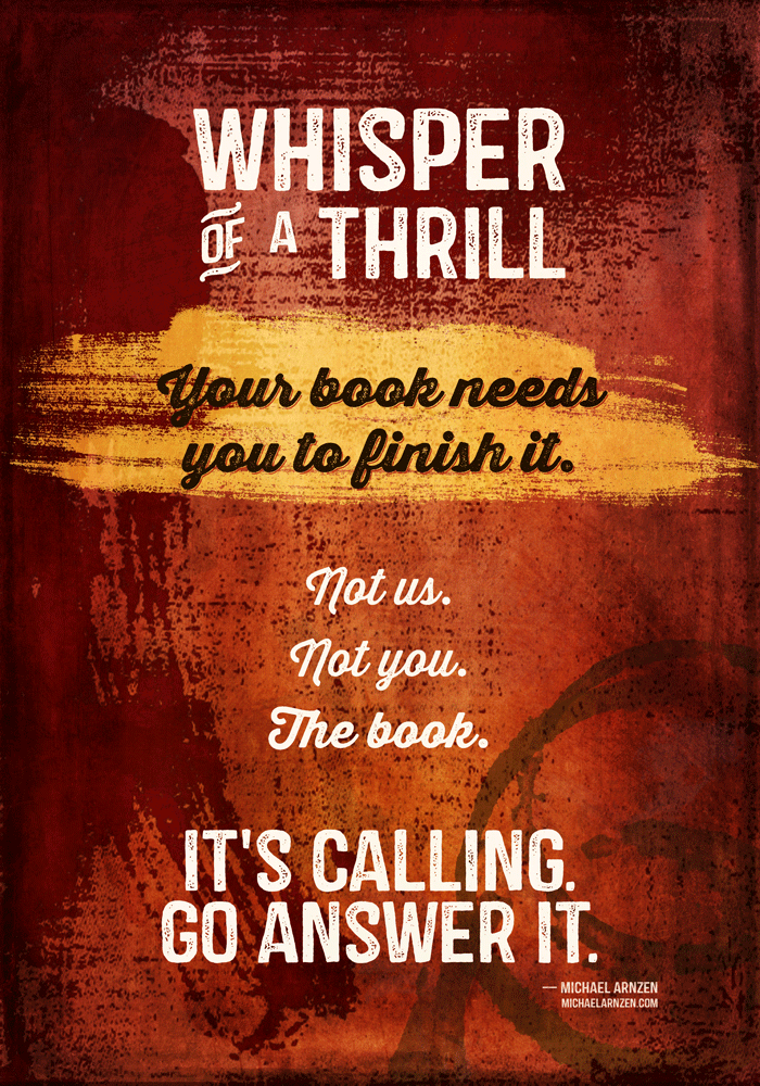
New Design: Your Book Needs You to Finish It
16 June 2014

Available from Redbubble in posters, prints, t-shirts and hoodies, greeting cards, and stickers.
I’ve had this saying around on my hard drive since grad school in 2003, when Seton Hill University professor Michael Arnzen said this. Neither of us can remember the precise context, though.
He is a horror writer, and I can totally hear that evil horror writer cackle at the end, so I went with a red theme, leaving it open to interpretation if that’s actual writerly blood running down the left side.
Oh, hey, there’s coffee rings in the lower right.
100% detail:

Credits
This time, I decided to use my favorite packager of graphic elements I love, Design Cuts. Every one of these came from one of their bundles; they run a single bundle every other week.
- Font: Castor and Castor Catchwords from Albatross.
- Font: Thirsty Rough from Yellow Design Studio. This is the script font. The detail shows the regular font plus the outline font, which is a really neat look.
- Two textures from 2 Lil Owls. One on the very bottom and one on the very top. The bottom one has some subtle text that you can kind of see hints of. As I write this, these are out of the current Design Cuts bundle. One’s from the Grandeur pack, and one from the Relic pack.
- The yellow swath is from Robyn Gough, who also did a few other brush textures used very lightly in the background.
- The red on the top and left is a vector element from Offset’s Vector Texture kit.
- The coffee rings are a set of Photoshop brushes from FanExtra.
Apart from that, I used one linear gradient and one radial gradient.
That’s it!