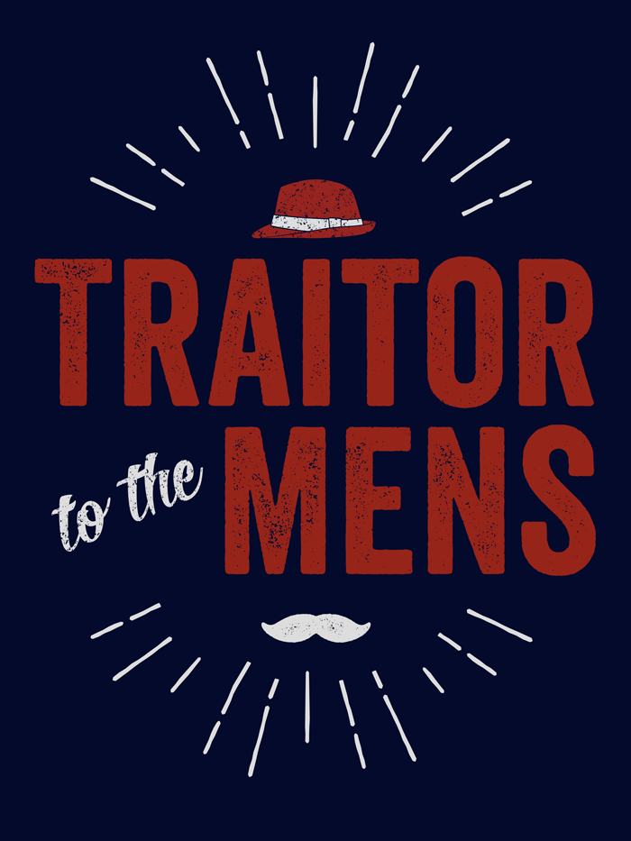
Scalzi "Traitor to the Mens" T-Shirt & Prints
30 April 2014
Available now: dark background t-shirt, light background t-shirt, and prints, stickers, posters, and cards.
If you need a size bigger than 3x or don’t like American Apparel shirts, then I also put them on Zazzle, which is slightly more expensive than Redbubble. dark background t-shirt, light background t-shirt.
John Scalzi said: I think I’m going to make a t-shirt that says “TRAITOR TO THE MENS” on it.
I offered to do the design.
He replied: DO EEEET
So here we are. Here’s John Scalzi’s background story for the phrase.
I offered in part because the very night before I was on a graphics site and had skipped over a free mustache graphic element because, and I quote, “I’ll never use that.”
When Scalzi mentioned the t-shirt idea, of course, it was the first thing that came to mind. As it turns out, I didn’t use that one I’d seen, I used one in a font I had.
Plus, thanks to Design Cuts and their awesome graphics bundles, I had—no joke—twelve gigabytes of new graphics toys chomping at the bit waiting to be used. I really wasn’t kidding about collecting grunge textures.
I want to give credit to the designers for the elements I’ve used, top to bottom.
- Sunburst, from Outdoor Logos by Ian Barnard of Vintage Design Co. (Purchased as a part of a Design Cuts bundle.) Initially, I just wanted a sunburst as a design element, but then I realized the kind of people who think feminist men are traitors are just, well, puckery assholes. So there you have it.
- Fedora, from Shona Dutta’s Retro Hats collection. Hey, someone local to me!
- Veneer font, from Ryan Martinson of Yellow Design Studios. Purchased as a part of the Design Cuts Monster Creative Font Bundle which is a great deal. While it’s a past bundle, if you buy the current bundle, you can also buy this one if it floats your boat. I love this, so I’ll talk about it more below.
- Roverd font, from Dexsar Harry Fonts. (“to the”) Indonesia represent.
- Veneer Extras font, also from Yellow Design Studios. (This is the mustache.)
- Grunge texture is from Vintage Textures by Ghostly Pixels, used on the fedora and “to the.” (Purchased as a part of a Design Cuts bundle.)
- (paper goods only) See the chalkboard in there? No? That’s the beauty of textures. It doesn’t have to be obvious to add to the whole. From Bruno Maioral/BMachina.
- (paper goods only) The book-like texture is from Cruzine. (Purchased as a part of a Design Cuts bundle.) I tried a bunch of textures, but I liked the feel of this one.
- (paper goods only) The folded paper texture is from Simon Berkey Hartmann/The Shop. (Purchased as a part of a Design Cuts bundle.) Metaphorical nod to the well-worn arguments that follow only a few lines of thought.
Veneer and Why I Love This Kind of Font
Bottom type layer: Veneer, color white.
Middle type layer: Veneer 2, color yellow.
Top type layer: Veneer 3, color red.
Cool effect, huh? That’s just three of the six variations. That said, I didn’t think multiple colors worked as well for the t-shirt. Usually, you’d use colors closer together, too, but I was illustrating the concept rather than using it in a larger design.